Play game
MonoKeep's itch.io pageResults
| Criteria | Rank | Score* | Raw Score |
| Theme | #7 | 4.471 | 4.471 |
| Art | #9 | 4.471 | 4.471 |
| Overall | #65 | 3.784 | 3.784 |
| Music | #114 | 3.176 | 3.176 |
| Is the graphics 1 bit? | #130 | 4.824 | 4.824 |
| Originality | #166 | 3.235 | 3.235 |
| Gameplay | #227 | 2.529 | 2.529 |
Ranked from 17 ratings. Score is adjusted from raw score by the median number of ratings per game in the jam.
Leave a comment
Log in with itch.io to leave a comment.


Comments
Both visuals and audio are great. The bar on the right was a bit confusing. Seems like you wanted to add a way to upgrade the individual parts of the tower (or at least leave that as something to expand on), which would be a cool way to add more depth to the game.
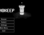
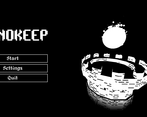
Incredible menu, the vibe was amazing too! I can see a lot of potential!
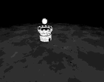
I really like the 1-bit graphics in 3D, and the music is great too!
It wasn't difficult to last for 5 minutes. I would like more choices in the game and more challenge
It is interesting that you can walk around, I wish this element affected the gameplay in some way or there were more visuals to look at.
nicely done submission! I liked the UI and also that the light indicates how much damage you got. I would love to see different enemy types and better music - the sample is looping too fast and somehow the BPM of guitar and drums dont quite match. The sfx are very nice though.
The grafic is splendid and very creative for this 1 bit entry! Also you nailed the theme!!
Very nice submission!! :D
Hey, thanks! Sadly I'm not very experienced in the audio department yet as I usually just tinker with visual stuff, and due to that the other things like the gameplay variety got sidelined a bit. I'm going to work on that in the future and try to focus more on the gameplay and audio next time.
Thanks for playing my game!
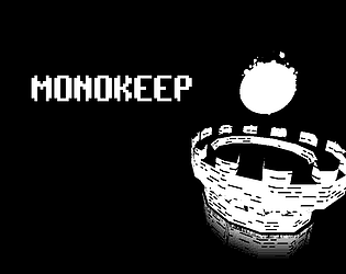
The visuals are very strong for the 1-bit jam, easily one of the best. Very cool dithering effect.
Wow, thank you so much for the kind words! thanks for playing!
I enjoyed flying around the tower. After like 5+ Upgrades I positioned the camera at the top just to see what it would look like to view all the way to the bottom. The shaders look great mate!
Thanks for playing! appreciate the kind words!
Very cool looking game, and interesting too! Would have liked to see some extra level to the gameplay, as it got a bit repetitive after a few minutes.
Also I was a bit confused by the UI on the right, the button for the expandable menu was in between the tower pieces? a little confusing but I understood it eventually
Yeah I know, definitely should have worked more on the gameplay and added variety.
The list on the right displays the floor pieces in the order that they're in, and you always add a new floor where the + sign is. I guess it might have made sense to do it differently and be able to reorder the floors but this is what I ended up with.
The camera is super smooth and fluid. It was fun to mess around with that. The art style is also very cool! Great work!
Some variety wouldve been nice to spice up the gameplay, but the visuals are very well done.
Yeah I get that for sure, I know it gets quite repetitive. I was planning on having more variety in the floor types and enemy types but got hung up on creating the procedural tower, shaders and making menus and such.
Next time I'm definitely focusing on finding the fun before I do the visual stuff.
I like how it gets darker the more damage you take. Very clever.