Play game
Walk the Horizon's itch.io pageResults
| Criteria | Rank | Score* | Raw Score |
| Sound | #6 | 3.500 | 3.500 |
| Graphics | #8 | 3.917 | 3.917 |
| Bitness (is the game 1bit?) | #15 | 4.417 | 4.417 |
| Overall | #21 | 3.333 | 3.333 |
| Use of Theme(s) (does the game have reflections, radioactivity, and/or dragons?) | #24 | 3.292 | 3.292 |
| Creativity | #30 | 2.708 | 2.708 |
| Fun | #44 | 2.167 | 2.167 |
Ranked from 24 ratings. Score is adjusted from raw score by the median number of ratings per game in the jam.
Leave a comment
Log in with itch.io to leave a comment.


Comments
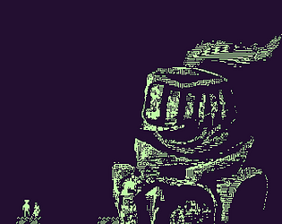
The music and art were very good however I was lost for most of the game and didn't really know what I was meant to do.
Your music was very relaxing and fitting! I really loved the art. I wish the game did not restart so abruptly. I do not know if this was on purpose or a accident, but the player kept getting stuck on the wall. Also my weapon did not ever kill any enemies. Overall needs a bit of work done on it, and Good job.
EDIT: The water reflections were weird when I did not move.
I don't have any critiques that haven't already been said. Love the art, nice atmosphere the music. Good work!
Graphics and level design was cool. Just wish there was more indication that I was hitting the bosses (a health bar maybe)
Nice game.
Some things that i think can be improved -
It was difficult to see where the player is, so add a indicator at top.
He just sticks to wall when collided with it without any animation.
Oh shoot, totally forgot to make a wall grab for the spritesheet. Thanks for playing.
Man the graphics and sound for this game is top notch! My only big gripe was that there is a little lack of direction in terms of where to go.
This is sounding like a common problem - hmm developers often use colors or visual keys to help illustrate the path to the player - I wonder what the best solution for this game is... Thanks for playing.
Not sure if this was intended behavior but my corpses stayed along after I died; I used them to trap enemies and traverse gaps.
The music and graphics work incredibly well together! Super moody and atmospheric; the one area that was kind of off tonally was the credits screen, and pssh, it's credits.
One of the ones I had a lot of anticipation and hopes for, and boy did it deliver. Great work!
Corpses piling up was totally intended! I'm kidding, but I made a temp solution and decided I liked it a little more than just removing those bodies from existence - made for some fun bugs. And I'm sorry about the credits - that was added last second, but no big deal.
Thank you for playing! I hope you enjoyed that dragon boss fight, it was fun testing out, and very simple to make - if only the Leviathan Lord had gotten that love...
There is something very charming about walking all over your past lives, forcing them to become more than merely the stagnant reminders of every failure. In the context of Walk the Horizon, anyway. I half-expected part of the point to be building a bridge of corpses to the end of the world.
I did enjoy taking on the dragon, though figuring out how to win was a little rough at first. Definitely let me know if there is ever love to spare and more content, especially Leviathan Lord content, gets added and polished. I will happily replay it!
Oh I have ideas, I just hope some of the team wants to keep tinkering away at this project with me. My first jam with a team - there are so many other assets we never used. No promises however...
Amazing graphics and music. Kinda go confused at some of the levels.
Thank you! We put a lot of work into this. If we had that extra 12 hours, I would have made those levels more clear to traverse - but I think we accomplished a great deal with those 3 days.
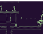
The world looks really detailed, but very cluttered. I had a hard time figuring out what to do.
Yeah level design needed more love and addition of the background made the game more cluttered. I will keep that in mind for next time. Thanks for playing!