Play game
That Time I Joined A Game Jam, But The Theme Is Aberration And Lost Track Of What I Am Doing.'s itch.io pageResults
| Criteria | Rank | Score* | Raw Score |
| Originality | #240 | 3.611 | 3.611 |
| Presentation | #337 | 3.444 | 3.444 |
| Overall | #394 | 3.148 | 3.148 |
| Gameplay | #565 | 2.389 | 2.389 |
Ranked from 18 ratings. Score is adjusted from raw score by the median number of ratings per game in the jam.
What do you like about your game?
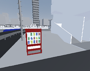
Even though it did not end up the way I planned, some 3d models looked better then I expected.
Leave a comment
Log in with itch.io to leave a comment.



Comments
a comment.
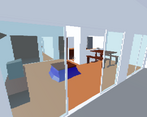
what a cool experience this was, there are so many hidden nuggets of charm in this seemingly isolated world that i'm not sure if i was able to uncover it all! this is walking-sim in its pure-essence, just moving around and taking the environment in. the experience in of itself felt so surreal, but not overtly to the point of being too cheesy about it. there were so many neat things in the game, some of the obvious ones like the objects in the apartment and the radios (seeing those always gave me a smile xd). then theres even just these small weird things in the game like the fact that you can double jump, the holes in the buildings which allow you to see through the non-back face rendered buildings, and this one random door that you can just open in the apartment building (i thought i was gonna get jumpscared, was about to throw hands).
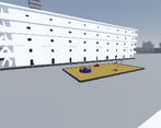
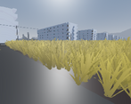
really loved the presentation of the game! the low res aesthetic works so well with the models that you created and laid out! that grassy field looks absolutely amazing, i stood out there for a good minute watching it flow through the wind (and hearing it too xd). the restraint in the use of colors against your mostly desaturated cityscapes adds a lot to the visual intrigue to the game. also a nice contrast to see the more rural and town-like area have at least patches of color here and there while crossing the bridge to the city leads you into an area drained of color full of black and white, with the grey towering building at the center of it all! even in the city parts and the buildings in the background, its impressive how visually appealing you can make these parts of the game just on arrangement and good shape language alone (especially in the city backgrounds), its very nice to look at!
overall, what a weirdly cool exploration game this was! you mentioned something about the manga shimeji simulation, which i haven't heard of before, but i do know of the mangaka's other work "girl's last tour", which captures the essence of beauty inside of an isolated dying world super well through the appreciation of these small humane moments and blips that we encounter in our lives. this world shares that same energy which is cool to think about! thanks for the manga rec, great work!
Hope my neighbors don't mind if I jump around on their roofs. Good job! I like the art very much
The overall vibe was neat. I enjoyed exploring and there was a decent amount of attention to detail. I feel like it would've been neat to have a bit more dialogue when you interact with stuff, just to keep things a bit more interesting when interacting with objects. The visual style is really cool and you did a great job with the assets you had.
This seriously gave me vibes of childhood in 90s growing up next to a whole block that was almost fully built but unpopulated and we could mess around entering apartments, it looked very similar.
I really enjoyed it for some reason. Finding the secrets was cool. The map is well made. It feels simple yet good to play. Reminds me of BABBDI without the weird stuff.
In summary, its a simple exploring game that you're told the bare minimum and you have to figure it out as you go. Even though the objective was literally standing out, I found myself wondering way off until I saw it lol
Hey, I thought this was a really cool experience, kinda made me feel like I’d just picked up a PS1 and found some really obscure walking simulator or something to go with it :). I loved the attention to detail, particularly with the vending machines and interacting with the workplace, and even with the variety of models that could be interacted with, they really kept me guessing. Only thing I would’ve like is some ambient music to add to the somewhat eerie feeling of walking on your own through a 90s feeling game, but otherwise I think you did a really good job.
Beautiful. Was very impressed you modelled the inside of the apartments, favourite parts were finding the radio, and exploring the alleyways. Hope work is enjoyable for the lil fella.
This looks like the kind of game where most of the game is hidden in some obscure location or accessible only under a very specific set of circumstances.
Really cool style, definitely felt a bit eerie.
Cool art style and design, but I was confused on what I was supposed to be doing.
man that is an anime title if i've ever seen one.
this game would stand right in the middle of the modern art exhibition section of the video game museum
Quite a cool premise! I think it is a little barebones, and there is a bug with the mouse lerp where it keeps wanting to turn right, which is a bit odd. I think if this had some more things to find and more places to explore it could make it a lot more interesting!