Indie game storeFree gamesFun gamesHorror games
Game developmentAssetsComics
SalesBundles
Jobs
TagsGame Engines

AppleJacks

256
Posts
29
Followers
55
Following
A member registered Jul 20, 2016 · View creator page →

Creator of

Recent community posts

i love single input games, and this is no exception! the gameplay has this nice mix of flappy bird and doodle jump which makes the game feel familiar but still fresh! i do agree with the comments that spamming does make the game a lot easier, so maybe having a cooldown for when the player can flap next time (or adding a max velocity cap) could fix that issue personally. though when just trying to play the game normally, its still a lot of fun trying to predict and time your flaps right to narrowly avoid enemies! the slowing down time does wonders in helping with this, because the game would be a lot harder without it xd.

the visuals in the game are also really cute! really feels like it came out of a childrens book! the little angel character and the terrors look fun and playful! the clouds against the purple background also look really nice! the way the clouds move makes the world feel that much more alive instead of having just a static background, so that touch is greatly appreciated! theres also a lot of nice small game juice here with the terrors lerping to the player once it registers the player as being to close to the terror and the zoom in that happnes when the player takes damage, all really nice stuff! all that's missing in the game is some audio that could give some nice feedback to the actions in the game!

overall, really fun game, i think i got around 5000 through spamming and 1500 through playing through it normally! great work!

this was such a pleasant puzzle game to go through! love this "go"-esque gameplay loop of having to flipping pieces to black with some pieces having different modifiers, made for some really interesting puzzles! the level design is so simple and elegant, allows for your brain to just kind of take all the information you need and piece them together into creating a nice flow state of flipping piece after piece! the act of just flipping itself is satisfying, seeing how the level unfolds before as you play and discovering which pieces get affected by the aberration pieces (which is also a really neat mechanic) created a lot of cool mental note-taking moment for me personally!

the visuals on display are incredible! the foreground elements have this very communicative simplicity to it that a puzzle game needs to allow players to not feel overwhelmed and easily digest the information before them. the UI with the lined borders and the retry and menu buttons also feel simplistic yet stylized in its layout, really feels natural to the game's framing without feeling intrusive to the actual view of the puzzles. then there's that fantastic background visual, it looks absolutely gorgeous! im talking about both in the title screen and in the actual game itself, the 3D elements with blur create this sort of fuzzy dream-like feel, which is appropriate given the game's name xd. the audio and background music also elevate this dream-like atmosphere to the next level, really tying the whole thing together well!

this was really great, could see this being a really fun mobile game to casual play while hanging outside! great work!

oh man this was a lot of fun! i love this concept of losing interest, allows for players to explore the different types of weapons in your game, make it a lot more engaging! it also helps that the weapons do feel pretty different in terms of how they're used, so it adds to this feeling of coolness when you go running around shuffling weapons and firing at will (especially when you throw them away too)! the interest meter also encourages the player to act aggressively instead of defensively too, which is always a plus in my book! one thing though is that sometime im not sure how i was able to get health back, don't know if its when i pick up a rare gun or not.

the aesthetic looks really nice too! really love the pixel art, especially the gun sprites and materials! they all look differentiable and easy to identify from each other (the white outline helps out a lot in visibility)! i also like the player and the enemy sprites, though there were some situations where the enemies blended too much into the background i feel (especially in the cave). sfxs felt really chunky and powerful which gave a weight to each action that it corresponded to, which felt pretty nice!

this was a pretty fun game, this would be a cool game idea to expand! great work!

hooooly, i was not expecting that ending and little bonus, but don't want to spoil so all i'll say is that that was super cool!!! incredibly unique game, i feel like a handful people under a specific niche would be loving this game to bits! i had a great time, but the difficulty quickly crept up on me to the point where i was struggling past level 3 and had to finally rely on hints xd. i like all the information that you give to the player in order for them to be able to understand how to reach the solution! you got the target, the result, the difference between the two, and then both the visual and auditory forms of that information! it took me a while to understand what i was interfacing and what visual pertained to what element of the game, so i think the UI could have been improved a bit for more readability, but otherwise this was super cool! one of the most unique submissions in the jam i've seen so far! great work!

nice take on the tower-defense genre! it was so much scrambling around my plants and hectically moving gravestones to better cover my defenses depending on where the farmers are coming from! it reaches that nice balance of strategy and quick decision making while making those decisions easy to understand how to make and rewarding at the same time! unfortunately i seemed to have ran into the same issue that others went through where there was one enemy  you couldn't scare at the end, but still had fun!

the aesthetic as well is so great! live everybody else before said, the thumbnail is absolutely gorgeous and eye-catching, it looks like a lot of effort went into that and it shows, super well done here! the pixel art sprites also look really nice! the purples work well under the grassy green background and make it easier to see whether the more red and bluish wearing farmers are going near the plants! also the plants being purple coordinates well with the player also being purple, easily communicating (even without the background story i feel) that they should also be associated as a part of the player. the bgm is also really fitting and nice to listen to for this type of game, well done!

this was pretty fun to go through, wish there was some form of score in the end to show how many people you scared! great work!

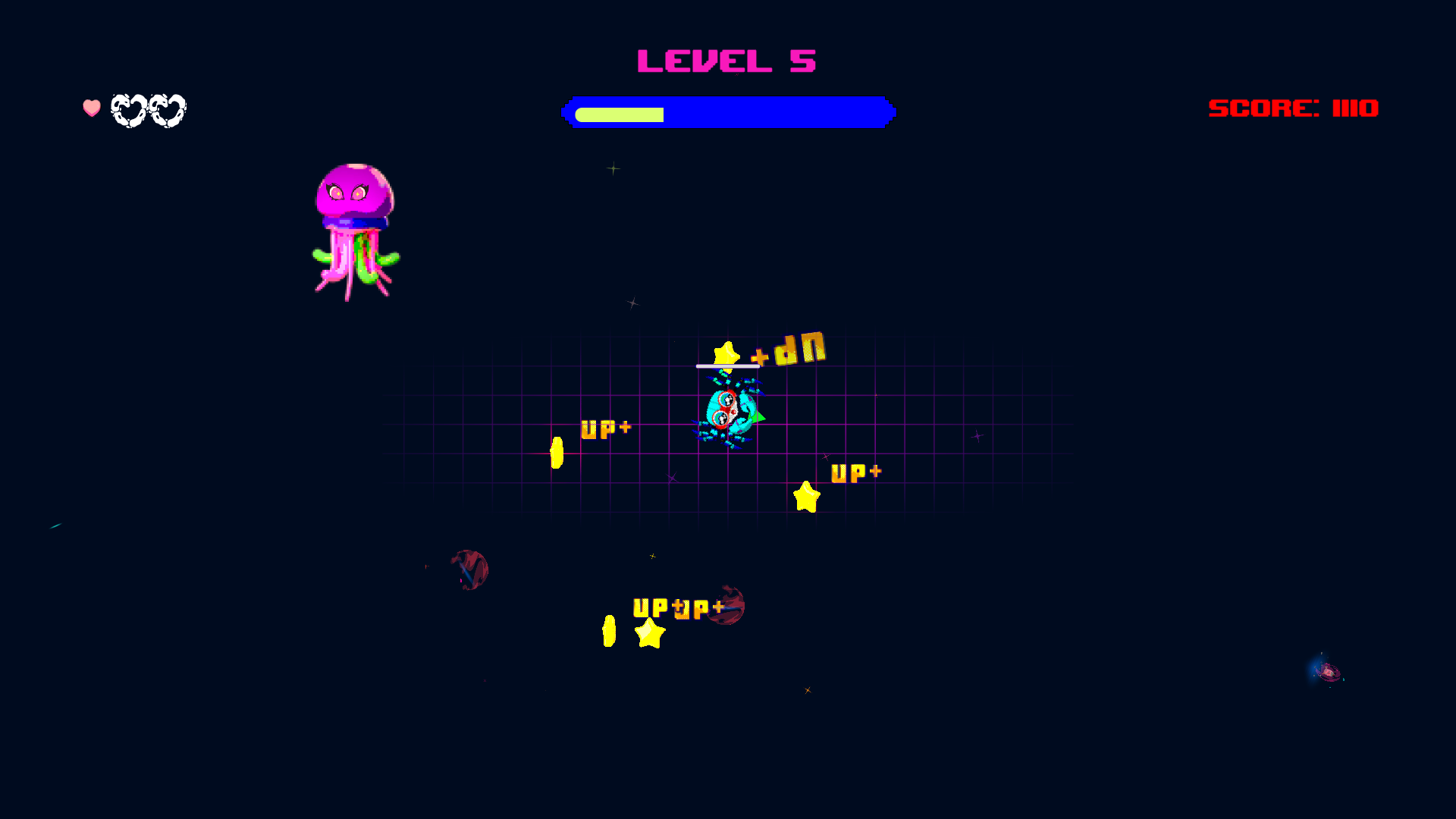
this game was really fun! had to fight through some of the known bugs (i had to consciously make sure to navigate the ui with WASD instead of mouse clicking xd), but outside of that it was pretty cool! shooting down various threats by predicting their movement and how fast both the target and the entity moved felt pretty satisfying everytime a hit landed! loved the space storm upgrade as a safety net, though im not quite sure how upgrading further improves the ability? i'd love if there was some way to get back health, whether it be everytime you level up or a random object spawn that you have to shoot at (acting as a tradeoff and leaving you vulnerable to enemy threats until your next bullet comes through)

the aesthetic looks really nice too, love the vapor-wave aesthetic and the vibrant color palette! the crab and squid sprites look so cute and they feel very expressive too!i like how the stars are animated with extra detail (like the spins) so that they don't feel like they are statically rotating with the player! the UI also looks good and communicative! same goes with the sfx and bgm choices, they feel very fitting!

again, really good base for a game and i can see this getting expanded upon! i don't think i got a good score xd, but this was the highest i got before i think it froze on me (though i was going to die anywas lol). great work!


i had absolutely no idea what to expect but was pleasantly surprised! had a lot of fun with this one! very Stanely Parable like with how the omnipotent spectator watching over you comments on your decisions within the game itself and tries to direct you into playing the game their way! the dialogue is very fun to go through and read, i opened the dialogue xml file to see if there were any branching choices i missed xd (thats kind of how i found out that the papers were real and were not some prank/troll from the narrator xd). but yeah, the game went to a lot of cool and fun places in terms of the areas that were crafted for the game and how it plays into the objective of the game! pretty unique way of progressing through the game too, didn't expect that xd! overall very fun game! great work!

SCHMUP:
in the beginning, spawning near the wall felt a bit unfair xd. this was unfortunately the only game i couldn't beat, was pretty tough! had a few interesting challenges where the player can't have too many bullets out at the same time and the enemies following you!

PLATFORMER:

i think the flying controls are still in the game because you can fly up and down if you press those arrow keys making the game a lot easier xd. though still managed to beat it without it!

PONG:

it certainly was pong! i assume that the computer paddle changes direction if the ball is either entirely above or below the paddle's ends rather than moving up and down relative to the paddles center. though thank god the computer was simple since im not sure how long it would take to score all 10 points otherwise.

RHYTHM:

instant win with an error message displayed. not sure if an error message in godot would display in-game like that unless it was on purpose (was that perhaps the aberration?!?!?!?)

overall, fun stuff! one complaint would be that it takes too long to wait for the death/victory screen to end before getting to play again, if it was shorter or was player controlled, i would have done more attempts on the schmup. still fun though! great work!

 ̴͕̣̥͖̍̈́͠ ̵͍̈́̀ ̶͕̘̈̐̊̏̈́C̶̘̍͋̒̏͝ ̴̙̱͑̀̀L̸̳̦̜̯̿͗̍̒͝ ̵̯̪͇̬͍͛̕I̶̫͉̦͎̲̅ ̷̪̈́̑̄́̈́C̵̘͋̍̀ ̷̛̻͍͈̝́̽͠K̷͖̿͂͆̏̀ ̷̘͗̾͜ ̴̡̿̽̚͘ ̵̿̿̐͌͜ ̶̪͔̅͘ ̴̦͓̫͠ ̷̭̪̗͚͈̐B̶̡̰͎̏͝ ̸̢̬͚̯̉̐͂͒͜I̴̧̿̈́ ̷̱͍͓̏͑̒̐̍ͅL̷̯͋̀̀ ̸̫̤̹̳͚̋̌̍͠L̶̡̬̱̦̭̑̐ ̶̙̘̀Y̶͖̆̾ ̴͉̪̻̮͐̇͠ ̸̩̞̬̏̈́́̇̀ ̷͎͔̑͆͂

wow, this was awesome! love this fresh spin (pun intended) on tetris' game design! its kind of a mix of tetris, puyo puyo, and dr. mario in a sense, which already sounds fun but the added addition of full level rotation alongside the puyo-puyo gravity casues for a lot of chaos to ensue, adding an extra layer of fun to it! i also did encounter losing lives without knowing exactly why like what some of the earlier comments were saying, but other than that i think that game is pretty fair in how it treats the player! im too dumb to understand how i can plan out my pieces to use the rotation to my advantage, but i do like the idea of extra blocks after level completion removing score, it really incentivizes the player to make sure to use all their remaining time to clean up before completing the level, which is nice for a score competition game!

the visuals are very fun with soviet iconography for the blocks and even using the flag's colors for the general color palette of the game, its very playful! the rotation of everything, including the UI, is also a very nice and fun idea, really sells the idea of flipping gravity rather alongside the orientation rather than just rotating the level! the BGM and sounds also give that classic retro feeling too!

this was really fun, could see this being a cool game to play on my phone! great work!

yoo thanks for playing! i spent most of my time working on building the presentation of the game so thankfully that went well! i did wish i spent more time working on audio, as you said the lack thereof makes it a bit unsettling due to the incompleteness of the game so i decided to push it down my list of priorities, but as you go through the game it definitely does feel like it needs some audio but i ran out of time in the end xd. again thanks for playing!!!

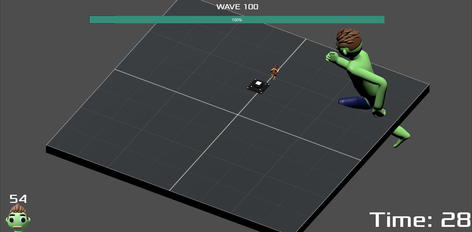
my guy is HUUUUGEEEEEE!

this was a fun and neat game to go through! really like this idea! you could probably take this and expand it in different ways! some examples would be adding different zombie units you can place down that can behave in different ways or having different level environments! very neat idea, even the core of what you have right now is pretty nice, where you have to strategically pick what upgrades you want to pick based on how the player is upgrading (my first run was all speed which only got me up to wave 5 xd). it gets to a point where the damage from big just one hit kills the enemy, but its still fun as it is right now! great work!

yes.

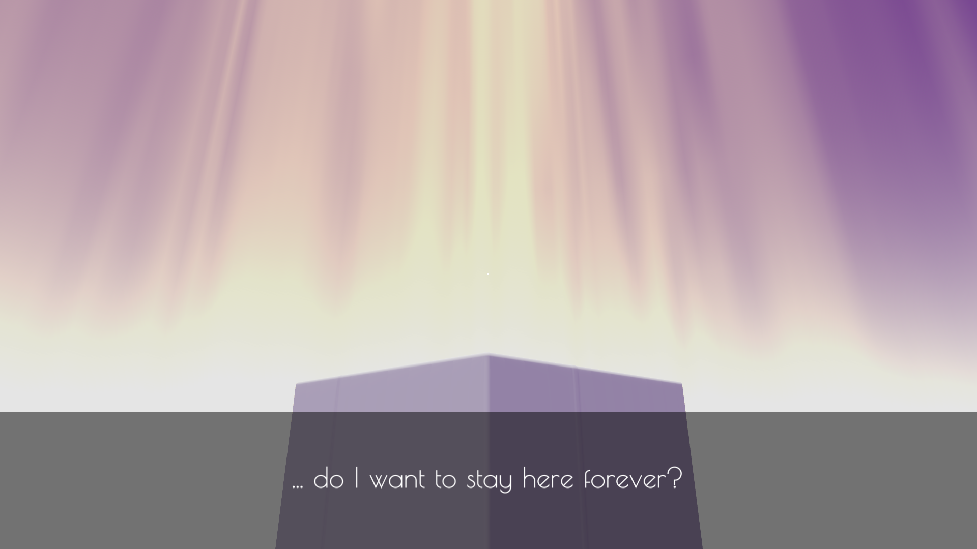
this game is absolutely beautiful! you've really captured the dream-like lucid atmosphere from the color choices to the shining rays of light beaming down towards the ground, almost painting it in the same white hues allowing the foreground to blend in with the background, it looks really cool! speaking of blending, the ray-marching mesh blending affect also looks astoundingly great, was mesmerized when i first saw it in action after you press play for the first time (went to go restart the game again just to see it once more xd)! its mesmerizing to watch the object melt into the surface as you travel further beyond your initial containment, feels like you're sinking deeper and deeper into the recesses of your "geometric" dream to reach your inner core (thus leading to more abstract inner monologue), with each new area levied with obstacles to keep you in a space "comfort" and away from what you might instinctively be looking. very dream-like indeed, really like it! the use of audio also does an incredible job at shaping the atmosphere to where it needs to be: idyllic and ephemeral. really loved vibing with music here while platforming!

i loved the gradual introduction of gameplay elements in the game! the dialogue hints helped a lot in guiding players on what they are capable of doing now while also aiding in adding to that dream-like introspective ambience you got going on! i like the mechanical relationship between the sphere and the cube, where the sphere helps the player climb and navigate through obstacles easier while the cube helps stop momentum in a sort of unconventional way due to its geometry. that duality helped add flavor to the platforming and made it a fun challenge to go through! i think i reached the end from what i saw in the comments (not sure if there was another objective based on the text that pops up)?

overall, really cool and visually stunning game! i had a lot of fun with this one! great work!

wow, this was so cute!!! really love the art in this game, all the sprites look so detailed with every frame contributing towards an amazingly expressive animation that the sprites are tied to! it was a delight to see what cool thing i'd see everytime i further progressed through the game! the sound effects also contributed to the playful tone of this game, really nice job here (really love the song, was a bop)!

the gameplay reminds me of those retro point and click adventures where you just drop right in and play around with the game's little mascots (in this case being the cats). it was fun discovering the rules of the game and realizing what i needed to do (my first ending was the red ending xd)! also liked the integration of aberration in the theme, i was surprised when i first encountered it!

overall, this was super cute! the jamming cats ending was definitely my favorite xd. great work!

damn i've been looking for this submission ever since i saw the wip videos in the jam-share text channel and it still looks incredible! i saw the disclaimer how unity broke the lighting in your build and yeah unfortunately i wasn't able to make it past the first bridge blockade (not sure how much of the game is progress-able with the current state of the game, not sure if im just dumb and don't know how to progress xd). but still, even within the small i covered, this game oozes with atmosphere and style. the visuals are unquestionably beautiful with a strong aesthetic style and incredible use of lighting in all of the visual effects. the light trails, the eye "memory" guides, and the darkness "vignette-like" warning all look astounding and seem impressive at technical level! the sound department adds to the atmosphere too with how the voices bounce around the void like an echo through a cave depending on how you look at the eye guide, its very cool!

i'd love to play the fixed lighting build, because the preview screenshots look wallpaper worthy and i desperately want to get to those parts! great work!

fun game with a really good atmosphere going on! i love the auditory experience in this game from the ambient music to the random machinery sounds going off in the background! the pac-man creaking feels especially threatening,  i feel a lot of thought went into the audio and you nailed it! love the slightly noisy low res dark visuals that are going on here too, adds to the vibes a lot! though i agree with the fact that it was kind of hard to navigate and it would have been helpful to have some form of map or landmarks to make your way, it took me a while to get to the door at the end xd. overall, pretty fun game with a nice atmosphere, reminds me a bit of Dark Deception! great work!

this was a fun game, really like the art! you really make use of the different patterns (like the varying spaced dotted patterns for the ground and the spikes) to add some nice visual interest to the 1-bit aesthetic, which works really well! the little main character also looks really nice with their movements feeling very fluid! the audio was also very communicative to what was happening in game, which adds to the presentation of the game!

the game was a short but sweet platforming experience! the signs do a nice job in guiding player expectations while you find yourself constantly throwing yourself into the spike pit, very fun stuff! accidentally stumbled upon an unused action (i think) when pressing spacebar, im curious towards what that was meant to be used for in the planned game design? still though, fun game! great work!

woah, the presentation in this is incredibly good! theres so much to say about what's going on visually that i don't think i'll be able to properly sing my praises! the composition of the game is just really nice, with the 3D style "Tap Titans" approach of slashing big enemies as a tiny little guy, so the background elements aids to help draw focus to the enemy (especially later on) with the shard background elements and the really cool color and ripple shader framing the scene to have players draw their eyes more towards the center-ish area where the enemy occupies. also the game has such nice UI, very persona 5 coded which i always love, it looks really good and matches with the style! the auditory experience also adds to the game overall, with a nice mix variation with the purchase sounds and really meaty attack sounds!

i love clicker games like these, and the progression was really satisfying! would love to see a game like this get expanded just to see more of this visual juice! great work!

it was self-defense i swear!

great game, had fun going through it! it was a little tough for me since unity webgl games have this weird thing where mouse inputs get read without me moving the mouse, so i slowly just rotate my character to the right (though this is just a thing that happens on my end so i don't think theres any concern there). love how the fog gets slightly bigger and bigger the further you go, adding to the anxiety of checking for any dogs that might spawn on you. i honestly got jump scared a few more times than i'd have liked xd.

overall, pretty fun with dogs that really cute (or "looked cute" i guess). great work!

nice idea, wished it was longer! i spent a lot of my time just baiting enemies so i could figure out what the text said, which could be a fun game in itself where you solve puzzles based on riddles that only get revealed by that custom shader you're using for the enemies! this was a nice first finished project, especially given the fact that you went ahead to play around with shaders! great work!

wow, both a great game and a great callout post xd! this really reminded me of Yume Nikki in the best way possible! you're kind of just thrown into the game and are left to your own devices to explore this abstract (at least on the surface) world that you've built. allows players to kind of just vibe and wonder the meaning of it all, with each room contributing to the overall message of the story and the "hallways" acting as a nice transition to slow down the pace and allow players to think about what they experienced in one room before reaching the other, great stuff! a lot of the dialogue and narrative bits felt pretty relatable for me personally, and this grapple between the main character's experience between the real and virtual world matches up with the aesthetics of the game really well, with the real world being visualized as slightly broken and uncannily off-putting!

i agree with most of the comment's feedback about how the game would be elevated with audio and how some parts could have been better communicated more, but i think despite that this was a really nice experience to go through, especially for a first completed game! great work!

hey thanks for playing, glad you enjoyed it! was my first time making this type of game and i don't play many of games of this genre, but glad that the "vital" moments were able to land well! also i didn't even think of people mistaking the faces for itch decorations lmao, looks like it worked out in my favor! for the faces, i was just mimicking how some games that get ported pc handle the 4:3 aspect ratio by adding letterbox decorations to the side, so i thought it was a good opportunity to also use that to add to the atmosphere of the game!

ahhh rip my bad, you seemed to have encountered two bugs D: , i know about the phone line sending back to the menu, was a logical error on my part, but encountering that means you entered the next part of the game. the other bug with the attached picture is something i did not know about and will probably look at later xd (sorry that happened).

i agree with the difficulty, did not have time to balance it out before the submission so the frustration is understandable. i made lives not be impactful for the first part of the game (can't get a game over during this section, framed the lives running out as a visual glitch in-game).

though despite everything, thanks for trying to get through the game and playing it out! also thanks for taking the time to write out feedback, means a lot!

wow, what a charmingly disturbing world you've built, with a nice aesthetic to boot xd, this is amazing! this a very fun exaggerated setting that acts as a nice commentary on the dehumanization that takes place in a majority of reality TV shows like these (like a personal disconnect between contestant and host/showrunner, which leads to shows being comfortable with putting contestants in uncomfortable situations, whether it be verbally or physically induced) and also comments on the gradual and growing desensitization of media and its tackled subject matter purely by means of it being advertised as consumed entertainment. although again, the setting is an exaggerated version of this, this game captures that desperate pursuit of sensationalism found in today's media pretty well imo, where extremities go from being the demand to the norm and the audience becomes desensitized and normalized to the insane fictional productions that they consume. its fun to think about the world outside of this show. is the world just normalized to murder like this show or is the show the result of this world's bar for what is acceptable to broadcast? what are the other shows that air alongside this one like, and what of the shows before it? what led to this point? its all cool to think about and its because of the cool immersion and attention to detail you brought to this game, well done!

the aesthetics are also just phenomenal! everything from the models, the textures, the colors used, and the crt screen filters and effects, they all work so well together and feel full of intent, it looks so good! the auditory experience in this game is also so well done and impactful, with sfx matching the actions behind it well and the bgm really fitting that 90s tv show vibe! the writing feels very grounded, but grounded to the world their in, making it easier to immerse myself in the game and understand clearly the personalities of each character! lastly the interactive parts of the game are really fun and matches the game show vibes! the minigames tie well into the narrative and are pretty simple and easy to understand! there was one bug that occured on restarting the game, but that was already addressed in a previous comment so i will just leave it at that xd.

overall, such a cool game! saw that you were planning to expand the game, which i'm very excited about! maybe adding more parts in the game where you learn more about the contestants and maybe form more of a personal connection with them between breaks would allow for better contrast with the callous and indifferent nature of the game show! great work, good luck with development!

hey thanks for playing! i was hoping to get that "old classic-looking game that you randomly come across" vibe, glad that came across well!

omg, this game is so difficult but so addicting! this feels like Spelunky in terms of interactive platforming (with the game objective kinda feeling like Spelunky 2's Cosmic Ocean level)! elements/entities within the procedural generated level just exist and they behave without knowing the existence of each other, (im talking about the bombs, spiked bombs, wind, meteors, collapsing ground, etc.). and when the stars align (to your dismay), it causes this crazy chain reaction which can lead to either some of the most miraculous moments where the game opens a path to a wing or the exit or some of the most tragic moments, like if wind comes in at the most unfortunate time, leading you into a spiked bomb that blows up the blows up the ground and you fall straight into spikes... yeah... totally not speaking from experience...

the movement also feels like Spelunky, very fast tight controls with crazy air mobility but has a relatively weak jump in comparison to their horizontal movement, it feels nice (though the horizontal velocity change took quite a while to get used to)! the game entities also feel very impactful with the wing obviously being good, the spikes obviously being bad, and the bomb / spiked bomb being double edge swords depending on the situation. and then to tie the design together is the aberrations, which are essentially the level modifiers! theres a good variety of aberrations, with each one interacting with the game so well! they provide a really nice sense of challenge and changes how you view the level! i got used to most of them, but the slideshow aberration was the bane of me throughout my time playing xd. when you tie all these gameplay elements together and put them into a randomly generated level, the level then becomes this giant interactive puzzle for the player to carefully navigate and solve, it almost becomes like an immersive sim in a sense, super well done here!

the presentation also matches up with the gameplay so well! this game's geometric aesthetic is absolutely beautiful, showing how much one can do with basic primitives if there is really nice art direction! everything feels so alive, with the ground, particles, and background elements moving and reacting towards the beat of the song, its so good! and that chromatic aberration effect though, it looks so astoundingly good such a great visual effect! the music is also really good and hypes you up while playing again, also really adds to the presentation by providing the beat for the game elements to react to!

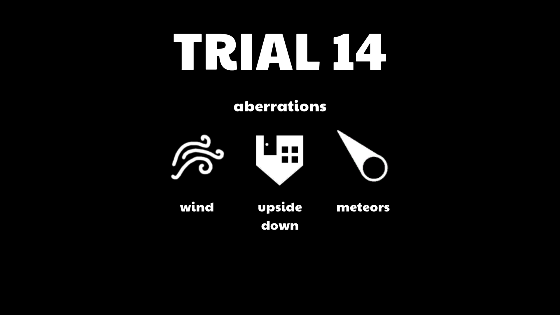
i am floored, this was so fun! as a platformer guy, really hit all the points for me, this is definitely up there for one my favorite submissions so far! highest trial i got was 14, was so close to going further but died near the portal after mistiming a jump which caused the wind to push me towards spikes xd. really great game, great work!

i can't believe you've captured the anxiety of test taking so well, incredible job! this was certainly unique, i loved the concept of warping one's own foundational knowledge of a subject and then going "btw answer the questions under a certain time limit", its very fun! this really captures the franticness of an open book test, at least me, where you'd constantly go back forth between your notes and the quiz, scrambling for the notes that are related to the question you're on and reviewing each section again and again after going through the quiz one question at a time (even if for the simplest questions, you feel the need to double check your notes). even the ticking clocks that you have click on the pages is so relatable, i feel like if i just stare and focus looking at the same question or the same writing area/field for a certain period time, time just feels like it goes faster for some reason (like im blanking out and losing my sense of time), so i would constantly go back and forth through my papers to review questions and that would help me regain my sense of time for some reason xd. this game just resonates with me in a weird way, and even with all i said above, i still don't think i was able to describe how well this captures that test-taking feeling for me! great work, this was fantastic!

wow, what a really cool idea, this is so creative for a first complete project! i love the mix of powers that you get from the ads and how they play into each ala Vampire Survivors style! i also love the interpretations of how the powers work based on each of the ads, its very fun and creative! i do like the decision of making the main attack have a long charge time before shooting the projectile which makes positioning matter and makes the player rely heavily on the ad powers, but that causes the beginning to be a bit slow to get through. maybe having the beginning level just kill one enemy to introduce the basic attack and then hitting the player with an ad would help speed things along in terms of pacing. other than that, the game slowly becomes a cat and mouse chase except if the mouse had like 10 drones aimed at the cats, which is pretty fun honestly xd, nice work on the gameplay!

the presentation looks really nice too! love the pixel art, looks pretty good together! the ads are also drawn with so much charm and are so creative, always loved to see what i got each floor (which is like the opposite reaction of what you'd expect from getting an ad, so you got me there)! audio is pretty nice too, though i wish the BGM came on a bit frequently, since there would be long periods of silence after the track ends.

really fun game, i could see this getting expanded and having fun with creating fictional ads, especially if you were to capture the energy of the modern weird mobile ads that we see nowadays xd! great work!

wow, this was really nice for a first game! i like the idea of switching inputs, really fun idea for a quick/short game! i agree with the comment below that there were multiple times that the input was bound to the same button, which made me either restart or wait til the controls switched again. there were quite a lot of fun level designs for the game, like playing around with constant control switching and playing upside down! in a game where the controls switch and are not how the controls usually are in platformers, i think it would have been nice to add some coyote jumping and input buffering to the game (or at least make the time/duration for it higher if it is in the game) to account for the unusual controls!

the art is also really nice, the sprites look pretty nice together! love how you went for a cinematic opening, thats pretty impressive to include for your first game! the furniture/objects looks nice, though there are  times when i couldn't tell if the furniture/objects was something i can land on or not. it was kind of inconsistent which lead to bad falls, so it would be nice if there was a way to indicate if it was in the background or not!

overall, pretty fun game and very good for a first game! great work!

wow, this was so cute and charming (at least as much as a cosmic horror can be xd)! really love the character art, the designs look really stylish and nice along with the fact that their idle expression changes adds that nice bit of flare to what could have been just a static visual novel, well done! love the set pieces and background art too, a lot of them have nice varying perspectives with very cool framing, looks pretty nice! also love the monster designs, both cute and threatening at the same time (also love the among us bone corpse in the library xd).

the story has a good bit of intrigue too, very cool mystery! you have the general intro that lays out both the tone of the story and the personality of cosmo pretty nicely. then as you enter the realm, you learn alongside cosmo the nature of this world their in while building your frame of reference towards what is regular in their own world (like theres magic and visions, etc.). theres a double layer of world-building to create a general understanding of the story which i like! there were a lot of instances where you either introduced a lot of terms/characters or laid a lot question-leading tidbits regarding aspects of the characters or the world (like what happened with cosmo in the past, what is his relationship with his brother exactly, etc.) that will probably get explained later to allow them to act as narrative hooks to intrigue the reader later on with a payoff, but for an introductory chapter i think it would have been nice if some of those questions got answer by the end of this chapter, especially on cosmo's end. we get to know the personality of cosmo in this chapter, but we spend most of the time reading what he does rather than why he does it if that makes sense? having a slight look into his motivations and his insight for the action he takes (or you choose), even if they are just vague hints towards his guilt for his past (at least from what i can tell), i think it would allow for more investment in the character rather than cosmo functioning as just a vehicle to drive the mystery.

overall, this was a fun read to go through, love the world that you've created so far! also love the campy banter that cosmo and ji-hu go through during their time together, it was very fun to read! saw that you were starting the second chapter, i'm curious to see where it goes! great work!

wow, for your first ever game, this looks really good! love the intro sequence and everything, your sense of presentation and delivery is really good! the pixel art and text gives it a nice sense of style while mimicking the look of these old computer start-up screens from back then! the audio sells it too, with each sound effect being nice to listen to! the lo-fi song was also a nice little addition to put in the background while im just clicking away xd.

i'll echo the same sentiments from the comments and say that i wish there was more upgrades to buy, even if it was just infinitely incrementing xd. though this is something that could easily be added if you wanted to, so its not a big deal!

again, really impressive that this was the first game you made, looks really nice! i can't really say the same for my first game xd. hope you had fun with the development process! great work!

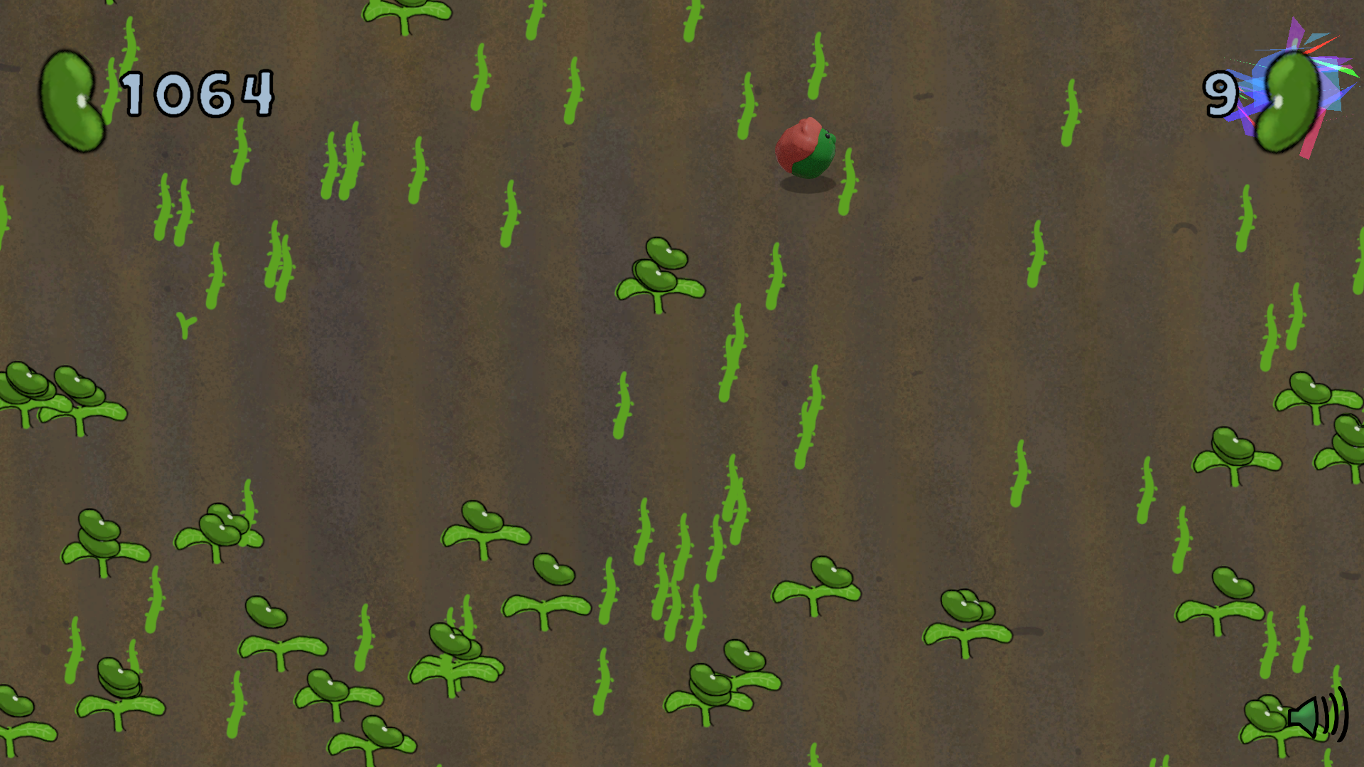
wow, this was so pleasant to go through, what a nice and calming experience! seeing the field just get filled further and further with beans as you go through game is just a very satisfying thing to look at it! the art is just super lovely, love the clay look of our little bean friend, looks like a very friendly fellow to hang around! the rolling, jumping, and even the squash and stretch idle animation on this guy are also so charming and cute! love the look on the plants too, really nice sense of growth with the frames drawn for the bean plant growing! also love that rainbow shard shader for the aberrant beans, very catching making the player want to go there, very nice!

even though this game was supposed to be more of a soothing and ambient experience, i love how the combo system just gamifies it! i love how more seeds are planted in random places depending on how big the combo count was after it ended, the placement of the beans makes it feel like a new generated level to get a new higher combo score on, which just gets bigger and bigger as you progress through the game, resulting in a nice surprising game loop! i know this isn't the intention , but here's a few nitpicks that are totally unrelated to the goals of this game xd. for one, i wish that the beans collisions weren't the one handling whether the plant would disappear or not, there were a couple of times where i would jump on the plant (which would add to the combo counter) , but it wouldn't collect the bean, so technically i could have stayed in that position and farmed for combo for a virtually infinite amount of times as long as i don't collect the bean. i see that the beans have some form of event to its parented plant to inform them when to be deleted, one solution would be to have it the other way around where jumping on the would auto-collect all the beans on it and then get rid of itself, removing the exploit. another small nitpick is that i wish that you can only jump on a plant once for it to count it towards the combo count. technically you can just continuously jump on a baby plant and get like 10 free combo score until its fully grown, maybe you can have logic to mark the immature plants that have already been jumped on (with maybe having a different color or highlight to indicate that its been jumped) and make it a failed combo if you jumped on the same one. again, super small nitpicks that aren't really related to the goals of the game, but just some thoughts that i had xd!

this was such a nice and pleasant to go through. am satisfied with the 1000 beans i collected during my time with the game! great work!


yooo thanks for playing! i totally get you on the over-saturation of these types of game setups. but when i first saw theme the thought "what if i made my own creepypasta" entered my head xd. i grew up on that era and circle of internet stories where it was just "X game, but haunted?!?" and i haven't made a horror game yet so i thought i wanted to pay homage to that era of the internet xd.

i also totally agree with the pacing improvement through easing the player in with 1-2 levels, would have made for a nicer build up for the game and allowed them to get comfortable with the mechanics! also agree with the music, messed up my priorities and ended up running out of time to include music unfortunately. one of the jam participants, ncharlie, was kind of enough to make music for the game unprompted after pointing out the same thing, which is absolutely insane! i'll definitely be uploading a quick post-jam version with the music they made + a couple of bug fixes sometime after the rating period! also you should check out their game if you have time because its pretty sick too: https://itch.io/jam/acerola-jam-0/rate/2582880

again thanks for playing and posting some nice feedback, means a lot!

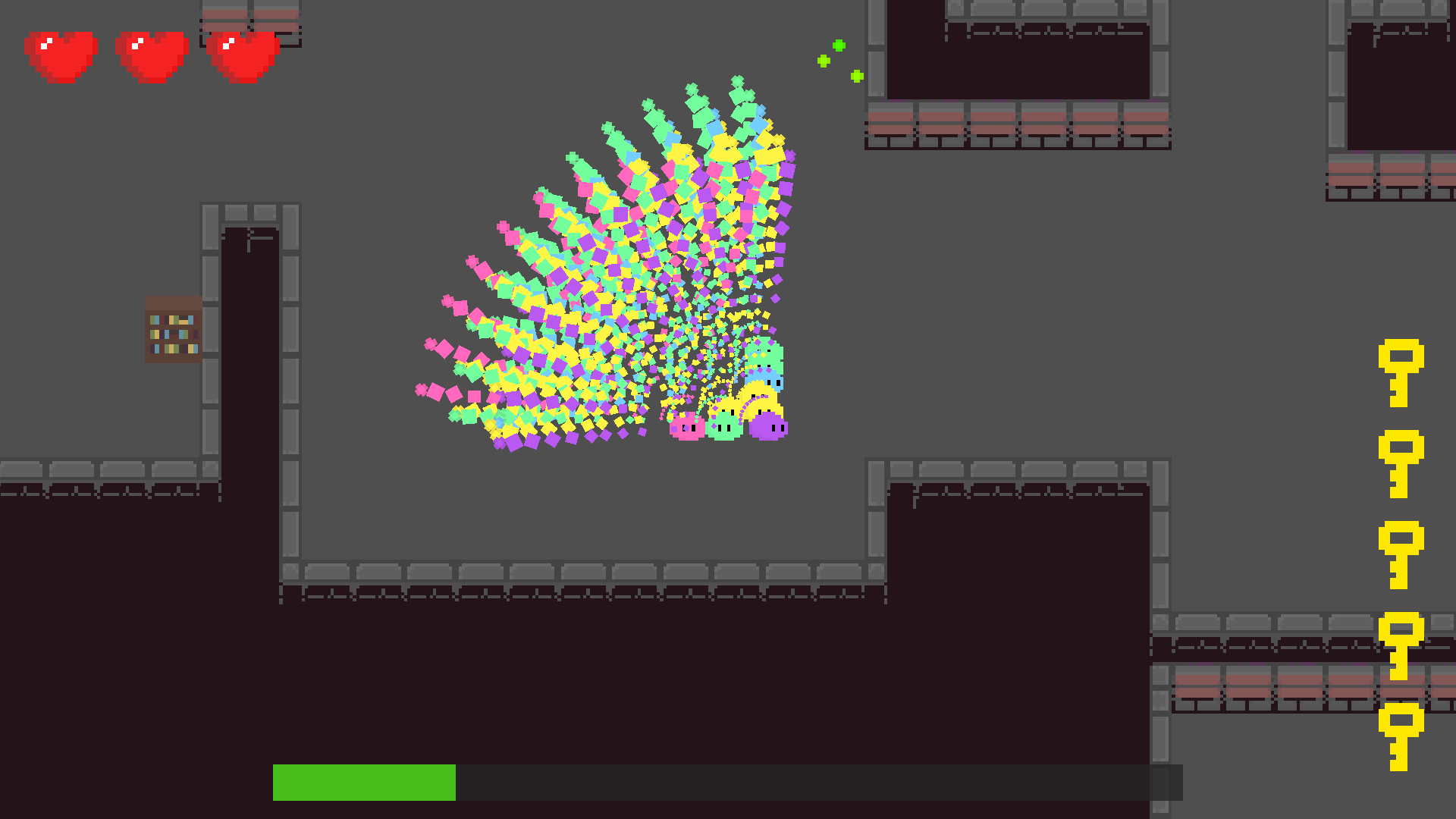
omg, i love how strong you get in this game xd. thought i would have to fight for my life in the beginning, but the multi-attack and split upgrades make such a huge difference in terms of defending yourself! really gave a nice power fantasy at the end where i was just obliterating everyone xd. i think i had like 9-10 slimes at the end, also very neat how you can control a bit how they are positioned by pushing some of them into walls in order to increase the attack coverage, creating a nice bit of strategy in the game!


the upgrades in general just feel nice and impactful, though there were some i heavily favored over others xd. the controls felt nice, though i wish that the dashing direction wasn't towards where your mouse was pointing but rather the last input direction you had before clicking the button. the dashing is supposed to function as a dodge, but since most of the time you are aiming directly at an enemy, it sometimes led me into dashing into the enemy, which feels counter-intuitive at times and felt like i was fighting with myself. also the stage in general feels pretty big, found myself getting  lost sometimes, though eventually found the exit. maybe having some form of way to tell where you've been and the way back to the portal could help (maybe a mechanic where you could leave a slime in area to idle to function as a breadcrumb to help lead you the back would be nice)! other than that, like the game loop of killing the 5 bosses for the keys, very fun to maneuver around them!

the art is also pretty nice, love how these little slimes look, so cute! the effects with the slime projectiles also look very satisfying to look at! the enemy designs also look really cool and love the way they tilt to animate to simulate walking and getting hurt, its very fun and playful! also like the BGM and sfx, makes the game feel that more impactful!

overall, fun game! kind of curious how score is calculated at the end (i assume that the number is the green orbs you collect along the way, though not sure if it functions as exp either). still, was a fun game to go through! great work!

wow, i have no idea how you managed to come up with and design a game with item synergies given the game jam duration, but this was great! love this take on the item-management based genre, backpack hero management gameplay contextualized with a more real time action top down experience is pretty fun! besides some balancing adjustments (3 sweatbands for the win xd), i feel that they all work really nicely with each other and provide good scaling for future waves! there were also a nice variety of enemies that synergized well with each other, making the combat feel tense and engaging! though i think the ai is a bit abusable since you can just take advantage of corners, since the bullets are big enough to usually collide with the corner if they stop at the right place (also your bullets being smaller than the enemies makes it easier for you to abuse this since it'll less likely for your bullets to collide with the corner). the random room generation is also very nice, but sometimes you can get really unlucky with the enemy spawning and run into scenarios where you can't really avoid getting hit. these are small nitpicks though and easily adjustable, the game is still really fun!


the abberated items locking their position creates a neat element of strategy in terms of how you want to try forming your inventory to future-proof yourself and not place yourself in potential bad positions later on down the line, which i think works pretty nicely in a game jam setting like this where people will only on average be playing for a few games, but at a broader scale i can see players constantly resetting and getting frustrated if the aberration rng doesn't go their way (especially since shop items are highly randomized). this next part is just me playing armchair game designer so you can skip it if you'd like (your game idea already works xd). to avoid this problem, i think instead of aberrations locking an item's position (which is a huge negative to the player) you can instead make items either weaker or have an inverse effect when aberrated (and can be sold for less than the original sell price). i think this allows for an interesting dynamic where player's are encouraged to frequently change their builds, constantly move around their items, and plan for future build pivots if they don't want to be affected by nerfed items (and it also allows players to experiment with the different items in the game more, thus engaging more with the game). though through slight nerfs, players can still opt to continue with their build that contains weaker items if the synergies are strong enough, allowing for players to make these kind of tough decisions during play. though again, the aberrations locking their positions is also a fun mechanic to engage with, this was just me doing a thought experiment xd!

the presentation also is really nice, again nice level generation with cool different themes to switch up the visuals! the spiral effect on the backgrounds of the shop and main menu look also really nice, adds some visual interest in the background through the spiral motion while not being too distracting! also love the attention to detail with the shop items where they tilt when you hover over them, feels very nice! every sprite asset just looks nice in general and feels consistent with the art-style that the game is aiming for! the BGM is also really nice to listen to, adds to the vibe of the game really nicely, well done!

overall, really fun game! whats here is already super addicting, and i could see this getting expanded even further to something really cool! great work!


wow, i am in love with the aesthetics here! the pixelated 3D look just rules and theres just a lot of fun stuff going on visually here like the pixelated skybox, pixelated dust clouds, and the pixelated texture cars! but out of everything, that really cool dimension shader is such a visual treat, the way the camera pulls back a little on approach (with i assume a slightly higher FOV) to then ease the camera settings back to normal after entering the portal looks so good! the accompanying audio also does wonders to the game, every drift feels so satisfying due to the sfx alone, good stuff!

also the concept of having an roguelike racing game sounds really fun to explore the design of! you can go in so many directions with the upgrade system, from the straightforward stat system you have going on to maybe even some wackier gimmicks that completely change the gameplay (car shrinks to half their size, wheels are bouncy, car is invisible, etc.)! i don't play a lot of racing games, but the controls felt really sensitive for me at least, i think it would feel nicer if toned down a bit! also ran into some unfortunate bugs where the track would generate a loop into itself, making it impossible to progress, but regardless had my fun just driving around!

this was a really fun game, had a lot of fun trying to get used to the drifting! the idea is really easy to understand and pick up, i could see this being built for and played anywhere (pc, console, mobile, you name it)! great work!

glad you liked the horror aspec- wait i mean what? its just an arcade game though?

jk, thanks for playing xd!

heeey thanks for playing! thought quite a bit about how i wanted to tackle the theme, so glad people are getting it! also glad you appreciated some of the details in the game too! spent quite a while looking at reference games to emulate from and tried to put my own spin on it, like how enemies in Mappy are reactive to their environment (ie. they sometimes hide behind the collectable furniture/items) and the letterbox graphics that come from ports of old arcade games, it was  a really fun part of the development process!

thanks for playing, glad you liked it! yeah Mappy (along with Burger Time) was my main reference for building the game! also thanks for the art compliment, took a really long time for me to do but i liked what i came up with!