On Sale: GamesAssetsToolsTabletopComics
Indie game storeFree gamesFun gamesHorror games
Game developmentAssetsComics
SalesBundles
Jobs
TagsGame Engines
A jam submission

SlideMazeView game page

Labyrinth-inspired broughlike
Submitted by SquareDev (@squareanon) — 2 days, 22 hours before the deadline
Add to collection

Play game

SlideMaze's itch.io page

Leave a comment

Log in with itch.io to leave a comment.

Comments

(2 edits)

Pretty neat for something made in a week. I could see a full game being made from this concept.

Enemies don't give chase and killing them nets no reward, not even the peace of mind of not having them respawn, so I felt no reason to fight them without the bow. 

It feels like the game rewards stalling a bit too much. Most of the time, the limited uses for sliding just force you to hit your head against a wall for a while to recharge with little consequence. The sliding mechanic itself is downplayed a bit by limiting the rows/columns you can use it on. You can often get stuck for a tad too long when you're surrounded by walls on non-slidable tiles as well.

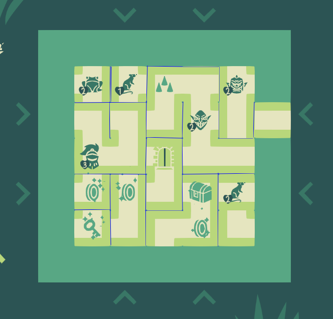
There is some jank with sprites often not reading as what their mechanics are, and they often overlap in confusing ways, but the artstyle itself is polished. It is often not clear whether doors are locked. Tiles could use some visible seams too.

Weapons overwriting each other sucks. It reduces what you can get out of the already limited gamut of non-stackable upgrades.

The game is a bit short. If these stages are procedurally generated, the parameters could keep rising for a good while longer without breaking anything.

Submitted

I enjoyed the game quite a bit.

The first tile you're placed on should allow you to immediately move, otherwise the game is confusing from the start.

I had trouble seeing the 'walls' and I think you could benefit from an art style that maybe shows the walls 'deepening' into an abyss, or some kind of 'raised' asset to help really show what is a wall and what is not a wall.

For some reason I figured reaching the edge of the maze would let me reach the other side if there was an 'opening' on the edge wall. It didn't work in that way, so that fell non-intuitive.

Submitted

suggestion:

make the sides of walls clearer. Sometimes i can't tell at a glance what cell a wall belongs too

A horizontal pathway with walls to the left and right looks very similar to a vertical pathway with walls above and below


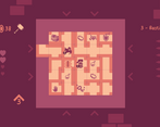
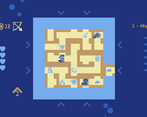
maybe its just a resolution thing, but even in fullscreen I can't see the gridlines that are in the screenshots

Great game for a 7 day dev effort. The color palette is nice. I wish the player had a more distinct look but other than that it played well. The only bug I had was hitting zero health and still being able to fight.

I liked it but maybe a tutorial would be good for brainlets like myself. I wasn't really sure what to do haha. But I did manage to clear 3 levels on my first try somehow.

Submitted

It's extremely polished, but I wish there was more explaining how the world worked with moving tiles. I got confused when things weren't moving the way I wanted to in a single direction when I was slamming against the pieces. Or what the end goal was to kill all the enemies and/or get the treasure. I kept progressing on death anyways, so I'm still not sure how I was able to do that. I tried to close the game to go back to the main menu and the game brought up a blue screen and it didn't change after that. All this can be fixed with a good tutorial level or two to showcase the mechanics more in depth. I hope you do more with this.

Submitted

i don't really see any flaws.

it's not my cup of tea, but a game like this would likely do well on mobile imho

Submitted

It's impressive you made this in just one week. I always loved Labyrinth and I still play it with my family.

I believe softlocks would happen less often if you just forced corner paths to not face outwards and have then not have keys and gates. I miss the ability to rotate tiles before you insert them into the dungeon. Tile clarity would improve if there was space or edges between them like in your main gif.

I found the game far too easy, but not every game needs to be hard. A larger labyrinth like in the original game would be better.

I think wall destroying is not needed. I think it would make for more interesting puzzles if monsters were not moving and players would need to play around building alternative paths or pay with their hearts to go through enemies.

I thought this was really good, I enjoyed playing it till the end! Destroying walls seems way overpowered though, it removed the puzzle aspect once I got it

Submitted

A really unique puzzle game.

Should try it again.