Game does what you promised in its about page. I enjoyed the atmosphere and environment alot. As far as the game feel and shooting mechanics it could use some work. The gun sounds weren't very satisfying and the shooting felt kind of bland. Maybe showing recoil or bullet tracers could help juice up the combat. Excited to start seeing some of the mythology play out in the future updates.
Play game
Shanghai Gold's itch.io pageComments
Thanks for the stream and the review! Gives me a great motivation to make it better for next DD and hopefully rise up the ranks. The gun feel and sound effects are definitely a weak point. Having to put in the hours of finding sounds or slightly tweaking values over and over again until it "feels right" is something I like putting off. I'm much more keen to jump into something with objective progress measurements, like putting in a save game system, where it either works or it doesn't. But it's definitely a good time to overhaul a lot of that stuff. You'll start to see hints of mythological influences, starting with powerups in tbe next level (should be ready next DD) and slowly introducing mythical enemies throughout the later levels.
A well executed boomer shooter. Does what it says on the tin.
Well done obviating your crouch mechanic by placing the key in the duct, I hadn't realized crouching was an option until that point.
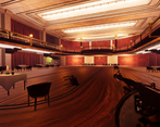
I also enjoyed inspecting the paintings, statues, and miscellaneous textures, they were a nice touch. I recommend an art gallery/museum level.
I also admire your ambitious statements regarding your goal to create life changing experiences. It is virtuous to embark with lofty goals in mind. I'm looking forward to seeing how it comes along.
It has! I have been contemplating a 3D game experiment, and find your crisp mechanics motivating. I will aspire to this standard in my own works.
I often contemplate how games impact the player, particularly on the aesthetic dimension. I am especially fond of Aristotle's conception of virtues existing between complementary vices of excess and deficiency. For example: Courage found between Cowardice and Brashness.
My "Main Project", Ingvanr Saga, has been an experiment in building a game that can deliver these philosophical notions to the player. I mostly achieve this through the visual novel style mission briefings (inspired by Fire Emblem) which I included, but I also think the gameplay mechanics enforce some contemplation upon the virtues of a competent Captain of Men, through the high risk combat puzzles, rewards based upon how many of your soldiers survive the level, and gear durability mechanics. Ratfall contains a similar attempt at expressing virtues through the gotcha system, but the narrative elements there are still underdeveloped.
I am curious to hear what virtues you might consider worthy of elevating in your game? How might you subtly enhance the (already excellent) core mechanics to elucidate these virtues for your players? I sense that you may be the sort of person who contemplates these types of questions.
Be well,
- Eldritch
I'm really not the kind of guy who thinks about this stuff. In reality I'm just hoping to give the player what they want: action and spectacle. And hopefully to take home a paycheck at the end of the day. I find that games often aren't willing to just admit that gamers aren't looking for anything more complex than just fun. When id software was developing doom in the 90's, they were thinking about big guns and their favorite heavy metal albums and how cool it would be to combine those. I'll check out Ingvanr Saga some time. Be well, - ShanghaiDev
Welp, I'm not a huge boomshooter but I tried it out.
Froze while opening the first time I tried. Probably an issue on my end, but keep an eye out.
Sensitivity is pretty low by default.
That's a pretty low and floaty jump for a boomer shooter.
Who's that guy's picture in the bathroom stall?
Going back to the game after tabbing out makes the mouse vanish even if the menu is open.
Call me a bloody heretic, but I think the gangsters should be hitscan.
Slow projectiles are not a good fit for the setting. This is John Woo stuff.
Find a different way for the player to avoid damage. Like leaning, severe hitstun
You've got a crouch mechanic; Blood reduced hitscan accuracy against crouching players.
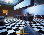
It seems like the enemies can't shoot over the bar counter if you're not jumping?
Is there no sound falloff over distance?
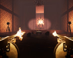
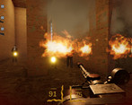
Flamethrower projectiles need to move faster.
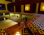
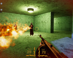
The HUD needs more contrast to it's easier to read. Also why is the ammo on the left when the gun is on the right?
Overall, I'm not a huge boomer shooter, but it seems decidedly "fine" at the moment. I'm not sure what's supposed to make it stand out, but I hope you have an idea and it's just not where you want it yet.
The guy in the bathroom stall is Joeyy. Just a silly easter egg. Going to have to disagree with you about hitscan enemies haha. The reason why crouch doesn't lower accuracy is because I don't want to encourage players crawling around everywhere and just have a romp instead. What I could do though is add a crouch slide that temporarily lowers enemy accuracy.
Thanks for those other bug reports and recommendations. I'll get around to polishing it up more.
Why does ammo need to be on the right and health left?
I think most games have the issue of trying to stand out. I feel that the setting is really unique and that there really aren't other games in this setting. I can mesh the 1930's shanghai elements with 80's action movie elements to some crazier designs. E.g. there will be some powerups that'll give you ancient warrior powers. Each level is going to be in a different location and each level should be interesting to explore (this current ones pretty basic indoor stuff). The game will have a plot too which will match each level with the story. Of course I also want the gunplay and movement to be on par with other boomer shooters. There seems to be a strong demand for this genre, where fans just want more and games. I'm not really trying to change the genre but just have solid traditional mechanics tied with a more unique setting.
Ammo goes on the right because that's where the gun is, duh.
Seriously though, it's mostly just convention but why mess with it? Like I can see why you'd wanna put ammo and health together in the center so it's easier to see both at a glance, but putting the ammo on the left when most FPS'es have it on the right doesn't add anything to the game other than the potential for confusion.
Great choice of setting, I’m a big fan of the original Shadow Warrior and Big Trouble in Little China so this is right up my alley. While it wouldn’t match the Roof Korean on the cover so well, you really need a Mauser C96 in here. Maybe have an enemy type that uses it. It’s just not interwar China without it.
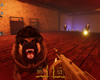
I thought the enemy balancing was pretty good. As long as you circle strafe the enemies aren’t too spongy and I never had a dog get close enough to hit me. Definitely nerf your move speed when crouching though, that’s quite silly.
I love your texturing, I stopped to look at the couches every time I went past. It looks really good, keep it up. Need to have a level in a filthy fish market or something. And maybe a dancing axe-user as an enemy type, there’s so much material you can go with.
I'll have a look at the Mauser! I know almost nothing about guns but I'm keen to add more period appropriate ones. I'm glad you like the texturing. I originally wanted to go for a hand-painted high quality look, but pixelized textures are just too easy to do and look good with not much effort. I've got heaps of ideas for different level locations and enemies. I hope you'll follow progress to see them!
I recorded this and uploaded it here: https://mega.nz/file/xb9EmQzI#qKrLV-IC4ip6Q9se2K3ji2H_fipsLIzQNnDZxzi-YMM .
Nice game, I liked it, only real complaint was that the crosshair was difficult to see against some of the backgrounds.
Do you seek to sell this game? I have no idea how well it may or may not sell. Have you done market research, seen how well similar games sell? Though your game is just a short demo at the moment and at an early stage of development.
Thanks man, I love seeing recordings of gameplay. It really helps show what players are enjoying or getting stuck on. Yeah, I'm planning to sell the game. I'm hoping it will have a decent chance of making some cash since there are many successful modern boomer shooters. There's a hardcore following for them that doesn't seem to show a sign of stopping. I'm aiming for around 8 or so levels for around 4 to 5 hours of gameplay. I have two more bigger levels close to being playable. The workload is quite hard, with a full time job. I'm a full time game programmer by trade, so the programming is easy for me, but I find art and level design very hard, since I've never done those before. My initial plan was to find someone to collab with for the art, but I reckon I can get the game done by myself and I'll be able to do it in my own vision.
Solid game; you've nailed the aesthetic. I got to draw the curtains and then died when I jumped back down.
The crosshairs are hard to see. The text for ammo/health is too tiny to read and they look interchangeable
Enemies will just sit and get shot as if they had cover if there is a short obstacle between them and you.
Circle strafing is the answer to every enemy encounter, but that's fine for a first level.
Overall the only problems with this are the ugly UI and title screen.
On the good side, environment is good, everything aside of jumping feels good.
On the bad side, it feels like enemies have inconsistent HP, sometimes dog dies within a second, sometimes it evades for good 5 seconds, might be spread of the gun, but still feels off. Headshots don't seem to be a thing, that is a must have.
Music is good, not sure if it's yours but it matches both game and style you seem to be going for.
Cheers for the review. I'll play with the gun spread a bit. I thought about adding headshots but decided against it since I don't know any boomer shooters that have them and I want to encourage more fast paced gameplay and encourage spray n pray rather than trying to snipe enemies. But I'll keep it in consideration.
whodev game? never saw it in the thread
enemies are bullet sponges and doggos are too hard. sfx needs work. also particle effects from bullets could use some improvement
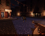
appreciate the rooftop korean and the underused (KINO) setting though



Leave a comment
Log in with itch.io to leave a comment.