Indie game storeFree gamesFun gamesHorror games
Game developmentAssetsComics
SalesBundles
Jobs
TagsGame Engines

Vita Brevis

58
Posts
32
Followers
10
Following
A member registered Feb 09, 2022 · View creator page →

Creator of

Recent community posts

fun


i really enjoyed the music. sprites could use a little work but the atmosphere is nice given the art limitations.
this seems pretty done, i would be very curious to see more AGDG50 minigames like this from you. or maybe something bigger in scope? what will you work on next?
(1 edit)

was looking forward to playing this after seeing it in the thread. thanks for posting it.

using k&m.

game atmosphere is very nicely autumnal and immersive. i love the rain sounds and the tree/wind movements.

spent a bit of time with the character controller.

  • camera follow is... interesting. at least in the intro area, sometimes it's possible to make the player go out of the camera's view, which feels rough.
  • top down view feels nice. definitely needs some kind of occlusion culling when there's an object between the camera and the player - rocks, trees.
  • not reading any controls, trying to just play naively. mouse to rotate player. feels pretty smooth. mouse to light attack, Rmouse to... block? heavy attack? maybe i'll find out.
  • repeated clicking, or clicking and holding, did not trigger an animation attack chain: the same leftward swipe attack plays over and over. if you're going for soulslike, you need some kind of attack chain combo. (unless i missed how to trigger it, please forgive me if i did)
  • when reading a signpost while moving, player continues walk animation while frozen in place.
  • needs weapon trail vfx on attack.
  • there should be colliders on the traffic stakes.

on to combat.

enemy model looks nice. i like the watercolor-like textures a lot. combat feels smooth and good to play. i like that it presents a minimalist notion of a soulslike controller and doesn't add too many bells and whistles. you have parry, dodge, light and heavy attacks, heal with animation delay, and it all feels good in that it's slow and enforces a defensive playstyle. that seems to gel well with the 70s horror movie setting (which is great by the way). i particularly like the heal animation and sound.

it felt good to play so i tried to get good. managed to no-hit all the way up to the boss.

could not beat the boss without "dying." i couldn't tell if the delay on his attacks was randomized, making him very lethal (and a bit unfair feeling) in a margit-like way. (perhaps you could add subtle sound cues to telegraph the timing of his attacks?) despite the difficulty of learning his timing, i did get pretty good at parrying him to deliver the satisfying heavy attack coup de grace.

sometimes the text on the notes exceeds its background.

tldr; overall i would say two simple but big fixes would be transparency/dither/occlusion culling for player blocking objects, and varying the animations more for both the player and the enemy. 

in addition to all the basic stuff which i'm sure you're dying to get to, like save/load, inventory, character customization(don't know if you'll add this or not, but i find it always nice in a soulslike)

anyways very cool demo and i'm glad i played, will look forward to seeing more as this develops. combat feels good, hoping to see more of the narrative and puzzles soon.

thank you so much!! this means a lot to me and is great encouragement to keep going!!

Scylvendi are a planned unlockable class ;) need to get my horse riding mechanics in place, of course.

thanks again. glad you found my demo, and i hope you'll get a chance play the improved future versions.

Truth Shines!

(1 edit)

thank you so much friend. perhaps i'll come back to the roman game after i'm done with the great ordeal (no promises, since that one did really burn me out). a lot of the content from the roman game has been carried over into the great ordeal, which shares its iron age setting, though including cultural influences beyond rome (like fantasy-gaul, babylon, scythia, germania, etc).

in any case, thank you for your interest and support. i very much hope to deliver a game you'll enjoy.

took less than 20 minutes of grinding in the level 1 dungeon to find it, dropped by a goblin champion. just lucky i guess ;)

(oh by the way, the champion enemies of any given class tend to always have the same name.)

the new area is cool, but it felt a bit repetitive quickly after opening many small room doors with a single skeleton. obviously an under construction area, but it would be cool to switch it up with different shapes and kinds of rooms. 

anyways great work as always, good luck and godspeed you.

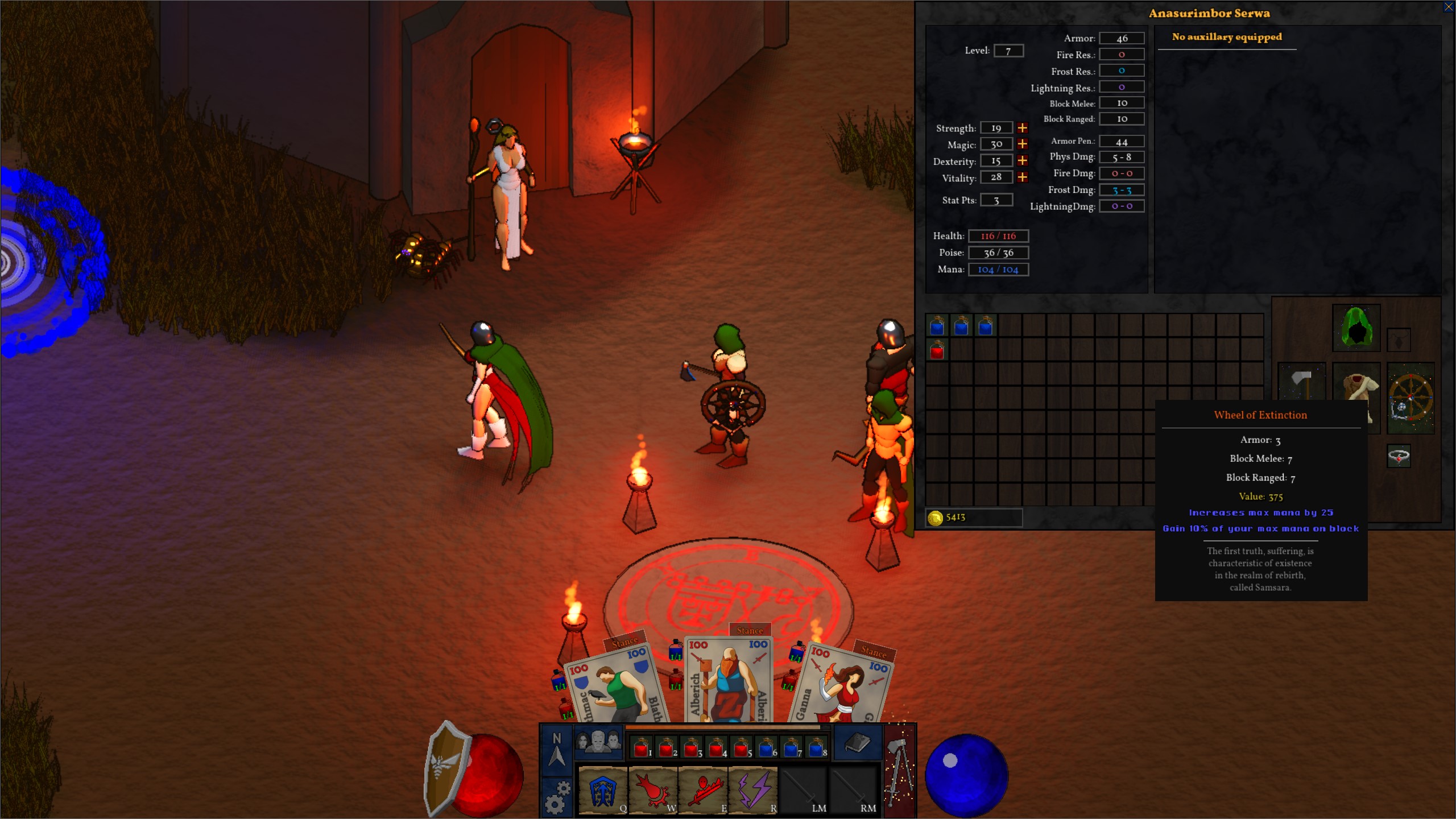
update: i got the samsara shield!


my life is now complete.

(1 edit)

stream here

https://www.twitch.tv/videos/2148907194

game is really fun. maybe a bit too easy right now. some rooms could use more enemies. drop rate is a bit low. some wonkiness with menus and UI i'm sure you're aware of. CRPG aspects are cool and fun. needs more dialogue interactivity. cloth physics stretch out too much. loot chance modifier would be great. dungeon layouts are nice and expansive, but the angled walls can feel procgen-y and hard to navigate. if there was a way to make them diagonally cut across the grid rather than conform to it, that could feel better.  enjoyed the grinding, very much looking forward to more. 

ps. re: witch, boobs don't look like that.

  • The cutscenes are absolute kino, man. Just amazing.

thank you so much, also thanks for streaming

  • The game is a bit sluggish, maybe because of my weak PC, or maybe it's not very optimized. But it's a lot of fun - the attacks connect, some of them look very nice and flashy - though I think TTK is a bit too high. Maybe that's why I feel that it's a bit sluggish.

i am curious how it plays on the lowest settings on a weak PC. if you set it to 640 resolution and option C graphics, i do wonder how it would perform. (no need to check now, i'm just curious in the future)

  • Feels very similar to Untitled Roman RPG, except now with over the shoulder view. Is this an evolution of that one, or a different project? Even has the same "Clip out of the intended area" bug

haha, i think i fixed that bug in the latest patch. thank you for exploring it so diligently.

yes, a lot of this carries over from roman RPG - same character controller, different camera, entirely different RPG character system. i think i'm slowly inching closer towards my goal of a fully featured souls style game.

  • But it's fun, even though jank. I'm curious to see where you'll take it.

i'm glad you had fun, that's the most important part.

i look forward to continuing to work on this and hopefully make it worthy of your time in the future.

  • Btw - if the game detects the controller - it breaks until restart.

no controller support as yet, it's going to take a total overhaul of my input system. next big challenge for me codewise.

thanks again and i hope you will play again in the future once i've smoothed things out a bit.

(2 edits)

thanks for playing Tomodev. and sorry it's so broken.

  • From your Page, why bind heavy Attacks to Strg+Lmb, why not hold Lmb to charge up?
  • Camera spins endlessly, due to detecting the Controller but not any Deadzone or similar probably.

no controller support yet, should've put that in the game page. i'm an idiot

as far as attacks, i just personally prefer having a separate input for light and charged attacks.

  • me having endless Talentpoints

could not replicate, did you have 99 Talentpoints or? after playing 20m you shouldn't have more than 7 or 8

  •  spamming Flamebreath since it deals full damage on click, rather then when the cast finishes, and obliterates everything in front of me,
  • Why can I only cast spells as a Witch and not swing my Stick? What happens if I run out of Mana as I did in the Tutorial, do I just die? 

the witch is meant to be OP for lore reasons. you regenerate mana by hitting enemies with the flame breath. of course i didn't explain this in the tutorial because i'm an idiot. the witch's "wand" is as small as a finger so swinging with it wouldn't make sense. sorry about the punching and movement lock bugs.

  • Also Lock-on doesn't work, and pretty much all of it is very barebones, and remotely functional.

can you explain a little more detail? lock-on has some problems i know, what specifically was not working with it?

thanks again Tomo. you're the best

i should probably just have loot drop as in-world props. a sranc helm looks like a sranc helm,  arrows look like arrows and not a glowing loot bag. i tried doing this before but had tons of issues. back to the old drawing board. thanks again for the input and i'm motivated to continue to try to make something worthy of another playthrough.

(1 edit)

thank you so much for this incredibly thoughtful and detailed review. i'm humbled by the scope and breadth of your analysis and i'll do my best to reply to key points you brought up:

  • The fact that your presentation is outstanding is great, but it feels like your priorities are backwards. To me it seems that you should get a single class working without any problems before you start adding the other 10.

i believe everyone in amateur solo game development has their own approach to the problem of, "how do i make a game?" for me, i absolutely started backwards. i wanted to make my dream game from the start and didn't want to make anything else, and so i hacked a bunch of disparate systems, github repos, store assets, chatgpt scripts, and my own terrible code and into some semblance of a game, something that had all the features i wanted. soulslike 3D combat. on model clothing swapping with stats. dialogues with branching options. dynamic weather. cutscenes. physics. skill trees. etc. etc.  i've been refining and reshaping this emergent, enigmatic mess over the last two years, from samsara, to roman game, to now..... this. my point in presenting this horrid, bug-ridden prototype to demo day is that i could make all these systems functional and work in the barest way possible. now that they are all there, i must go back and refine, refine, refine, until something resembling my dream game arises from the muck.

  • If the lore presented in the game is anything to off this might be one of the most unique and unconventional fantasy worlds I have seen. Using something that unique as a base for an straightforward action game where the lore is nothing but background flavour seems like a massive waste. There are no opportunities to engage with the story. 

the lore of R. Scott Bakker is quite possibly the deepest in any fantasy series in existence. i want my game in some small way to honor its maddening complexity. at present, only the functionality of the RPG system is in place, and none of the content. in the future, the RPG content will be the real essence of the game- the combat is just the Meat of the game, but the RPG storylines will be its Soul. each class has a different starting location and storyline, with each ending in multiple endings - what is the fate of the soul of a sinner? what does it mean to become a violence-crazed killing machine that slaughters the enemy in droves, hungry for more and more power, even in the name of great righteousness? the meta-difficulty curve of the game will really lie in the player's choices.

  • graphics and UI issues

as i said in my page description, everything is placeholders. i am aware of most of these issues, and will address them in the future.

  • The loot drop system is bad. 

the loot that the sranc drop is meant to be low quality junk. the good loot is found in the chests and after killing Bashrag. i strongly agree with you though that i need a better pickup system. the diablo "press alt to highlight dropped items" is a nice feature and will, i'm sure, be a pain in the tushie to implement. but i think it will be worth it, as you say.

  • NPC and combat issues
  • Dialogue and input issues

all will be addressed in due time, i promise you.

  • The interaction prompt is weirdly coded. It shows up when you're 1-2 meters away from the thing you need to interact with but not when you're standing right next to it
  • The levers start twitching after you use them.

i believe you must have played a version before 7, the current build hopefully fixes both these small bugs.

  • Consider having them run out of some kind of tunnel or something similar

good idea. something i've been meaning to do.

  • You can still hear the outdoor sounds of rain and the horn ambiece while you are inside the Nonman's Well

that whole "level" is really nothing more than a rough test area at this point. i probably shouldn't have included it in the demo build.

  • Great work on what you're accomplished but the issues need a lot of attention. The game's scale is grand but the polish and attention to quality is not there.

thank you again for your kind words and extremely helpful and detailed feedback. i know i will be spending the next year or more addressing every one of these issues and trying to extract something wonderful from this mire of jank. it's comments like yours that inspire me to keep going and make this a proper game, so thank you again. i sincerely hope you will consider playing again in the future when so many of these issues have been ironed out. 

bless you my friend and right back at you.

also - happy orthodox easter (belated)

(1 edit)

enjoyed playing. movement is smooth and gunplay feels good.

if headshots are implemented, they need to feel a lot stronger to distinguish them from body shots.

encounter design is excellent, a strong point of this game.

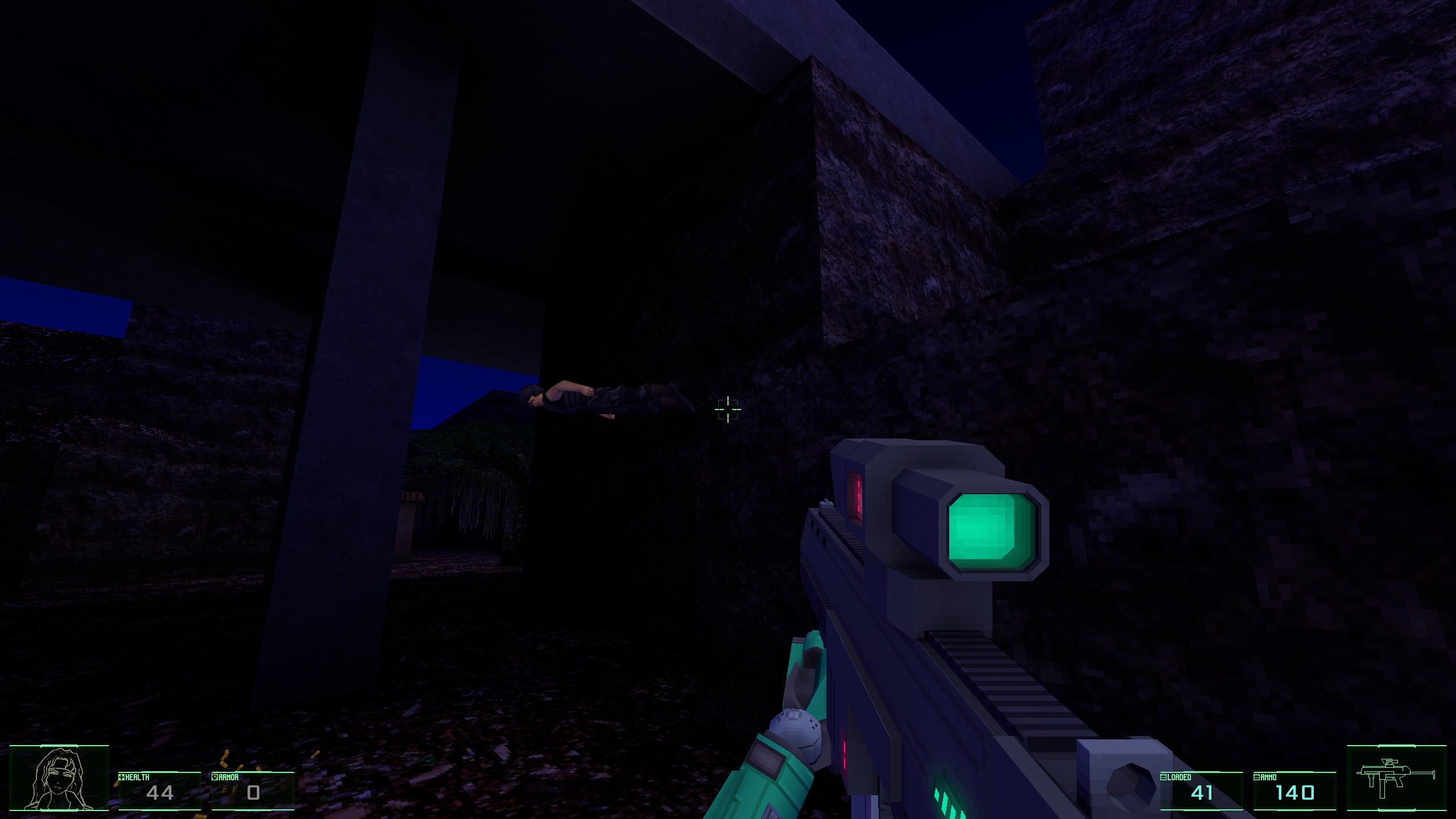
several areas were way too dark - under the underpass for example. i understand using darkness as a level design feature, but this just seemed poorly/incorrectly lit.  

no mag drop/replace animation? no flashlight? 

the edge of the map when underwater ends abruptly.

i could definitely use more visual detail and interactivity in general, like destructible environment props, consoles, etc. anything to build out the world a little more and make it feel a little more immersive.

this enemy died weirdly.


melee weapon is super strong and fun to use for stealth-kills.

speaking as someone whose game uses unpronounceable names as a feature, i think you might consider changing the title... i know the historical city it refers to, but i'm not sure how that relates to the story, and it's quite difficult to pronounce.

.exe is buried in two layers of folders, "Windows" and "WindowsNoEditor."

no menu yet, i understand this a tech demo.

art is very charming. the bright neon colors are nicely chosen and stand out well against the dark background. i particularly enjoyed the glowing Console near the beginning.

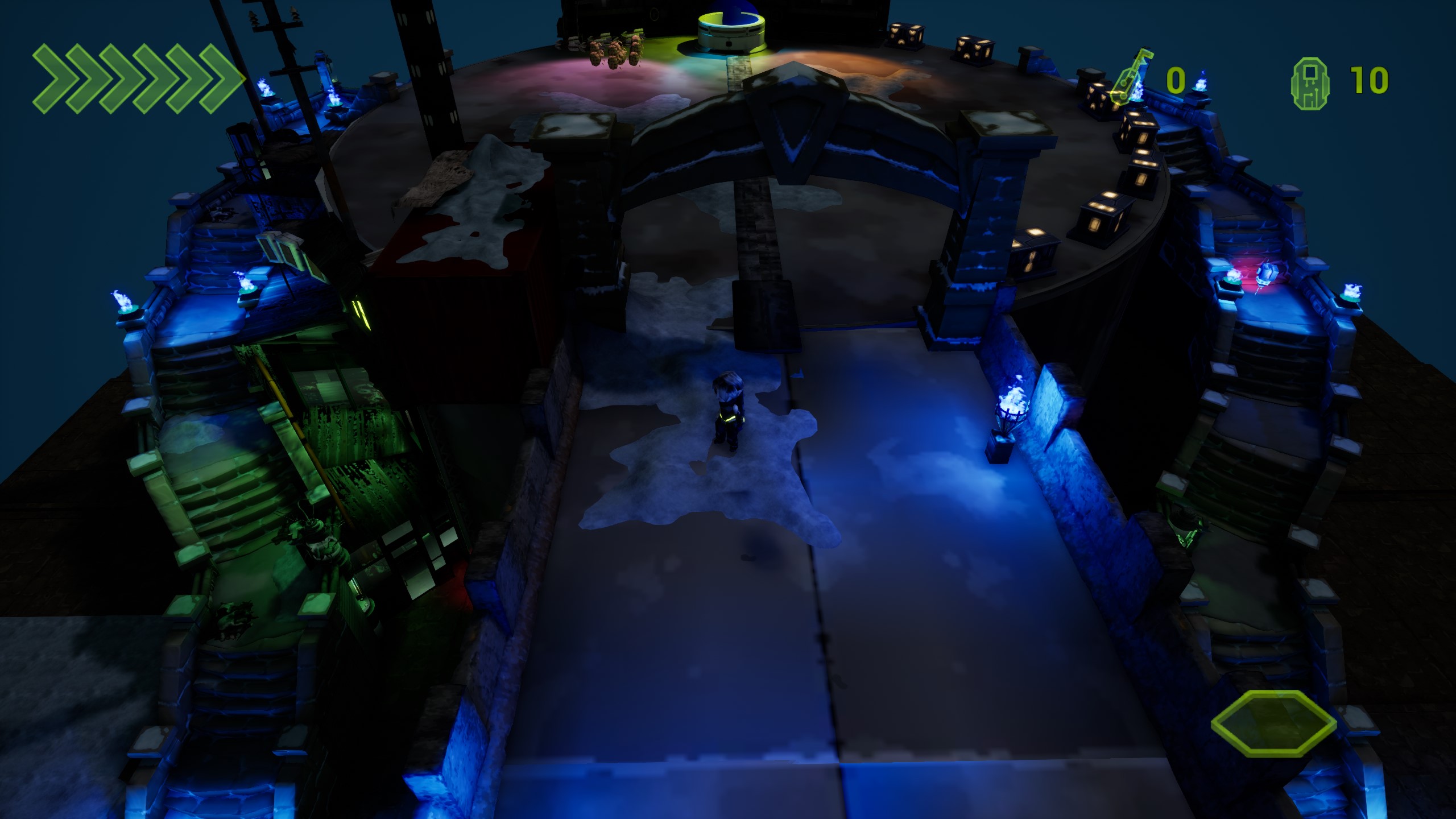
snow looks nice and is a wonderfully soulful touch. but the interaction shader needs work, as i'm sure you're aware. sometimes, it looked like i left a perfectly cylindrical smear across the snow. other times, like below, it seemed more like i'd just left some kind of shadow on top of it.

appreciating the level design so far. why are there old, medieval-looking stone stairs in a bladerunner-type world? i wonder if this is intentional, perhaps the cybernetic structure is built on top of ancient ruins?

found George at the bottom of the stairs. he is cute, but lacks animations and follows the player too closely.

the glass door to what looks like an office or shop is a lovely detail, wish i could open the door.

talked to the Hooded Figure, could not interact with him anymore after the first time.

hmm, it seems you're not the only one who found this bug... exiting to the main menu and reloading your character should bring you back to the hub scene! 

movement feels good. couldn't figure out how to swing with the torch, but i wanted to.

for melee FPS games like this i really think it benefits from a charge-to-hold attack like in vermintide.

it seems like you have some kind of a parry/block function. maybe i missed it, but does this work such that you can poise-break the enemy/riposte? that's another essential in these kinds of games, imo.

is there a kick button or did i miss that too?

i assume all the art is fully placeholder. i think with the right art direction and perfecting the combat feel, this could be the start of something great

very impressed with your speed of progress, this is so far beyond the first version i played before (DD54 maybe), which didn't even have sounds or projectiles... this has come so far in such a short amount of time, great job.
echoing a lot of what others have said here, but for me i think the most helpful thing to add would be indicators.

  • indicators for offscreen missiles
  • clearer indicators for which weapon is armed, and the cooldown remaining  
  • improvements to the health/damage indicators, so for example a limb on the monitor blinks yellow or red when it's hit

the mech weight feels nice while also not too slow. some nice clunky mech footstep sound effects would go a long way in helping with that classic mechwarrior feel.

also i died alot. enemy onslaught is pretty unforgiving

anyways good job, has the bones of a great mech game, and look forward to seeing this progress!

new build is up, hopefully all those things are now fixed or at least band-aided!

you are awesome. thank you so much.
cursor issues, like collider trigger issues, are ever the bane of my existence.

i'm currently pushing out a second hotfix which simply removes the cursor toggle from the keybinds menu. it'll just have to be hardcoded to CenterMouse for now... 
glad mana worked for you now. in the latest fix, i've set the fire orb to a separate spell rather than having it be the secondary fire of the fire wand (thanks for catching that!) also she should no longer insta-heal when casting her shield spell.

your feedback is invaluable, i can't thank you enough Mett! can't wait to do a deep dive into PLUNDERGROUND this weekend!!!

thank you so much for the detailed feedback and sorry for the excessive jank! i appreciate you for slogging through it!!!

going to see how many of these bugs you mentioned i can fix this afternoon before work, and hopefully get a new build up right away.

i'm gonna do that right now, then get back to you on some of the other points you brought up. 

thanks again for playing <3

whodev game? never saw it in the thread

enemies are bullet sponges and doggos are too hard. sfx needs work. also particle effects from bullets could use some improvement

appreciate the rooftop korean and the underused (KINO) setting though

UNCHANGED SINCE LAST DEMO DAY'S FINAL BUILD!
So if you played that version already, don't bother.

never mind, i did it ^_^

ladies and gentlemen, patricians and plebeians: we have a victor. 

great hero, you have unlocked the OST for yourself and everyone else. included in the latest build.

sekiro/tenchu demake in godot? nice.

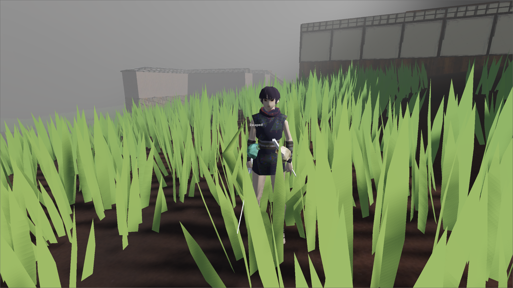
love the character models, nice simple soulful detailing and animations without being too "try hard". environment textures could use some work though, they appear stretched and they don't match the resolution of the char models. looks like there's some clipping in places where the plaster and stone wall textures overlap

the caltrops are so much fun and i love the animation when you step on them. 

deforming mesh grass? heck yeah. collider might stand to be a little bigger though since the grass blades kind of warp in on the player.

played on KB+M so i had to figure out the controls by pressing random buttons. having input detection to switch the tutorial icons from gamepad to KB+M would be nice.

ooh found the katana, sweet. but no parry or backstab :(

>no healing item 

unless i'm able to kill an enemy immediately, he will pretty much always kill me first by stunlocking me with his attacks (even punch) and three-shotting me. i don't know if this is intentional or not but the game is pretty hard for this reason. made it to two of the three targets then gave up

camera is way too sensitive for my taste and there's no way to adjust.

very nice presentation and game feel. not sure about the font though, feels like you could go for something with a little more personality to match the setting.

disclaimer, i'm dumb and also never really play games like this, so the learning curve was a bit steep (though much much better than the previous version i played on DD50). took me ~20 minutes to clear the tutorial. mostly because i was trying hard to play the game in a technical way. wall jumps and parry both seem a bit difficult to pull off intentionally and i kept getting killed trying to execute them. then i discovered it's much more fun and effective (for me at least) to kind of just play the game in a sloppy way and spam spacebar. discovering you can ride the rockets was a high point for me.

kind of wish there was an at-will healing mechanic like a health flask (but maybe i'm just a wimp). the green healing orbs do give such a small amount of health restoration that it felt disappointing to pick them up.

encountered a weird visual bug where it looked like an enemy sprite got flattened and stretched across the whole screen. tried to grab a screenshot but it was gone before i could.

kept getting killed on the walk-up to the first boss. finally got old galeynd down to 5% health remaining but then died to his rocket attack, big gamer rage moment.

love how damage is represented on the player sprite.

it's a unique setting and want to learn more about the lore. who created the titans and why? when did the bug invasion begin and are there other factions in the world? guess i'll have to get good and find out for myself.

fun game, i'll give it another shot after i play some more demos.

i'm floored, music is something i cherish so much. i'll include some free ost mp3 folders in the next build just for you !

the music is my own yes. that is a huge compliment coming from you. thank you

i am just now pushing out a new build addressing several of these things!! 

thank you for sharing your observations. i agree with you and all will be addressed in due time.

congrats on your game, it is quite an expansive achievement.

heya clyde!! nice to hear from you and thanks for trying to play!... that is bizarre, i have not encountered such a bug in all my playtesting, and couldn't seem to replicate. is this with the latest build (12)?

i really hope you get a chance to play and i really look forward to playing the latest version of necrovale!... i must say, your thoughtful comments on samsara really had a big impact on me and ultimately led me to creating this new game. so i especially hope you can get a chance to play a working version! !

played for a short time. pretty early start but i like the vibe

  • intro text is way too much to read, should be presented in chunks rather than en masse
  • crosshair is very hard to see, should be a lighter color since it gets lost in the background
  • revolver should do more damage, have a slower fire rate and different shot sound to distinguish it from pistol
  • please add a reloading weapon sound. also really needs music
  • took damage on changing levels via the portal (?) for no explained reason

might come back to this later. strong start though

thank you so much for the swift feedback osur! what a pleasure to hear from you & thank you for playing ^__^

regarding the combat, the game is built around a dark souls style lock-on feature, activated with TAB - were you using it? if not, i can see how wonky it could be to try to aim.

and thank you for noticing the other points. i'll add them all to my list!

gamedev is indeed forever, the most herculean of pursuits. this was a new project i created in the last month or so in attempt to right many of the ground-up design mistakes i made with samsara. i will be back in the thread and probably submitting this prototype to demo day for the heck of it

hope you are well and very much look forward to trying the latest build of kalemonvo! i still owe you a stream...

the orbs march ever onward

will be streaming ( and attempting to beat ) on weds may 17.

/obligatory comment to get me off the wall of shame