Play game
Get Rid Of It's itch.io pageResults
| Criteria | Rank | Score* | Raw Score |
| Gameplay | #17 | 3.265 | 3.265 |
| Overall experience | #22 | 3.382 | 3.382 |
| Creativity/game design | #26 | 3.441 | 3.441 |
| Presentation | #36 | 3.353 | 3.353 |
Ranked from 34 ratings. Score is adjusted from raw score by the median number of ratings per game in the jam.
Does your submission follow the required limitation?
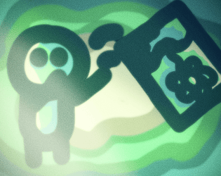
Yes, the game has only 4 colors and you need to keep the painting away, but random people keep bringing it back to you. :)
Leave a comment
Log in with itch.io to leave a comment.


Comments
The story for this is good, creative and funny and fits the theme really well, the gameplay is, though quite simple, actually pretty fun and satisfying when you hit the middle point I also liked slowly upgrading my painting into a rocket lol, music is pretty neat and the art style is quite cute and I think it fits the game well!
Those voicelines really irritated me after awhile lol. But for real, good job, really like the visuals and theme usage, though I think it may have been a bit repetitive.
A fun and simple game. But the game was too slow and at first it was hard to figure that where the power bar because it blended with the colors so I was just spamming that thinking that it is in the right. Also the text in the story is hard to read ( but it's funny) .
The story is funny the art looks great the music is very nice and works well and the gameplay is very fun. The sound and feedback when you hit the center is a great addition. This is a very creative take on the theme. (True ending: the person who gave you the gift finds out dun dun dunnnn). Great job :D
Herof (the guy who draws the art) has some daily drawing thingy that he draws something every day, so he made this very epic comic about this and it kinda has that kind of ending (he made it like 2 days ago) :) .
.
Its a fun little game that was just simply, quite nice. I reckon the style of simple textures and graphics is a fun idea but needs some work, thinner lines so that shapers are is easier to tell apart and text is easier to understand. The game is reminiscent of those flash games with a similar goal like yeti sports.
The music was nice and the story was funny, satirical even. It also fits the limitation and theme very well, good work.
I love the idea about trying to throw away something that keeps coming back. Gameplay is repetitive and that one voice line gets annoying lol. Art has lots of potential but looks a bit messy. Very creative and original.
Good game design! I just feel that the art needs a little more of visual organization. I like this kind of sketchy artwork, but with a clearer design you could reach the right point of the style.
I really liked the game, it's very fun :)
I'd like to give some feedback so here it is:
That's all, i really enjoyed the game :))))
Love this it made me laugh so much!
A nice experience.
good and fun game idea : )
I really liked the art style and the gameplay idea. I love the game learn to fly and this reminded me of it. The only problem I would say is that it can take a while to get going but is still a super fun experience which I enjoyed a lot!
That we got the inspiration from :)
nice fits the theme really well. also kinda reminds me of the flash game learn to fly
That was probably the primary inspiration. :)
Wow that's a really cool art style!
The only thing I didn't like was the upgrade options kind of achieving the same effect. It would have been cool to have upgrade options like slowing the slider down or additionally having to hit the perfect throwing angle which could give you a bit more control of the throw.
But that's really only my opinion and you could argue that the slider should stay as it is and rather have the player adapt to it's movement, so this is a really nice game overall!
I like the art, but there's so much bloom effect that I have to give it a 3. It's genuinely hard to see what part of the bar you're supposed to hit because the bloom blended all the colors together. The "blahbablahblah" sound effect when throwing again also got grating after a while, though it was pretty funny.
Otherwise it's a pretty good game! I think the concept's really hilarious, and I've always been a sucker for "throw thing and then it goes really far and upgrade it to go further" games. The subtle detail of "Oh I found this at the bottom of the ocean and I think you dropped it" was great!
Kudos on the solid entry!
idk what is it about the artwork... but i like it! simple but addictive! had me playing for 20 minutes! great job
Is there something bad with the art or do you mean the painting in the game?
oh nothing negative, it's just it works idk why, it gives me Adobe flash vibes, like newground.com vibes
Lessssgooo! I actually finished the game, it took a damn while but i enjoyed it, well done. I couldn't tell is this game made in four colours? If it is then well done! The game gets kind of repetetive and the "story" text is a bit hard to read?... Good job!
Yeah, I know it gets kinda repetitive, but I feel all the games like this (I have played many flash games with this gameplay) do that and I don't really know how to fix it, but yeah and it has four colors, four shades of green, but there is post processing so it looks much more (and that is allowed, even Benbonk said that in one of the community posts).