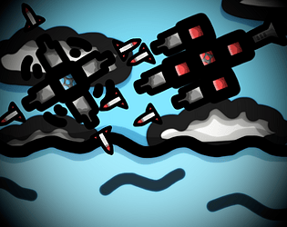
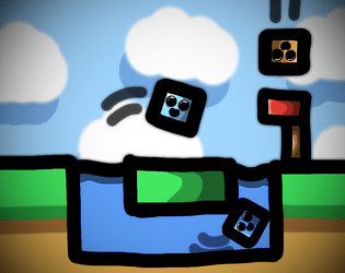
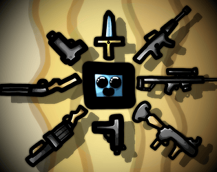
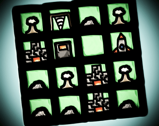
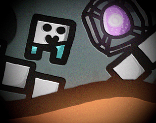
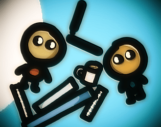
A lot of people have complained about not seeing the cursor so we'll probably add some quick custom cursor to make it easier to after the jam.
Ratainen
Creator of
Recent community posts
Okay the game is kinda fun! I see you fixed that no decisions bug so it actually works and I think I was just dumb earlier reading that closing the door decreases your sanity. I also love the pixel camera and the flashing lights, they make everything look a little bit scarier.
Though I don't really like the fact that the decisions are don't do or do, as just not taking them will basically not change anything and will be the best choice in most circumstances. It would be a whole lot better if there was a choice between 2 decisions, as then both would have a risk attached to them.
Also the death screen comes really suddenly, maybe there should be some kind of an indicator just before dying like if the oxygen is running out you get a blue vignette or purple or read if you are going insane.
Also now you can spam through the paper in the first quarter of a day and then you just look at the walls if there's danger or you have to open the valve. Maybe the decisions could be spread out through the day so like you don't just spam through them all at the start.
Though overall a great concept and with some polish it could be really good.
...I also spent like 7min trying to get zalgo text in to the leader board name, but I see you blocked copy pasting in there, even the emoji keyboard didn't work (though idk if that just uses copypaste functionality or something like that too).
Is the game bugged or am I just dumb? I can close or open the door and sit on the bench, but can't do anything else really. There's that decision paper, but there's just letters q and r there, but no text. So should there be like some decisions I could make? Also should I be able to interact with the vent? Currently I can't do anything with it. And I don't really get the sanity, the text says it decreases when you close the door, but it seems to decrease anyways and then I just die.
That was kinda fun trying out the different endings.
Though I'm really annoyed that there is no skip button or just pressing again when the text is still being typed out to skip to the end of that line. Like I want to see all the endings, but gave up after like 4 or 5 ones, because I really don't want to have to wait for the same text over and over again.
Also there should be a button fade thing when your mouse is over the buttons, it would just make clearer that they are buttons.
Also the music is kinda repetitive and slowly driving me insane.
But yeah, this could be really fun if you just added a line skip function.
The game looks really cool! Though I had like 15fps with the lowest settings, but still.
Though I really didn't like the gameplay. Like you just go around throwing animals into random portals. It got really tedious really fast.
Also why's there some random cheat button in that one room. I didn't realize what it did and skipped 2 days. The third day I played fully, but like even that was really repetitive and I really don't want to imagine doing that for even more days.
Also the mechanic is kinda poorly explained, first I had no idea what to do and then I was confused for a while why the animals were still turning to monster, because I didn't see the current animal thing (or maybe I'm just blind).
I love the game! The art is clean and the even though the gameplay is really simple, it works for the short game. Also the ending card thingy is great. Also I like the more puzzly computers which you have to do something for to get the employee out of the way.
Though I feel like there should have been only one free computer and 3 puzzles, as you have to repeat the same thing twice now with no difference. Also why can't you put all of the objects to the trash, that would just make sense.
Thanks for the game! It's pretty good for your first game. I like the dark atmosphere. Though I have some feedback for you so your second one can be even better.
Sometimes the climbing just stops and I guess there's some kind of a stamina system. There's no indicator for how much you have left though so it just feels kinda glitchy. Also I'm not sure when you can start climbing again. Is it like a thing where you have to stand on the platforms for a long enough time so you can climb again? Though there's no indicator for that if that's the case. Also if you just spam the climb button and don't hold it you can climb indefinitely so that's a bug.
Then the enemy spawners spawned the enemies instantly when their old enemy was killed so it created these invincible enemy thingys which just instantly spawned back. I would recommend adding a delay to the spawning. (Though If you add a delay there should be an indicator that an enemy is about to spawn)
The shooting also felt kinda clunky, because you had to press the buttons and the gun would slowly point to the right direction when you have to shoot. It didn't really work when the game was kinda fast paced. You should probably just make the gun point towards your cursor and make the shooting work with left click.
Also the best strat was kinda just to climb next to a wall and shoot upwards, but that strat might have only worked, because of the infinite climb glitch.
Also some kind of a indicator on how close to the end you are would be nice to give some motivation when you have no idea how long the game still lasts.
Then there's just some general polish things which you could add: transition effects like a fade when you switch scenes, camera shake for shooting and killing enemies, particles on dying enemies, something to make enemy spawning less jarring (particles or animation?) and sound effects.
Also the ending kinda felt like it came out of nowhere and like it was trying way too hard to be dark. I feel like just some you got away yeee thing would have been better.
So that's all. I know that's kinda of a really long list, but this is your first game and I know it's really hard when your just starting. So keep it up!
Glad you had fun!
Charlie actually was an accidental reference, but we did know of that. I remember when we were coming up with the characters and like 5 minutes after coming up with the name for Charlie my friend was like: "Wait a second..." and showed us that channel. We just decided to keep that, because that is pretty funny.
I'm also pretty happy that the who could have not done it thing worked, because we didn't playtest at all and realizing who the culprit is could have been way too hard.
Pretty fun, it was fun figuring out how to escape and the artstyle was kinda cool too.
Though the interaction areas for the objects when clicking with mouse were way too small, at start I thought many things were uninteractable when they actually were, because I clicked little bit off the interaction boxes.
Also you should have added a window sprite for the window in the left side of the cabin, at start I was wondering why I couldn't walk through it. (also why doesn't the wall in the right side of the cabin have a sprite?)
Also you should have somehow told the controls, because at start I had no idea how to open the inventory.
And there were a lot of typos. (adpandoned???)
But overall, I had a fun time playing this game.
The game is really fun and the transition too the game from the intro is just awesome, how the music chances and the water starts coming down is very epic, and the way how you get one firefly at the start, and the second gives you the second one to instantly get an upgrade, to teach that mechanic is pretty awesome.
The game does get pretty repetitive after a while, so maybe some alternate obstacle thingys, like bombs that explode after a while in a 3x3 area and stuff like that.
Them the harsh black outlines on the spikes look pretty bad, maybe a lighter gray would look better, because they look kinda weird on the light ground.
Then the firefly amount for the upgrades scales way too quickly, you should make it scale faster in the beginning and slower in the end, so max you'l ever need for a upgrade would be about 12 or something. But keep the 2 fireflies for first though, it teaches the mechanic really well.
The game is really fun and addictive, but it could be improved.
The hook mechanic is fun, but I really don't like the it spins and then you click mechanic, you should have made go towards your cursor.
Also the hook could be made more juicy, like if you chance it to go towards your cursor it will probably get easier, so give it gravity, and some cool sounds and camera shake on landing and the game will feel a lot better. Also if you give it physics, when the player starts going towards the hook, the player should fall as well, and then get pulled back, so you could do really cool swings very you hook to a surface, and let go of the hook, and conserve the momentum. That would make the game a lot more fun, by removing the annoying timing thingy, but still keeping the difficulty.
Then the background, it's just bland color, you should make it like a cave or something and give it parallax, and it's gonna look so much better than just a single color.
And the coins, there's no use for them, maybe you could buy some skins or something like that with them, so you would be actually incentivised to take them.
Also you should add some death particles, because the player just disappearing is really unsatisfying.
Ok, I really love the story and it's kinda fun.
But it's missing a ton of juice, you should add camera shake for shooting, hitting an enemy, taking damage
And I don't know can you do that in GDevelop, but some particles for shooting, damaging an enemy, killing an enemy and dying, would look cool, but if you can't do that, then yeah.
Also you should add a lot more feedback for taking damage, those particles, that camera shake and maybe a red flash of the screen.
Also the pixel size, the problem isn't that bad in this game, because of the pixel perfect camera, but the larger pixels are still noticeable, and it doesn't look good, especially the background has way too big pixels.
And for some reason when you die, you go to the settings menu, it should just start back to the game, or at least just to the normal menu.
And the gun doesn't point at the cursor, little bit off, you shoot to the cursor, but the gun facing the wrong way irratiates me, and some times even confuses.
Okay, I like the idea, but the execution could be better.
First thing im gonna say, is that I didn't progress after the first code puzzle, because I got stuck in a corner because of a glitch, and didn't feel like going back there (screenshot below)
The code thingys felt like an after thought, it was a platformer with random code thingys thrown in there, so maybe have them somehow incorporated better to the gameplay. (I don't really know how, but somehow, very good feedback, I know)
And the fact that you couldn't move in the air, was so bad, and because of the slidiness of the player, I always ended up sliding off the platforms, so maybe you should just be able to move in air.
Also the quick jump thingy, it felt like a bug rather than a feature, because like it makes no sense, if you tap to the other direction when jumping, magically you jump instantly, and that "feature", needs some coyote time, so if you press the opposite direction little bit early or late, it would still work, so it would at least feel fair, because now it works just 50% of the time, if you press it like a frame late.
Also the graphics, you should have just made art for the UIs, because just having some default Unity sliders and textboxes there feels just weird.
And the background is really bland, you should add some random shapes moving there, so it would look less bland. (the 0 and 1 do a little bit, but at least in the starting area)
And the death particles are really bad, they move so slowly and then just disappear instantly, you should make them move a lot faster and farther, and fade out, or shrink, or both, so it would be more satisfying. Also the respawning should be a lot faster, the camera should stay where you died for like 0.4 seconds instead of like 4.
Also there should be a, checkpoint taken sound effect (also particles), sign opened sound (just use that page flip sound like in the menu), and a cool increasing in volume very epic sound, in when you choose yes or no in the do you wanna help thingy.
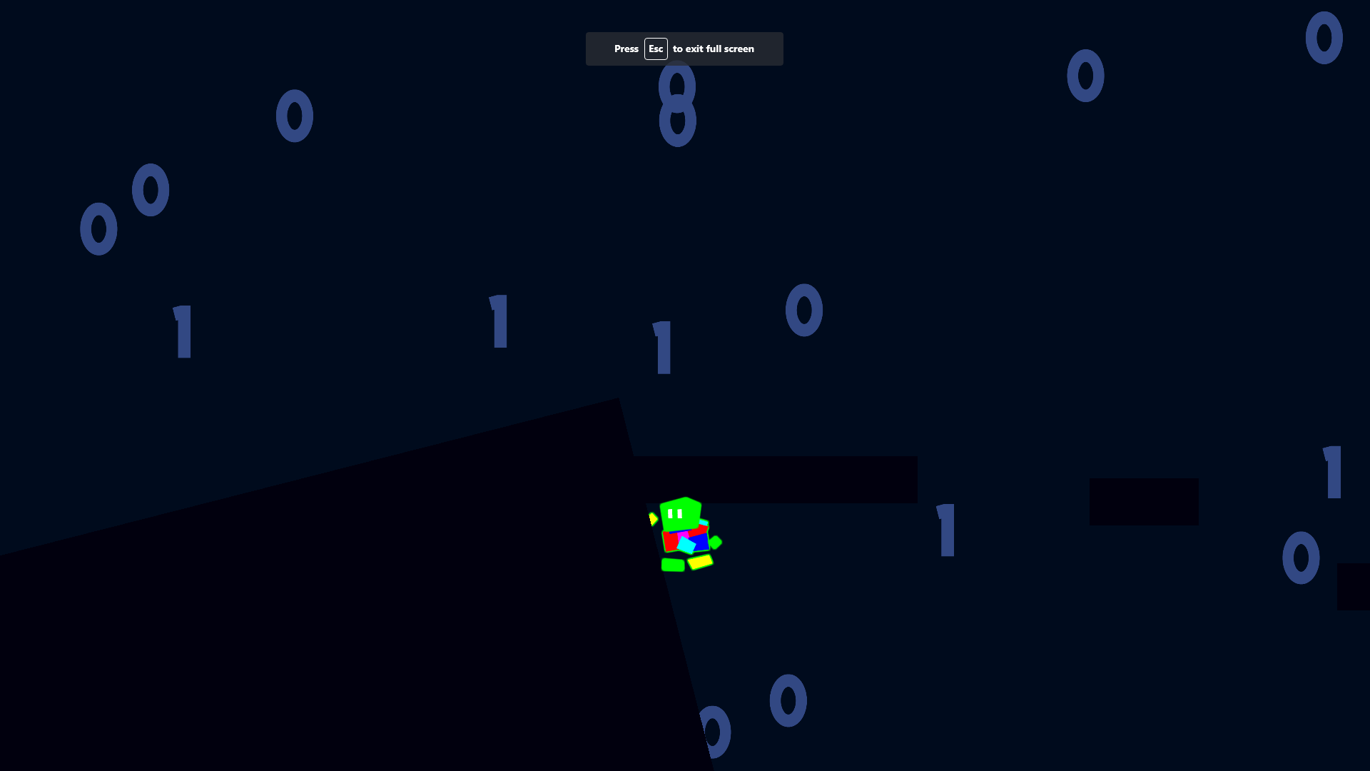
Ok, the idea is pretty cool and the multi layer parallax is absolutely awesome at the start, that your descending down a deep hole, but the execution is well, pretty horrible.
First of all, the worst thing about this game: THE CLOUD, I hate that thing so much, it's so glitchy, you don't even know how many times I died to that thing, because of it just not being where it's supposed to be, some times it's just blocking the path and I die, because im rushing to get back where I was, yes I know that when rushing it's easier to do in any game, but when you die because some dumb cloud was where it was not supposed to be, well that's very annoying. Also the cloud feels like a so lazy way to stop you from just jumping to the bottom, especially when it just teleports to where it needs to be.
Instead, to stop the player from just skipping sections, I would add fall damage, that's kinda hard to communicate, but maybe just make the screen tint more red faster your falling, so you know when your going to die and when not, of course you still don't really know will you die from a jump, but that's still better than dying to some random glitchy cloud.
Also there's way too little checkpoints, maybe it's just a skill issue, but it's kinda annoying to redo massive sections of the map to get back to where you just were. And I know how easy it's to make your game way too hard, because your so good at it, so it feels balanced, our game for example is way too hard, but still.
And then jumping from walls, it feels really glitchy, you should add coyote time, so even after falling from a wall, for a few frames, you can still jump, so it feels more fair, because right now, every time I try to jump from the wall, I just end up falling.
Also if you jump straight up from a wall, you can't jump again, if don't go away and back to the wall, and that's really annoying.
Also I don't really know can you do that in Godot, but post processing would look really good.
Also in the hole, the backgrounds parallax is cool, but you should add more layers to it like at the start, so maybe the background could have holes and there could be more background with different parallax amounts.
Also dying is really unsatisfying, you should add some camera shake and maybe some crazy death particles when you die. And then the camera should move to the start where a new player could be, now it just slowly moving to start looks really unsatisfying, and yeah.
Also you should add a jump sound effect.
And at start, it was really weird, because some walls you could climb some not, so you should have marked the walls that you can climb on.
Aand at the start, the pixel size for the font is bigger than the other pixels and that looks weird, so you should scale that down to be the same size.
Pretty fun game, but get's a bit boring after a time.
The game is way too slow paced, the best tactic is to just be somewhat far away from the center where the enemies spawn, and the shoot them from far away, and when you get more upgrades, this get's really effective, especially with the shield and dash.
You should make it so the enemies spawn around the player, not just in the center, to make that tactic not work so well and to make the game more fast paced, make a slower torpedo cool down for the player and the enemy subs and maybe make more of them, and increase the speed of the enemies a lot.
Also the camera is kinda bad, it should go with you cursor, so you could check behind you and move at the same time, and that would work really well.
Then the movement, it's like too snappy, the sub is underwater, so in my opinion it should be more icy, some maybe don't like that, but it's underwater, and it doesn't feel like that currently.
Also the movement of the enemy subs is way too fast, some times they start like spinning in place, which looks really weird, they should be only able to turn slowly, and also only turn when moving, so it would look more natural.
Then the weird box structures in the corners of the map, you should make the camera go below them when you get close, or just remove them, because now 90% of the time when you are near them, you don't even see them, because your camera is clipped inside them so you can't see them (that was a lot of "them").
Also the top of the water, it doesn't look like the top of the water at all, I guess it is, because you can't go any farther up and the blue water effect disappears, but like, you can't see the top, you should see it like wavy and cool, also please allow the sub to jump above the water, it would be very fun.
Then the missiles, they are way too hard to see, maybe add some lights to them, so they would glow, like red glow for enemy missiles and yellow for the player?
And the sound effects, there isn't any shooting sound effect, clear dashing sound effect, torpedo and the torpedo explode on enemy sound effect is too quiet, it would feel a lot more satisfying if it was louder, even in little farther distances.
Also the torpedos turn really weirdly, maybe slowing down the turning could help?
Also I survived for 13min 53sec and the score was 1340.
Thanks for the feedback, we probably should have clarified that checkpoint thing, and that difficulty thing is 100% true, the game felt balanced when we were playing it, but yeah, for other people not so much. And about that air, I checkpoints closer to goal thingy for the green place way too difficulty right place obstacle course thingy, but I guess I didn't think about it for other places. And there are signs for the dead end roads, you need to follow them. And about that dash, I didn't think about that fact, but you'r so correct, probably some larger area with many jumps and stuff would have been better for the third area.
Okay the idea is really cool, but executed very poorly.
You don't really need the nostalgia shift at all in the game, the teen is the best, because it can kill anyone, the adult can only bribe normal people, not police, and the dash is useless.
Also the game is really boring, you just spam the attack with the teen, move right and win.
This game would work a lot better a level based platformer, maybe you can bribe the enemies, attack some switches, blocks and stuff and dash over obstacles. Then you would need to use all your abilities and the game would be more than just moving right.
Then the kids dash is really glitchy, it just some times doesn't dash, and the effect is really unsatisfying, you should add some particles behind the player, instead of just a small dot when dashing.
Then the game is really unjuicy, you should add camera shake when attacking, attacking particles for the police, because those don't die in one hit.
And sound effects, the game is missing so many of them, click menu buttons, talk thingy in start cutscene, all the abilities, enemy damaged, enemy die, nostalgia shift, jump and then a sound effect, when that white screen comes slowly in the start cutscene, it's really unsatisfying, when there's no sound and it comes so dramaticaly.
Also the graphics, the pixel size is pretty inconsistent, the background, enemies and player have the same size, but the ground and a little lines in the background actually are a really small size, which looks pretty bad.
And a small nitpick, the text in the right top corner, it should be a pixel font, as it looks pretty bad, being a normal font.
Thanks for playing, and I watched your stream, and like you can say that it was way too difficult, I won't get sad....
But like yeah, we realized how difficult the game actually was only after submitting, because when your like player your own game, it's not that hard, but yeah. And the "red ball", was a lever, but because the bushes were kinda a last minute addition, we didn't realize that the lever went behind the bushes. Also we probably should have clarified the fact that everything you did, will get lost if you don't save at a checkpoint, including levers, so yeah, and also that dash to the rock felt like an obvious thing, but I guess it wasn't.
Also you actually beat the game, which is pretty cool, as said the game was way too difficult.
Umm, you passed the hardest part, you need to go to a checkpoint after getting the dash and then you have it, and then you can break a rock that's earlier to move on. That right spike part is so much harder than everything else, but we kinda realized that after submitting so yeah, everything else is so much easier.
Here's our very cool game: Rate The Breathless Journey by Herof123, Ratainen for Brackeys Game Jam 2023.2 - itch.io!
The game is pretty fun, especially when you get really fast and break many different blocks without fails, but I ended up quitting at the inner core level, it was too hard.
But, the best strategy ends up being pretty much just, hold down, chance tool, tank 1 dynamite, and dodge others, especially because you need to be so fast and that minimizes movement, and that's not as fun as planning.
Then there's way too little sounds, you should add: getting damaged, dying, maybe speeding up down, going really fast down (like wind or something), tool chance, retry and menu button click. Maybe there are others too, but those I could hear were missing.
Then some of the sound that you do have, have a lot of noise, so you should fix that by using for example Audacitys noise suppression, or something else if want, that's just what I use.
Then you are missing a lot of feedback for when getting damaged, that sound effect, camera shake, and maybe like a red flash of the screen.
Then the art is really inconsistent, I can see you use assets, the ground and player have a very different style, also there's so many DIFFERENTLY SIZED PIXELS, please scale all pixel art the same size, it's gonna look 10x better, please just do it.
Also a trick that I tell everyone, please use post processing, bloom and vignette will make the game look so much better.
Okay the graphics are awesome, and I the atmosphere was awesome.
But then the gameplay was pretty repetitive and boring. You just went from place to place and did that small minigame, just holding one key until you get there and then you press another key. And maybe it would have gotten more fun and the third level where there were to monster, but I hate horror games and the moment I saw one so no, no, no.
And those marker, you should make it so they don't scale with distance, because they got really small and glitchy (sometimes just disappeared in different camera angles) so they were really hard to see.
And then those text boxes, they should have sound effect, I know it's for a very little time, only tutorial and start of the levels, but it annoyed me to death, because they had no sound effects.
And actually I don't really have anything more to say, I probably missed the actual game, when I saw the horror stuff, but wellllllll, no
The game has a lot of potential, but barely has any content at the moment, you can get the treasure, and maybe the dolphin, but other than that, there's really no fun to be had.
Currently you don't really feel like you are under water, so maybe you should add a blue tint over the screen and a wave shader, to make it better.
Also a thing I say to literally every Unity game that doens't have this POST PROCESSING, just some little bloom and vignette will go a long way to make your game look so much better, so please, do that.
You managed to keep the pixel size consistent in the game game really well, but the UI has a different pixel size, so you should fix that to make that look better.
And then the game needs some swimming and text appearing sounds, text that appears slowly feels so much better if it has some sounds.
And then a transition, because the hard cut from the menu to game doesn't look that good.
And then some attacking feedback, like the current fish attacked sound is way too unsatisfying, it's so quiet, so you feel really weak and also a fish died sound would be good, to for it to feel even better. Then attacking and fish dead particles, because those also make the attacking feel better.
And when you run out of oxygen and supposedly go back to the surface, you should make it so the player starts automatically going up and then the screen fades to black and then away when back up, because it just cutting doesn't really look that good.
And then a really small nitpick for the last thing, the wall at the ends of the maps are really cool, but there are 2 layers of them, and it would look so much better if there were some parallax.
Okay, I really love the store and it's fun getting the different endings and the music fits really well.
But getting the endings is pretty boring, because you end up just waiting, until you fail at the job, so maybe all the minigames should have some instant fail condition, to make it less of just waiting.
And then the art, it's pixel art, but the pixel scale is so inconsistent, when making pixel art, you should always have the same pixel size for everything, or it's gonna end up looking bad, if you want big things, have the same pixel size and more details, but don't just scale it, differently sized pixels will ALWAYS look bad, so please don't do that, your games will look so much better if you just scale them correctly.
And then a trick to make the game magically 3x better, use post processing, bloom and vignette and it's gonna look so much better.
And you should also add more sound effect for extra feedback, like picking up a file, putting a file to folder, clicking a calculator button, those minigame bulbs lighting up and clicking those bulbs, those at least need some simple sound effect, because they feel really empty currently.
Here's our very awesome game: Rate The Breathless Journey by Herof123, Ratainen for Brackeys Game Jam 2023.2 - itch.io
Really fun and addictive, and I like the upgrades, the chains that the bombs make are really cool and the sounds are really satisfying.
But there are some problems, like sometimes the player just starts floating, when you move to a empty space, which removes some fun, it definitely makes the game easier, but less fun in my opinion.
Then you handled the pixel size in the map really well, but the UI has the pixels scaled so incorrectly, some pixels in the UI are really small and some too big, so that should be fixed, as that just look bad, so you probably knew that already, but Im still saying it: PLEASE HAVE SAME PIXEL SIZE FOR ALL PIXELS, so never scale pixel art, draw new art, always, scaling it always will look bad, even in UI.
Also post processing, please add that, bloom and vignette, and tadaaa, the game magically looks 3x better, do that.
Also there's way too little feedback for taking damage, add some camera shake, particles and maybe a red flash of the screen, it's hard to realize that you took damage, and that's really bad.
Then the ghost and spike thingy, the ghost should have death particles / damage player particles and the spike should get destroyed when you touch it and have particles too, because now you just end up standing on the spikes which looks really weird.
Then for the gameplay, the game is way too grindy, at the end you end up just spamming down to get money and not really caring, deeper down you go, there should be better coins, so it's less grindy and you don't end up just pretty much spamming. And the 50k coins achiement, WHY? I ended up just autoclicking down arrow key to get that for like 4 minutes to get that, like how should you get that without an autoclicker, im not gonna spend a hour just playing this to get that.
Also I don't know if there's some cool lore that I missed as that "how does this with the theme" box kinda suggests that, because I didn't get 1000 meters down, only 900 and then I quit, so if there's something cool I missed, sorry.
Here's our very cool fish game: Rate The Breathless Journey by Herof123, Ratainen for Brackeys Game Jam 2023.2 - itch.io
Yeah the game is way too difficult, but we kinda realized it way too late when our friend was playing it, but you actually completed the game really fast, it took like 10 min in the way too difficulty green place thingy and you did it in like 3 or 4, also yeah the player is kinda slippery, but the hitbox is actually really small for what it looks, it's just a small circle in the head of the fish.


