Play game
Re:flex's itch.io pageResults
| Criteria | Rank | Score* | Raw Score |
| Overall experience | #7 | 3.846 | 3.846 |
| Presentation | #8 | 4.192 | 4.192 |
| Gameplay | #9 | 3.385 | 3.385 |
| Creativity/game design | #19 | 3.538 | 3.538 |
Ranked from 26 ratings. Score is adjusted from raw score by the median number of ratings per game in the jam.
Does your submission follow the required limitation?
Yes, it only has four colors, and was made in 72 hours
Leave a comment
Log in with itch.io to leave a comment.


Comments
Pretty fun game! I did encounter one bug where the ball got stuck in the red wall and I could get infinite points
Thanks!
This bug happened with all four of my playtesters, lol
Pretty fun and the graphics were really cool, but there should have been some camera shake when punching and a lot of camera shake when actually hitting the ball and some destruction particles for breaking the wall.
Thanks!
The shaders, the polish, the simplicity...
Its such a nice game! I think I'll probably play it in the future trying to beat my highscore (4 walls down so far)
It really reminded my of leathal league blaze but in 3D but with it's own identity.
Loved how you really didn't need to but you still added that animation when you move (idk exactly how it's called)
So yeah, you did a great job with this game ^^
Thanks! :)
I literally love the artwork (if you could tell me how it's named i'd be very grateful since i wanted this kind of art for my game but didn't know anything about shaders nor 3d so lol) and the gameplay is very very good. The only thing i can say is that i'd love the ball to go a little bit faster and the "crash" with the walls to have only a little bit more impact, like punching has.
Overall, i'd say that if this game isn't the winner or at least top 3 somebody is lying.
Thanks!
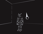
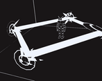
I have no idea what this artstyle it called, but it's actually very easy to do in Blender using a "Solidify Modifier"
Thanks again for the nice words :)
Nice game! Also when the goals get hit more than four colours are used, right? Very well made, I enjoyed playing Re:flex :)
Thanks!
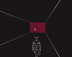
When the wall is hit by the ball, it uses dithering, not multiple shades of red :P (But thanks for the concern nonetheless!)
Very nice game, the art style is very awesome. But some times it's hard to hit as ball as the camera gets too close to the player.
Thanks!
If the camera is getting too close to the player, then it's probably because you are up against the back wall :P
I really liked the game, the art style with the shaders created a cool experience that felt arcade like but modern. I thought the swing animation was a bit slow and unresponsive at times but other than that great game, I had a lot of fun good game!
Thanks!
The swing animation is a bit buggy, but the functionality of the punch is completely separate, so it only makes it difficult for new players that aren't used to it yet (Which is most players, since it's a game jam game)
If there was one thing I wish is spent more time on it would probably be this
Suuuuper sick game, and the graphics are awesome. I definitely see the lethal league inspiration. My one complaint is that it's just kind of difficult to see sometimes, especially when backed up against the wall.
No way Bebok!??1!?!!1!?1???1!!??? 😳😳😳
Giving me strong Lethal League vibes and I love it! The visual effects are amazing and although I sucked at the game, it was so fun. Great game!
Thanks! I'm glad you could enjoy it!
best thing ive ever seen
Lol
really cool game, you get a really cool feeling when punching the ball back! That feeling could maybe have been even stronger if the punch had more visual weight, but you already explained that there wasn't much time left, so it's still a great game!
Thanks!
Very solid entry! It's a ton of fun, Love the 3d four color aesthetic, and the sounds fit quite well. The punch animation doesn't feel weighty for what it's doing though.
It's pretty tough to tell if you're gonna hit the ball or not, especially when it bounces up. I feel like some kind of indicator would be great for that, like a shadow of some kind. An indicator for when you've charged up a punch enough to hit would also be great.
I think the back wall health also needs to be a bit more obvious, since I didn't even notice it the first time I played.
Overall, it's a pretty great game!
Thanks!
I think spent a little too much of my time on the visuals and sounds, most of the issues you mentioned are there because towards the end I was rushing to get the game playable, lol
Thanks again for the feedback!
a good game
Thanks! :)