Play game
MagicChaos's itch.io pageResults
| Criteria | Rank | Score* | Raw Score |
| Art | #113 | 3.500 | 3.500 |
| Music | #114 | 3.250 | 3.250 |
| Black and White | #176 | 4.167 | 4.167 |
| Overall | #185 | 3.111 | 3.111 |
| Theme | #186 | 2.833 | 2.833 |
| Originality | #218 | 2.917 | 2.917 |
| Gameplay | #273 | 2.000 | 2.000 |
Ranked from 12 ratings. Score is adjusted from raw score by the median number of ratings per game in the jam.
Leave a comment
Log in with itch.io to leave a comment.


Comments
It was not quite clear what I had to do in the beginning - maybe a tutorial would be nice.
The animations/cut scenes made an quite impressive impression in the beginning, the rest (controls/adjustments of graphics etc) still needs some polishing I guess.
All in all nice work and thanks for the jam entry!
Sidenote: Pixelart works better if you don’t mix up resolutions of of graphics. Also the music loop is nice but a big short an repetitive.
Well done!
Thanks :D
I thought this looked pretty cool visually. I think the cutscene movement was solid. I think this game could benefit from in-game instruction to give the player a better idea of the goal. Congrats on submitting!
You put a lot of efforts into your game - really impressive. Couldn't find out the right order, but was walking around and looked at everything. Great artwork and super cool intro!
Thanks for feedback :D.Hints were not very clear
Interesting one. I think the game just needed some text to help explain some things as well as set the scene. I figured out that pressing the r button didn't seem to do anything unless you step on those floor symbols first, however some more feedback would help here too just to let you know what had happened.
Good concept
Thanks for feedback :D.I thought about adding dialogue but I ran out of time. the story is a bit complicated
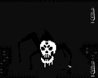
The opening cutscene was super cool and I really like the art style and atmosphere
I couldn't figure out the gameplay though. I walked around a bit and pressed r on everything I could and couldn't make sense of it.
Overall, it shows promise and could be great with a little polish!
Thanks for feebackk :D.Yes you are soo right.Gameplay mechanics and usage was very confusing
I'll be honest, I couldn't really figure out what was happening even after the gameplay started. I'm always on the side of cinematics coming after the gameplay loop is airtight, and I wonder what this game could look like if the time spent on the intro cutscene was put into the game. No that I'm condemning your decision! Cutscenes are great ways to establish things. But yeah was still pretty confused, as the intro doesn't really do much to inform what you do. Art was strong though!
Thanks for feedback.There would actually be dialogues in the introduction, I wanted to tell a story, but I couldn't convey it well. I couldn't focus on the gameplay because of the scene, as you said, it could be better :D
Cool game. Art for the obelisks and book were really well done.
Thanks for feed back :D
I liked the art, obstacle order could definitely be better, overall great job :D
Thanks for feed back :D
Hi,
the start of the game was awesome, I really liked the short intro, even though I didn't get a lot out of it. The whole concept was also pretty confusing, I have to lighten up the obelisks by using my magic? Maybe you could try to explain this more clearly to the player in the game with some a basic tutorial instead of putting it in the description of your project (I know it's a jam, but still). The art was pretty good, but the animations were kind of weird, but that's probably personal preference. I hope you can do something with my feedback :)
-Remi
Yes, you're so right, there should have been a gameplay tutorial in the game.Actually, I was going to add dialogue to the intro scene, but I couldn't load it.Thanks for feedback
The pixel art character is awesome! Was a little confused by the obelisks though. I feel like I activated them all but still died randomly.
maybe the obsidians are not in the right order