Play game
Moles's itch.io pageResults
| Criteria | Rank | Score* | Raw Score |
| VISUALS | #218 | 3.769 | 3.769 |
| DESIGN | #301 | 3.231 | 3.231 |
| THEME | #448 | 2.923 | 2.923 |
| OVERALL | #464 | 3.000 | 3.000 |
| INNOVATION | #645 | 2.385 | 2.385 |
| MUSIC | #879 | 1.308 | 1.308 |
| SOUNDS | #906 | 1.385 | 1.385 |
Ranked from 13 ratings. Score is adjusted from raw score by the median number of ratings per game in the jam.
Leave a comment
Log in with itch.io to leave a comment.


Comments
Apparently I can't hear anything and I can't scroll the slider for music and sfx so ¯\_(ツ)_/¯, the visuals and effects like the enemy exploding was awesome but when the player gets hit, AHHH MY EYES, like seriously I can't see shit when I get hit XD, not sure how this is connected to less is more but it was fun :D
suggestion:
1) I prefer to have a larger space where I can roam so why not increase camera view and space :D
2) the enemies are a bit too predictable so could you make the spawn location random and a heads up before spawning so we don't get "sneak attack"
3) the pop ups like speed has been decrease or the floor is slippery, please make last longer cause I can barely read them
4) tutorial?(very common but necessary)
5) more content like a SQUARE that is essentially a tank or a CIRCLE that is fast cause it's a aerodynamic XD how about new weapons like a minigun that fires TRIANGLE or a grenade that shoots out HEXAGON that explode
6) might want to add trails on your bullet(just preference)
like the way the enemies move since most of the time you would expect them to B line towards you but there is fiction and also the fact that they "slow down" so that's a nice change of pace either way congrats on your first game jam(you sure as hell did better than mine) :D
The polish was well done! The camera was a bit too close though.
Thanks everyone for the feedback! I've never really gotten any feedback on any of my games, so this is all pretty exciting! Thanks for the tips and suggestions, too! I completely agree with everything, like the camera and UI scaling. Also the cursor definitely makes pressing buttons kind of annoying. Thanks for checking out my game, and I hope that all of you guys also enjoyed the game jam!
the art feels amazing and combat is polished.look game
ps:i love the theme
The feel and look of this game is amazing (especially since it's your first!). Keep going on, and you could one day make professional games. Great game!
Congrats on your first game! My favorite part of this game was the camera shake, it makes your shots feel super punchy. This game would definitely benefit from sound effects to supplement the other effects. Great work!
Hey, glad to see you joining the game jam community!
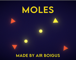
I really like the minimalistic visuals as it does make it very easy to tell what is what and it is very easy to play yet it still poses a challenge! I really like that! I am also a big fan of the game modifications that change it up a bit.
As far as improvements go, I wouldn't stress too much about it as it is your first game jam and you've only been using unity for half a year so really I'd say that this is a more great start! But I do want to mention that I feel the camera is a little to close to the player and the menu, while looks great colour-wise, is hard to select the correct button and I think you should make the non-button text be smaller.
I think that (if you are using unity) you could use the 'scale with screen size' canvas option so that the menu can be more spaced out and the in match UI doesn't get in the way when you go into full screen.
But like I said earlier, don't worry about it too much as this is a great start! Just focus on what you achieved for now!
I do agree that this game is missing some camera follow but the particles and the camera shake were very nice. I think this is a great first game jam submission, congrats!
I say pretty good for a first jam game, granted the menu is not that good and the camera doesn't follow the player I think it's a good game. I have been using unity for 3 years now and I still haven't learned how to use post-processing and particle effects correctly. Great game
Hello.
I played a bit of this game and have some feedback for you.
Firstly, your main menu is very messy. It's hard to properly click on what you actually want. This also applies to the settings menu.
Secondly, the fact that there is an "Exit" button on the game scene is very annoying. If I want to quit, just let me have a button to do so. UI on the game scene could also be on the top.
Thirdly, I feel like the camera should follow the player, as taking damage off-screen feels cheap/unfair.
Furthermore, the effect of when you kill an enemy is too big and makes it hard to see other enemies.
Lastly, a way to show my score on the last run, or even a high score system, would be very nice.
I wish I could show you my high score to prove that I played, but as I mentioned, I cannot.
Congrats on finishing your first game jam. Don't take this feedback as if I hated you or something like that, just trying to help.