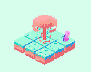
Very nice art, and concept!
Play Insatiable
Insatiable's itch.io pageResults
| Criteria | Rank | Score* | Raw Score |
| Presentation | #16 | 4.077 | 4.077 |
| Overall | #39 | 3.400 | 3.400 |
| Gameplay | #47 | 3.077 | 3.077 |
| Concept | #49 | 3.538 | 3.538 |
| Immersion | #55 | 3.000 | 3.000 |
| Relevance to the Theme | #63 | 3.308 | 3.308 |
Ranked from 26 ratings. Score is adjusted from raw score by the median number of ratings per game in the jam.
Credits
Lusitano
External Credits
Silkscreen font by Jason Kottke
How did you/your team interpret the theme?
You are evil. You eat everyone.
How was your/your team's experience in this jam?
It was my first online Game Jam. An absolutely incredible experience.
Content Warnings
N/A
Comments
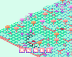
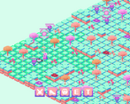
Love the color palette and art style! Seems like some UI stuff needs worked out. I noticed the damage numbers appear underneath certain objects instead of above and it's actually a little hard to see the black text over the abilities. It may need an outline of some kind.
Overall, nice job! And congrats on submitting to your first jam!
Nice colours and animations, especially for a first try with pixel art. I think some sound effects would be very good (walking, attacking, taking damage). Those should also make the short background loop mentioned below nicer to listen to.
I really like the color palette and the perspective you created. I really enjoyed it. I would love to see it fleshed out with additional mechanics. Nice work.
Well, it's surely looks sweet, but gameplay is quite simple. It would be nice to add some variety and make UI more intuitive.
The artstyle is amazing, it's really aesthetic and the color palette <3
At the beginning the game was pretty confusing, and as someone here said, UI is pretty complicated. Overall I think it's really cool!
The color palet is so cool! These kind of colors are my favorite, I don't know if hyper light drifter is one of your inspirations but it gives the same vibe. One thing I have to say, is that the game looks cool and the systems interesting, and probably very fun if you understand them, which I don't. I feel overwhelmed by how many actions I can do. A tutorial would be nice in the future. Still, good job !
Thank you! I agree, I love these colors as well! I never heard of hyperlight drifter until now, but after a quick search, I can tell that I will like that game. That is true, I need to practice a better tutorial specially for turn-based games as they might be a bit complicated at first. Thank you again!
Nice artwork and fun to play, but UI is very complicated for me. And I don't understand if I have move left or not. Music is too short to loop. Other than that it was fun to play.
Game is very pretty looking although it's hard to tell what my health is, the gameplay is a little repetitive after a bit especially with so many enemies but overall a very fun concept and lovely style :D
Great classic presentation and fairly easy to pick up.
PROS:
- Loved the pixel art, especially the color palette.
- Interface was nice and intuitive other than the symbols for "e" and "t" not being too clear initially.
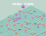
- Objective is explicitly called out in the pre-game cut-scene so you're immediately guided to what you're supposed to try and do.
CRITIQUE:
- Volume control or mute button would be appreciated since the music loop did get a bit old with the level lasting a long time.
- Control labeling wasn't too clear for some controls as mentioned above.
- The enemies look like "orbs" and the objective calls out the orbs so might want to better distinguish things you need to defeat vs things that could help you but aren't necessary to defeat.
Hi! Thank you for the comment and criticism. This was my first time doing pixel art so I am quite happy you enjoyed it. I agree that the music might be a bit repetitive after a while and a sound menu would be good. I intend to implement it in my future projects. Control labeling and objective calls it is something that I definitely should have made a tutorial specific for it. I will try my best in the future to create one solely for learning the mechanics and enemies. Thank you!
I like the pastel colour but probably better if you increase the contrast for the text or any UI above the game. This is really good for a first game jam.
The art is good - just maybe use other colors? So the different buttons and tiles stand out from each other? The controls are also kind of strange and I don't know how to move the camera and can't continue the game after killing everyone in one place and not being able to move the camera. But this is a great game!
Exceptional pixel art.
It was a little difficult to see the keys for the actions.


Leave a comment
Log in with itch.io to leave a comment.