Play game
The Greatest Hero's itch.io pageResults
Criteria | Rank | Score* | Raw Score |
Relevance to the Theme | #45 | 3.688 | 3.688 |
Presentation | #49 | 3.375 | 3.375 |
Overall | #63 | 3.125 | 3.125 |
Concept | #63 | 3.250 | 3.250 |
Immersion | #74 | 2.688 | 2.688 |
Gameplay | #78 | 2.625 | 2.625 |
Ranked from 16 ratings. Score is adjusted from raw score by the median number of ratings per game in the jam.
Credits
Eduardo Jacichen - Coding & Art
Luiz Zamban - Coding & Sound
External Credits
N/A
How did you/your team interpret the theme?
We thought that the initial idea of someone who is not the hero would be the villain. But we thought that it would be a good idea to highlight the unsung heroes that assists the "Great Heroes".
How was your/your team's experience in this jam?
Pretty good, the week long deadline was more forgiving but we still thought that with more time we could have polished better the game.
Content Warnings
N/A
Leave a comment
Log in with itch.io to leave a comment.
Comments
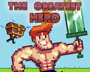
I like the concept, but why a chest?
It could be a normal human sidekick thiner and smaller than hero, anyway i enjoyed the near 300 miles, meters? played. I like to see more options because as somebody already said it turns monotonous, perhaps after some distance they could find a shop or a town and break the monotony of the same monsters and same background.
I think this game has a lot of potential and can be expanded further. Keep on the good work!
P.S. on a second round i saw the sidekicker is holding a big chest LOL...
Thank you!
We want to increase the diversity of weapons and enemies in the future, it can get pretty boring after a while.
Yeah he is holding a chest hahaha! Maybe it isn't so clear to see it the first time
Very good concept, nice pixel art, gameplay is good but there should be more things for our hero to change as the game gets monotonous after a while. For example, new enemies from some distance that we fight with something else.
Thank you very much Dortex!
We wanted to put more enemies, weapons and even shields varieties. But since we are very unexperienced at programming in Unity we spent most of the time fixing and understanding stuff rather than programming, so we didn't have enough time to increment our game.
But we want to do that in the future!
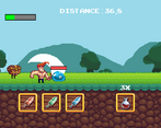
I love the concept, reminds me of an old flash game with a similar one. I also really like the joke in the title screen where there's two sets of buttons for the hero and the guy you're actually playing as, but it might get super confusing. The art is also fantastic, and I love the fast-paced rock-paper-scissors gameplay.
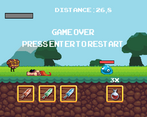
The problem is the game kind of gets stale after a while. My high score was 466.8 distance, but it got fairly boring at half that. I know you say in-game that there'll be more monsters, but I'd also really suggest having a larger weapon selection, too, like around 5-7. That'd make each monster more of a puzzle. If you do go for that, introduce the weapons in slowly, to make sure the player won't get too confused!
I'd also recommend making the health potions a little stronger.
Aside from that, the game was still pretty good, definitely needs to be expanded on in the future!
Thank you very much! You are right, the game gets pretty boring after a while for lack of diversity.
We want to make more weapons, enemies and we even had an idea that we couldn't implement due to time restraints of a shop that you could buy more gear for the hero.
About the health potions, they are indeed pretty weak so I think we can make them a little stronger.
Cheers!
Interesting combat mechanics: A Rock-Paper-Scissor but with Elemental swords instead! The art is good and I love the parallaxe!
I think the music is really short and could be improve, same for feedback effects (it would be nice to have more impact during the battles, like cam shake or sound effects) but maybe you did not have enough time to polish everything, and that's absolutely normal!
I love your interpretation of the theme, I'm a big fan of fantasy/Dragon quest-style adventure :)
Thank you!
You are correct, improving the feedback would make for a much more pleasant experience! We hope to polish it in the future :).
I'm really glad that you liked it!
Liked a lot your pixel art nice game!.
Thank you! Very much appreciated :)
Text is awful to read at the beginning. Controls are quite clunky to change between swords. Barely fits the theme as I don't feel like someone giving the hero weapons, but I just feel like I'm playing as the hero myself.
Those are really valid critics, we will keep those in mind. Since this is our first jam using Unity we really struggled to get it done.
We wanted to give more features that would reinforce the idea that you are assisting the Hero, but then again, time is key.
Thank you for the feedback.
I like the pixel are and music, the gameplay is simple but works good. I found a bug where I wasn't able to click play in the main menu, the game just wouldn't start, but after I waited a little it worked again.
Nice game! The art is fantastic, and the gameplay is simple and easy to understand!
I think toggling the sprite of the hero's sword would really help make the game more intuitive. That, and maybe changing the sounds of the sword swing depending on what sword is equipped? (a fwoosh for the fire, a rumble for the grass, and like a frozen sound for the ice)
I also think arranging the sword buttons in a triangle might be a clearer way to help players remember the advantage system
Well done!
Thank you!
Oh these two ideas are really good, I think I'll take them! It would make the game a lot more intuitive :)
Cheers!
Very simple and fun reaction game!
Thank you! I'm really glad you liked it!
liked this game! ran into a bug where the chest would continuesly open if you clicked a sword multiple times but thats no big deal. the idea is great and i like the simplicity of it. The art was really good too
Oh thats a bug we couldn't solve in time! Hope to fix it in the future :)
I'm really happy that you enjoyed the game!