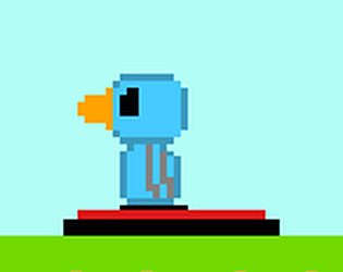
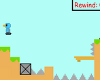
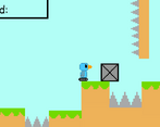
The hitboxes could be more generous and the background music gets annoying but other than that it is a good little platformer
Play game
Reverse Adventure's itch.io pageResults
| Criteria | Rank | Score* | Raw Score |
| Game Design | #817 | 2.894 | 2.894 |
| Fun | #822 | 2.788 | 2.788 |
| Theme | #855 | 2.879 | 2.879 |
| Overall | #968 | 2.654 | 2.654 |
| Innovation | #998 | 2.530 | 2.530 |
| Graphics | #1042 | 2.561 | 2.561 |
| Audio | #1053 | 2.273 | 2.273 |
Ranked from 66 ratings. Score is adjusted from raw score by the median number of ratings per game in the jam.
In what way does your game fit the theme?
You need to go back and forth to win the game, use buttons and a stopwatch (Rewind) to pass al levels and win the game.
Did you write most of the code yourself and made all the assets from scratch?
Yes, I wrote all the code using Construct 3 myself, I also made the pixel art and the music. All that is my work.
Comments
Really fun game! The art and sound effects are cute and the idea is very nice.
Sometimes movement and collisions (especially with boxes) are a bit buggy, and at one point the character turned left when going right, but just small things.
The game itself feels well designed and I had fun playing it. Also I like a lot the ending screen using the buttons, nice touch! Good game and keep it up!
Would highly appreciate if you could check out my game and leave a rating :)
Very fun game. Played to the end, smallest change, I would add a reset button. A few times I got into a no-win situation and it felt humiliating having to go purposefully die :D
I was able to finish the game! Sometimes I felt like some hitboxes were so out of place that made want to quit xd But overall really nice game!! Not only you have to think how to get to the red button, you have to analyse how to go back, which is a good premise for a good puzzle platformer.
Similar concept to me in the whole complete the level and race back to the beginning! Nice game though! I enjoyed solving the levels!
The concept and the way you featured the rewind is very good, but there are bugs. i can get stuck in some places and can't progress in the level. It woud be also cool to add some animation.
*maybe you sould also like to try and rate my game*
I loved this game but ı would see some animations if you add animation this game will be perfect but totally good game
The idea and adaptation of the theme are very cool! In general the game is simple and fun, my only day is the thorn colliders that are a little strange in my view, but anyway good work!
Cute little game.
Level design was good enough, and the art and sound effects were pretty well-made and cute.
The only thing I really take issue with is the hitboxes on the spikes; they definitely feel bigger than the graphic implies (even if only marginally so)
Besides that, well done!
Nice game.Controlls cause issue when playing in browser .
fun take on the theme, nice levels and handles really well great job! I did have an issue in the browser with the up and down arrow keys but I got through.
I like the concept, I had this issue with the up and down arrows in the browser, so when i tried to move up the browser move along with with so it was tricky to play
The idea of manually going back in time and not automatically is very refreshing! Good game!


Leave a comment
Log in with itch.io to leave a comment.