Play game
Time Collapse - Brackeys Game Jam 2020.2's itch.io pageResults
| Criteria | Rank | Score* | Raw Score |
| Theme | #539 | 3.368 | 4.125 |
| Game Design | #700 | 3.062 | 3.750 |
| Audio | #828 | 2.654 | 3.250 |
| Overall | #837 | 2.858 | 3.500 |
| Graphics | #877 | 2.858 | 3.500 |
| Fun | #908 | 2.654 | 3.250 |
| Innovation | #982 | 2.552 | 3.125 |
Ranked from 8 ratings. Score is adjusted from raw score by the median number of ratings per game in the jam.
In what way does your game fit the theme?
You can rewind or advance time in the environment to be able to advance. The development of the game also goes backwards as the game progresses. It starts with interesting scenes ending up with bare-bones prototyping assets.
Did you write most of the code yourself and made all the assets from scratch?
Odin Inspector, InControl (Input System), Cinemachine and Timeline were used for the development. The rest of the code was written by us.
Assets were from the POLYGON Dungeon Pack from the AssetStore.
Main character was reused from previous projects.
Leave a comment
Log in with itch.io to leave a comment.


Comments
This has to be the best looking game submitted to this jam. All visuals, animations, background stuff, etc. were extremely well made. Also, the usage of theme was on spot. The only real problem I've stumbled upon during my playthrough was that you had to wait too long after respawns for the stuff to fall down in the vertical levels, which was getting pretty annoying after several deaths.
Overall, I'm amazed, this is one of the best submissions I've played so far. You should really put some time into making your ratings count go higher, because I frankly believe your game could end up very high on the ranking.
This game seems really polished and seems to have a lot of potential! However there are a few things to point out:
- The controls are a bit difficult to wrap your head around, between careful platforming and constantly switching between forwards and backwards time, it gets very complicated quickly. Not that this is bad, but I think more complicated platforming challenges should be saved for later once the player is more accustomed to the controls instead of throwing them right into the deep end so quickly.
- The red death areas don't look like they should kill you, to me they look like rubber or just a normal platform. I think they should be replaced with spikes, or lava to make it more obvious to the player.
- I think there should really be just one button to change time, having more than one is very confusing.
- The assets, music and animations used are all great! Same with the UI!
- There should be a more obvious visual indicator for when time is moving forwards or backwards, like a blue tint on the screen or environment when going back and red when forwards.
Still a very polished game, and makes great use of the theme in the gameplay!
Thank you for writing such detailed feedback, I appreciate it. We tried a button (Y on controller) that toggles the direction of time, but I got lost when trying to make split second decisions. Maybe with a better UI showing the flow of time it could improve. I agree with the rest of your feedback. I wish we could have done more, but some major bugs appeared and we ran out of time fix the other stuff. If you are interested, we will release a better version after the voting period is over.
Thanks, I'll see if I can play the updated version!
i like the main character and the mechanics but is a little difficult to pass
Thank you. I agree it gets hard really fast. We ran out of time to set a better learning curve, but we will work on it.
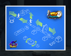
I really liked the puzzle mechanics and the idea in general. The game is fun and do its job. I just have some points: the character could have more friction, so he wont be slidind in the ground. And the red blocks could have more "danger" into it. Like, if they were in a light red, more vivid or have some texture that reminds me danger (lava, with yellows, oranges and reds, for example). One more thing is that we dont have a menu, so I played and quit it. Its a good thing to have in a game. But it doesnt change my experience. I really liked your game, and you guys did a great job. The art with the name is AWESOME and the tutorial image is beautiful too!
We're glad you liked it. Getting the movement of the player right was one of most difficult aspects of the game and I agree it ended up feeling a little slippery. We ran out of time to make the menu, but it definitely would have been nice. Thank you for your feedback.
Very awesome game! great art and music. the mechanics felt really fun! Nice work!
Thank you! I'm glad you liked it.
Very good game! I really enjoyed the art and main rewinding mechanic. I'm quite surprised your game doesn't have more ratings! Please check out our game if you haven't already, as well. https://itch.io/jam/brackeys-4/rate/722658
Thank you. We'll try promoting more our game during the week. Btw, loved your game.
Great gamedesign. The movements are fluid, the rewind mechanic implemented well. Also I really dig the music. Nice job!
Thank you. As a hobbyist musician, I'm really happy you liked the music.
It controls nice, and I really like the idea of being able to rewind falling objects in the level!
Thank you. I like how we had similar ideas (rewinding time of the objects), but ended up with two unique implementations.