Play Thingy
Guyman's Adventure's itch.io pageResults
Criteria | Rank | Score* | Raw Score |
Audio | #634 | 1.890 | 2.500 |
Graphics | #813 | 1.701 | 2.250 |
Theme | #822 | 1.701 | 2.250 |
Innovation | #844 | 1.512 | 2.000 |
Overall | #848 | 1.575 | 2.083 |
Fun | #899 | 1.323 | 1.750 |
Game Design | #908 | 1.323 | 1.750 |
Ranked from 4 ratings. Score is adjusted from raw score by the median number of ratings per game in the jam.
Leave a comment
Log in with itch.io to leave a comment.
Comments
Nice touch with the tutorial. I like that you added the ability to jump to the end of each dialog message, many games in the game that have a dialog system that types our the text doesn't implement that. I like how the player looses his hear when he dies. 8 bit audio effects or good and retro.
The physics of the player jump could be tweaked a bit though. Felt very floaty. Maybe try adding more gravity and counter balancing that with more force on the rigidBody.
Nice submission.
I'd love your thoughts on my game.
Thank you for the rating! I'll be sure to check your game out!
Rated - interesting game haha. Tweak the controls and other's suggestions to improve it. Hope you learned a lot in the jam. Good job for submitting something~ Please check out my entry if you can.
Thanks for playing and rating! Glad you thought it was (ominous theme) interesting.
Unfortunately, I don't own a Window so I can't play your game. I can say that it looks very
niftyneat though.Alright, so I couldn't pass the first level, so my feebacks will be based on the short content I saw ^^
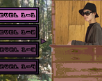
First, you talk too much xD (I guess it is your pictures ingame, sorry if it's your sister.). Less is alway better, expecially when you explain the controls and mechanics. You don't want your audience to fall asleep when providing key infos. Be concise. Especially for a jam, people have less patience. You need to hooked them the first 5 seconds after they pressed the "start button". For your next jam, challenge yourself, no text :p
My main problem is that I got stuck in the first level... lol. I think it is good guideline to started the game with easy content, just to encourage the player to explore the game, get to know it, learn the mechanics, etc... To be fair maybe it's my fault and I missed something during the explanation in the menu... and if it's the case, this is just too much text. It is 23h54 and I am tired, I don't want to read x)
How do I pass the 2 ducks with the grenade just on top?
The controls are too floaty. For a platformer I expect something more snapy
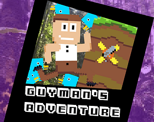
You putted a good effort in the graphics and the sounds, so good job on them ! The UI with your pictures, the characters, the ducks show me you have a good sens of humor. I think you are a funny guys, and I think it's going to be your key asset in the futur, in your life, and in your games if you continue to make games.
Keep it up !
I am very curious to see the games you will make in the futur, when you'll have more experience as a game designer, and as a programmer.
Cheers
Thanks for the playing my game and leaving such an in depth review!
My goal when designing the first level was the make it a decent challenge, but not so much that it's too hard. In your case though, the problem may have been a glitch that I only found out about post-deadline, where skipping the dialogue typing will skip the next line as well. So, you probably wound up missing some important information. (I swear that bug never happened in the editor... guess I know now to also playlets the builds thoroughly.) Though, looking back, I probably did make the first level a bit too hard.
On the dialogue, you're right about there being too much. I really should have put less at the start and instead put a few tutorial messages throughout the level in order to combine the tutorial and the gameplay.
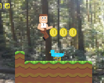
As for the gameplay itself, increasing the character's gravity will definitely be something I'll do in future projects. It does tend to work in the player's favour in the case of the part with the two ducks. What you have to do is jump onto the side of the platform while the ducks meet in the middle, and then you can just jump right over them, grabbing the gun in the process. It is still pretty difficult to time jumps when the character is so floaty though...
I'm very glad that you liked the UI sprites, the character, and the ducks! Humour was mainly what I was going for in this project, so it's good to know that the graphics are indeed funny.
Thanks for all the feedback! Cheers.
Rated! It was nice. Needs some polishing, but i had fun.... Check out our game https://itch.io/jam/cgj/rate/477169, rate and leave us some feedback.
Thanks for playing! I sorta procrastinated a bit on this jam, and ended up rushing everything the last night before the deadline, so I didn't have the time to polish a bunch of things that I really should have. I'll be sure to check your game out and leave a rating too!
That was pretty funny! I didnt expect his head to fall off so easily :D The jumping was very floaty but at least it gave you time to avoid the evil ducks, uh, i mean pet the lovely friendly blue ducks :D Nice work!
Thanks! I was gonna have one of those "hold jump to jump higher" systems, but decided to comment it all out just 'cos I thought it was goofier to just have a floaty jump with a fixed height. And thanks for that dialogue tutorial by the way. Wouldn't have known how to get my textboxes to scale properly without it!