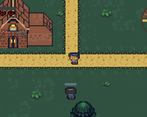
Play WebGame
Lies Throughout's itch.io pageResults
| Criteria | Rank | Score* | Raw Score |
| Theme | #77 | 3.705 | 3.705 |
| Overall | #113 | 3.351 | 3.351 |
| Graphics | #137 | 3.723 | 3.723 |
| Innovation | #138 | 3.259 | 3.259 |
| Audio | #178 | 3.250 | 3.250 |
| Game Design | #199 | 3.286 | 3.286 |
| Fun | #351 | 2.884 | 2.884 |
Ranked from 112 ratings. Score is adjusted from raw score by the median number of ratings per game in the jam.
Leave a comment
Log in with itch.io to leave a comment.


Comments
I liked the RPG elements and the sprites. All the walking got a bit boring at times, though.
Please rate our game: https://itch.io/jam/cgj/rate/473783
Cool idea, but i think it needs a lot of polish (i guess you didn't have time to finish it properly). A lot of missions are the same (follow X guy who is with my sister/wife, and i don't trust him), i find weird you can't talk with other people when you are in a mission, you get stuck sometimes in the buildings... etc.
The graphics looks pretty cool for being done in a week, well done!
Great game, especially the graphics.
Hello! :D I absolutely loved the art in your game! The music was nice and upbeat and the concept fit the jam's theme really well :)! Great job!
It's really good
Hi, i just died again on my 3rd playthrough so i decided to rate the game based on how far i have reached so far. I did not read the tutorials on the games main page so it took me quite a while to figure that i was supposed to follow the black square. Also, who is that black scary looking guy, sometimes they appear and sometimes they don't. And sometimes they disappear after one interaction but some just stayed there so i went ahead and black out a few times only to know that i actually lost health due to that action. I do love the graphics and sound though, seems very polished.
Hi, so i played the game and now im gonna comment about it. Lets start off by saying the art is awesome, really impressed. Now, lets move onto what i didn't like about the game. The game actually really resembles mine, lol. Anyways.. i couldn't figure out what the lying mechanic was for or what telling the truth or lying did tbh, maybe i'm just dumb. Another useless mechanic would be the minimap. Its just a slightly zoomed out version of the main camera, doesnt help anything. I also noticed that every time i load a new screen like the credits screen, the music restarts. Guess you made different scenes for each screen, i do it in the same scene by disabling and enabling different components to get the correct result (i don't know why i'm pointing this out lmao). Anyways.. the game also doesn't appear to fit the theme, since the game isn't doing any of the lying, the little dude is. All and all i'd say the concept is cool but the execution is lacking. God damn this wayyy alike my game. All and all it's not a bad game, you could easily expand upon it and make something much better. Kudos! Cya!
Ummm... Ok, yeah agreed on the lying mechanics improvement and mini map improvement...
I kinda don't agree with the theme not fitting, because it does fit the theme as you move ahead in the game... (Read the tutorial section if you don't wish to complete the game by yourself). I made main menu and scenes last hour of submission and had no time to [don't Destroy on load]. I will add it asap...
Thanks for the improvements suggested... Will surely improve
Its ok. The game will be really fun once you do improve it. And your welcome! :)
Good game. Great job. Minimap I see the same as in the game.
Interesting little experience. The art was pretty nice, however I found the game itself felt like a little bit of a chore. The lie/truth options felt a little random- pointing out the obvious lies didn't seem to give anything towards my lie meter (and played the "denied" sound?), while accepting the lie tasks just punished as expected. Doing the regular tasks and lying about them seemed to be kinda random too- sometimes you lie and they'll just call you out on it for some reason, which would make more sense if the stuff you did was really able to be called out on. Lying about the club makes sense, but lying about the delivery (and then giving it to the requester as the lie?) seems a bit odd. What I'd suggest is maybe having specific things, like "they went to X Pub (Lie)" and so forth, so it makes a little more sense as to how you're actually going to do whatever (and if you're gonna get called out) Also, i read the earlier review about the minimap and one thing i'd say to improve it is to zoom it out a tad. Right now, it seems like it's just a copy of the view you have, but with less space since the edges are cut off.
Overall, though, good concept! Good luck on your expansion.
The graphics are really nice and I like that minimap on the corner. The sounds are also good. Please, consider playing mine and rate it as well.
https://itch.io/jam/cgj/rate/477298
Great graphics! What a fun game!
Looks and sounds amazing, I couldn't play it enough because of a bug where i got stuck inside a tree, I bookmarked this to play it again :D
Good game man
perfect game!
The design the graphics WOW just wow!
Its amazing how much you have done in a one week
Hope you will update it after the jam and improve it even more!
Great job!!!😁
I like the environment art, especially the plants. Best pixel art plants I have seen so far in the jam :D Its a very unique and interesting concept, did not think of this one. Very original!
Here are things to improve:
Also, I found a house with wrong collision:
All the pixel art improvements will be surely made, as this was my first time in pixel art, I didn't knew how the pixel art is supposed to go with the environment, I looked at a few games and got the idea... Surely improve on art details...
The dialogue mistakes you talking about are intentional, its a clue for player that what the NPC is speaking is lie 😅, I am working on the Tutorial part...
The collision detection is a glitch... Unity is not good in handling mesh collider... Will sort out that issue soon...
Nice game! Sometimes it was hard to figure out how the game worked. But it's a good jam game!
Feedback on my game would also be appreciated. (Its my first game jam)
It took me a while to figure out how the game actually worked but once I got it it's really well done. Good job I suggest maybe switching out the block square for an arrow to make it more clear what its actually for.
idk if it was me or a bug but the game kept freezing
it must be a bug, try using a downloaded version, maybe WebGL has caught the bug you had...
For some reason I lost lol But, nice job!
Maybe just one thing... Not sure if it is my bad and I'm just a casual, but I didn't understand the purpose of the minimap. Looks fine and good, but it only shows the same as the main camera, so I see no reason why to have it more than esthetic and in that case I found it unnecessary (not saying that it's wrong, just that you probably can take advantages that you have a minimap and play with the player's expectative).
Anyway, good job!!!
The minimap is a result of my over ambition... I imagined map to have location of NPCs to follow, and all sorts of things just couldn't complete it in time...
Hi,
nice game. took me a while to figure out the black square.
Please feel free to try out my game and rate it here: https://itch.io/jam/cgj/rate/474542
Many thanks,
Kris