Indie game storeFree gamesFun gamesHorror games
Game developmentAssetsComics
SalesBundles
Jobs
TagsGame Engines

Arrain

219
Posts
3
Topics
6
Followers
11
Following
A member registered Aug 05, 2019 · View creator page →

Creator of

Recent community posts

(1 edit)

I know I know. The good old walljump mechanics which destroy the gamefeel^^. Thanks for the feedback! Soooo... I have written that I made 99% by myself. The only thing which I didn't make was the ripple effect. It would be not that difficult if you start practicing to code shaders, but I'm simply not good in it. If you want to make something by yourself I would suggest the unity's shader graph, although you can also learn shader scripting. 

Ripple Effect: http://blog.onebyonedesign.com/unity/unity-ripple-or-shock-wave-effect/

If you have problems on how to use it, just ask.

If you didn't watch it and are interested how I made the rest of the game(in the description are all the tools/tutorials I used) you could watch my makingOf: 

What was great: The graphics, mechanics, user interface and a awesome color combination! Improvements: Animation of the main Character. You could have just squished/stretched him a bit, to give him a move animation. That would made everything more organic and would give the player a better feeling. Other things were all in all good! Hope you had a good jam! :)

What was great: The graphics, mechanics, user interface and a awesome color combination! Improvements: Animation of the main Character. You could have just squished/stretched him a bit, to give him a move animation. That would made everything more organic and would give the player a better feeling. Other things were all in all good! Hope you had a good jam! :)

You made everything by yourself? Wow, that's an effort. But it was worth it. The audio was really really good (Sound effect were well placed and the music fits the ambience). The Graphics, from background to character looked all awesome. Only the level design/mechanics were a bit strange. The character can only hammer to the left and right or am I wrong? I would change that to give the player a more versatile experience. But overall it's a awesome game for a gamejam.

You made everything by yourself? Wow, that's an effort. But it was worth it. The audio was really really good (Sound effect were well placed and the music fits the ambience). The Graphics, from background to character looked all awesome. Only the level design/mechanics were a bit strange. The character can only hammer to the left and right or am I wrong? I would change that to give the player a more versatile experience. But overall it's a awesome game for a gamejam!

Wow, really creative use of the theme. On the beginning it was a bit difficult to understand (at least for me, but I'm a fish), but after the intro levels it started to make fun. I loved how you implemented the rewind mechanic in some kind of recursion. The graphics were good for this kind of game. Audio was... not that much existing but the "piep" sounds were good placed^^. Good job on this entry!

Wow, really creative use of the theme. On the beginning it was a bit difficult to understand (at least for me, but I'm a fish), but after the intro levels it started to make fun. I loved how you implemented the rewind mechanic in some kind of recursion. The graphics were good for this kind of game. Audio was... not that much existing but the "piep" sounds were good placed^^. Good job on this entry!

Here we have a really good game. What I like: The art, audio (I know you didn't make them, but that doesn't change the result. Obviously it would be cooler/better if you made them too^^).  Game design is great. With the layout you made the player has really to use the rewind mechanic (+ to dodge things). Character Movement(+ mechanics) feels good, all in all a good entry!

Here we have a really good game. What I like: The art, audio (I know you didn't make them, but that doesn't change the result. Obviously it would be cooler/better if you made them too^^).  Game design is great. With the layout you made the player has really to use the rewind mechanic (+ to dodge things). Character Movement(+ mechanics) feels good, all in all a good entry!

I love the story and the cutscenes! The graphics are a bit too "simple". If you create a little character and animate it, it would look great. Also the colors are a bit oversaturated. The mechanics were all in all good. Improvements for the mechanics/controls: Lower the speed of the player. If it's a fast paced game and you can't change that, you should make that the camera is fixed on the players position. The music is great and I love it! All in all good work and with some more polish it would be even better!

I love the story and the cutscenes! The graphics are a bit too "simple". If you create a little character and animate it, it would look great. Also the colors are a bit oversaturated. The mechanics were all in all good. Improvements for the mechanics/controls: Lower the speed of the player. If it's a fast paced game and you can't change that, you should make that the camera is fixed on the players position. The music is great and I love it! All in all good work and with some more polish it would be even better!

(3 edits)

[CLOSED THREAD] Reason: I joined the Mizizizis Game Jam and I can't give feedback without playing it extensively. Overall great entries and I hope everyone has learned something new!

---------------------------------------------

[READ CAREFULLY]

I'm not doing a rate for rate (you don't have to rate mine). I'll go trough this feed from the first to the last, no exceptions. Do NOT post the game here if you can't handle feedback. I'm playing only BROWSER games (I will not react on other games, clearly they didn't even read this).

[OPTIONAL]

If you are interested in makingOf's, tools I used and my procedure of creating games you can watch it here:

CONSIDER: I'm new to YouTube (VideoEditing with Davinci Resolve is like flying a plane lol), not a native english speaker and normally very shy. So every feedback/criticism regarding to the video is more than appreciated. 

I love difficult games. And this one was great! I liked the tricky level design. The music, pixel art and mechanics were good. Couldn't stop playing until I finished it :DThe only thing what I need now are more levels ;)
(1 edit)

Wow, one of the best games I've played so far. Assets and code from scratch? Awesome work! The puzzles were really challenging and made a lot of fun. 

I enjoyed the background music, the only thing which was a bit exaggerated was the sound of the jump (a bit to intensive/too loud?). If you use a such intense jump sound I would change the pitch dependent of a random value between two constants, so it sounds every time different and is not that outstanding. 

Love the look of the game. Good job!

What a funny (rage) game. I really like the style of the game (ragdolls, graphics...), the idea behind it.

The controls are a bit weird/fast in kind of uncontrollable. Sometimes if you are unlucky the ufo stops that far away, that it's a bit annoying. Im on my laptop and forgot my mouse at home, it would have been easier if the winding up part is also on the keyboard (but I think that's my problem :D)

But overall it's a good and the most important FUN game. Good job!

It could be my fault. Idk why but sometimes specific browser games don't work (I have to say i have now just a macbook pro 12.9', which is of course not  the best for any kind of gaming). 


Im not able to play your game I'm so sorry. My safari browser said no and in chrome I only hear music and see a frozen screen. I have to say the music is really good. :D

Haha congrats!

The dev fish thought it's better to leave a blood mark on "restart" because the more tries a not dev fish has, the easier he remembers. Therefore he doesn't deserve a lower difficulty. But yeah... I think that's mean. I will change it ^^.

Thanks for the feedback.

(1 edit)

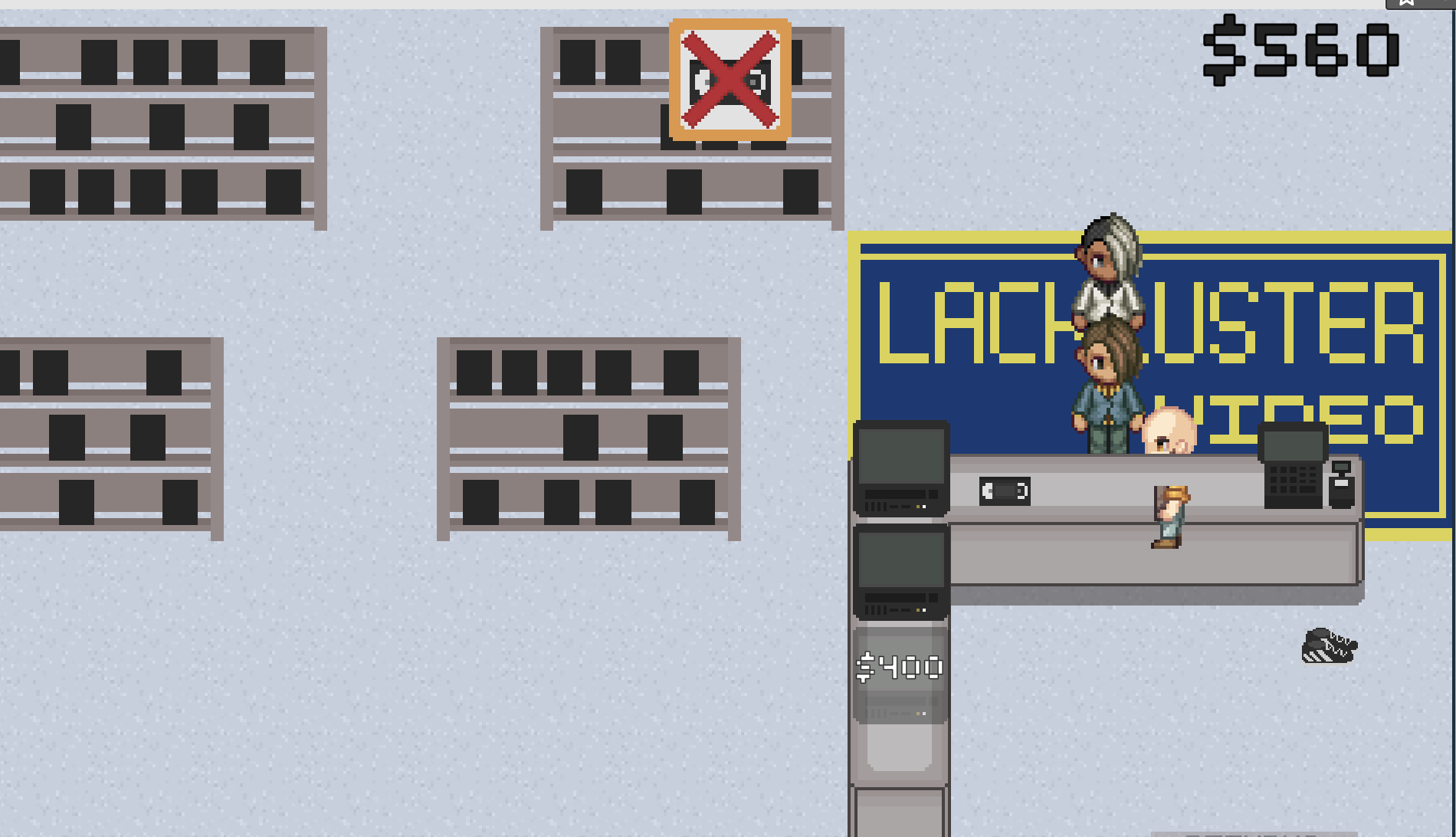
Interesting game. It's something different. The graphics are good, also the movement feels good. At the beginning I was not sure how it works, but after some time I managed it. I don't know if I played it right, but mostly I was outside the sales table. Maybe put the shelves behind/below the salesman? Or change the layout a tiny bit. The Upgrades were good, they gave me a temporary aim.

Another suggestion: Remove the colliders from the customers or change it a bit. The first problem was that the collider was too large (y - scale), so I couldn't run past them if I was right behind them. The second problem:

But things like that are normal in a game jam :D

Everything else I didn't mention was fine and well executed (UI, Introduction, red Arrow which points at the shelves etc). Overall good job.

Glad you liked it. I will for sure work on the walljump mechanic. Thanks for the feedback!

Thats a good idea, thank you for the feedback and for playing!

Wow, thank you for this!

 Haha. 

Yeah you're right. Otherwise its like "die once to start playing". 

Ohh the good old walljump, i think that feature hits my rating right into the face haha. I was used to the walljump, so i didn't realize the bad behaviour. I think for the input buffer i could simply add a courotine which sets the "walljumpbool" after a certain time (after leaving the wall) to false. But of course i'm interested to see a better variant :)

Thanks for your words. Never got such a detailed feedback.

Never heard about that. But it sounds like fried. I like fried things.

(1 edit)

You're so right! On my first gamejam i was so happy about the positive feedback - "great", "awesome", "nice game"... But now i can't read it anymore. I love to get some criticism, learn from others and get some new ideas. But the rating system will not change. The best way to get some real feedback would be to create a small and active rating/gamecreating community where everyone does their part with heart. 

Haha I didn't know it since now. I'm glad you like it, thank you so much! You're right, I think I've to add this because otherwise you have always to die once. Thanks! :)

Thank you!

Haha, yes sometimes it's quite difficult and can be exhausting but It's the only way to create the things which come into your mind. Actually I didn't watched a brackeys tutorial for the lightning(had no time haha). I've just used a normal point & directional light (decreased the position- z axis and added to the player) in combination with a Sprite - diffuse material (added on tilemap, background, character). But I would recommend to avoid this and use proper 2d lightning, because I had many bugs with the rendering. :)

Thank you for your feedback. I agree totally with you. It's always difficult as developer (after being used to the game) to find out what's "strange". I've written that I made 99% by myself, but I can't accept that compliment because the ripple effect was the only thing I searched in the internet( I'm not that good In shader coding). If you want to check it out: http://blog.onebyonedesign.com/unity/unity-ripple-or-shock-wave-effect/

After the Jam I will update the controls of the player. Thanks! :)

I'd love to hear what you think:

https://itch.io/jam/brackeys-4/rate/723623

Hope you like it :)

You gave everyone here such an insightful feedback. You're such a great person, wow! I will check out yours in the next few days (im on my mobile now) and would also be honored to get constructive criticism :)

https://itch.io/jam/brackeys-4/rate/723623

Hope you like it!

Hi!

 Hope you like it:  https://itch.io/jam/brackeys-4/rate/723623

Cool first game!

Improvements: Shorter SceneTransitions, increase readability of the text (color, brigtheness, size)

Everything else was fine. Solid entry. Keep going!

Fun little game. Its overall good, it would only need a bit more polish. But hey, Gamejams exist mainly for the experience, fun and creating that what comes into your mind. :)

I've also made everything from scratch and yes it can be really stressful. But the more you do/practice it, the faster and better you get! Keep going :d

Nice puzzle game. On the beginning it was quite hard, nonetheless I liked it! :)

Improvement: Try next time (if there is so much to say about the controls) to use images to describe the controls or make it shorter/better readable (font & background contrast).

Overall good entry!

+Overall a good game. Great colors, art and audio. 

-The jumpAnimation is played after the jump (it seemed a bit weird), so I would suggest to play it right  on the button-input?

For a game made in 1 week its awesome :)

Thats a great game! Congrats on this one. The more I played it, the better it got! Normally I try to find negative things but... there aren't? ^^

The control mechanics are so good. Those are missing in my game, give them to me haha ;) 

Quite cool and challenging little game. And yes, it's a rage game :D

Sometimes it was a bit too difficult, but I think that's only because of my skills.

Well done, great entry!

We all have these problems :D

Just don't think too much about it!

I will let the link to my game here, in case someone wants to play it ;) https://itch.io/jam/brackeys-4/rate/723623

Im joining the queue :D

https://itch.io/jam/brackeys-4/rate/723623

Hope you enjoy it. Criticism is welcome.