Play game
carbon clicker prototype (browser game)'s itch.io pageResults
| Criteria | Rank | Score* | Raw Score |
| Promising Idea | #2 | 4.500 | 4.500 |
| Use of Themes - how effectively or uniquely does it engage in the jam's themes? | #3 | 4.200 | 4.200 |
| Overall | #11 | 3.950 | 3.950 |
| Playability | #12 | 3.900 | 3.900 |
| Aesthetic / Feel | #31 | 3.200 | 3.200 |
Ranked from 10 ratings. Score is adjusted from raw score by the median number of ratings per game in the jam.
Leave a comment
Log in with itch.io to leave a comment.


Comments
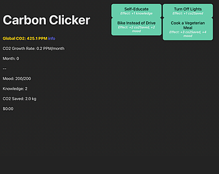
Ok so this could be great. Like really great. It needs art. Like in the buttons perhaps a transparency could fade in and then out of something related to the action when you click, but the concept nails the jam, it is fun, playful, and you can learn something playing... and perhaps feel empowered to do something... now that my comment is complete I shall go to wallow in misery.
Man, so you combined a game style I really enjoy for a "lazy-type" game and a topic I am not versed in to make a great learning utility also. I love the concept. This would be great as a phone app also, similar to cookie clicker, etc.
Although this seems like a simple game that requires only clicking, I like how the game encourages people to think deeply. In addition, it seems that the complex theme of climate change has melted very well into the game. I think it could've been better if art was added.
I have never played a clicker game but I really wanted to click more ! I really like the idea and I can really see this as an educational game somewhere sometime. I am probably gonna play the full game just to see what was added and how far you went. The writing seems really promising !
I like the idea you have. It reminds me a lot of Spent, which if that’s what your going for, it’s good. My main issue is the click fest aspect of it, as there’s not much depth. However this is a prototype, and I see the direction you’re going in, so it’s not a huge issue. Overall I would like to see where this goes.
I enjoyed playing through this prototype, and I appreciate the information given to the player through a life simulator! It was very well-written, and its humorous tone made it fun to read. My biggest critique would be that the text box that pops up is very hard to read, so I had a difficult time getting through what should be a fun and interesting piece of text. I suggest using colors that work a bit better together, and that have easier readability. Additionally, I agree with IronConMan that dialogue should be added for each button, in order to incentivize players to try everything. Writing is a strength here, leverage it as much as you can. Overall, great job! I'm excited to see where this project goes.
I really enjoyed this prototype. The whimsical fun fact dialogue was fun and kept me wanting gain knowledge. I like the idea you implemented of the different milestones formed from different button combinations, and overall having different effects on the stats of the emissions and the character and I would lean into that more. Consider adding dialogue for each button, they don't have to be as in depth as the fun facts, but something to keep the player clicking each button multiple times to have a more immediate payoff. Also consider having more buttons that have a more drastic upside and downside to add more difficulty for the player to balance out the various stats, like take the vegetarian meal for example, it has no real downside, so there's no reason for the player not to click it, perhaps those meals cost more money than regular meals. Make the player think of ways to balance those stats. This has great potential so far, keep it up!
Really cool idea, I especially like the log display as a narrative device! Excited to see what you cook up for the collective action phase.
My only gameplay feedback is that it's not 100% clear when exactly each button is able to be pressed again. Perhaps filling up the button left to right instead of changing opacity?
ah sure, that's how i initially envisioned it! we'll prolly use that approach instead. thanks for the feedback! we're excited to flesh out the collective action phase, seems like a great opportunity to exercise our imaginations