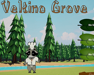
Icons are next. I got it in as a quick feature so players would have one. Right now I removed static meshes from the map. (it is a camera above player, but I left render shadows on). And yea our artist only provided us with one model, so I have to go in and make some new textures. I already did it for npcs but it didnt make it to release. (its in my dev build)
PhoenixDevelopment
Creator of
Recent community posts
Gameplay: Same glitches as others, but with the tutorial it was quite easy to play.
Art: Simple polygon art. It fit quite well. Reminded me of the old sim city!
Audio: Really enjoyed the music and the fact you put the artist/song name in the top.
Overall: Cool game. I'd like to see more features in the future. I'd look at sim city or any other city management game and incorp gameplay from it, but keep your focus on climate and not just earning money.
Gameplay: Overall plenty simple. It's your typical railroad "platformer." From my perspective, there's nothing really new or reaching out to me to show that this game is different from others. I'd like to see you push boundaries and not follow a standard.
Movement: Smooth and simple to figure out.
Music: Soothing and calm. Enjoyed it!
Graphics: 2D and 3D was an interesting experience. Artistically it worked quite well for you! Personally I would have liked to see some sort of shader on the 3d model at least to match the 2d art.
Narrative: Well written, and throughout the game it all fit with the climate theme.
Overall: For timeline we had, you guys did a phenomenal job! Hope you keep working on it.
I appreciate the comment. Cooking I didn't get to code yet. I was focused on the climate part and all the other subsystems. If you get to 50% karma bar (under minimap) from collecting, then you get a preview of what can happen to environment. (near main area). In the release an area of nice trees disappear and sickly trees are supposed to appear, but they are invisible. (Bug for some reason). Works in editor. I have a final tomorrow, but I do plan on looking at some of these bugs after, as well as getting some of the main features in: Cinematic I had started and cooking system.
I retargetted/made new rig with goals and ik limb. It uses ue5 mannequins animations with a little bit of adjustment. I'm a programmer, so animation wasn't high on the list when I did it. I'm going to eventually add more stuff. I do have multiple static animation poses I did for npc cinematic but cinematic didn't make it in.
I played until I won. (After taking down the government).
The game was good, but I honestly had no idea what was going on. I was just clicking the buttons that had positives on them, so any of the narrative essentially got washed out. I think more of the pop ups or forced context will at-least get information about climate change out.
Thank you for the reply. I've been programming as much as I could to get features in, and conversation was a last minute addition, so I never got to add in the "ted talk" about controls, etc into the actual game. Look forward to more releases even after jam is over. Our team is working diligently to get quality work done, instead of rushing.
Unfinished, but looks like you guys are on the right track. I do like the main character's design. Cute. There are some weird issues when coming up on the interaction box where it isnt registering, so I'm not sure how you are checking. Is it raytracing or bounding box crossing, etc? Regardless, good work. Hope to see more updates, even after this is over
I don't personally play phone games, but visually this is quite interesting. For those who don't have an android phone, you can download bluestacks on pc. https://www.bluestacks.com/bluestacks-5.html?utm_source=Google&utm_medium=CPC&ut...
and then you can install apk inside it to give the app a try!
Can't wait to see how this progresses.
I love the cat model. I'm not sure why but super kawaii... Anywho.. Is the cat going to match the interesting aesthetic of the background art? As someone said, it does seem very tutorialish from a youtube video. The text for distance, etc isn't really necessary. If it is meant to be like a lot of 3rd person games that say "press space to jump", etc when you are doing initial part of game, then yea it would make sense. Otherwise, good start!
The game right now from just a playtesting of the prototype is kind of confusing if you were to be showing it to someone to offer a pitch, etc. To help I would consider adding some floating text above game objects so that you at least know what the game objects are for and their intended use. (IE: What are the green chevrons for?)
Your game sounds interesting to me. I would recommend coming up with a one-sheet so we can get a production road map. Also a small GDD would be good so people understand more of the mechanics and aesthetics. Other than that, I think it fits the theme great and is definitely well scoped out size wise for this!


