Play game
Cyborguard's itch.io pageResults
| Criteria | Rank | Score* | Raw Score |
| Engagement | #15 | 3.000 | 3.000 |
| Theme | #15 | 4.111 | 4.111 |
| Gameplay | #17 | 2.889 | 2.889 |
| Overall | #18 | 3.306 | 3.306 |
| Presentation | #21 | 3.222 | 3.222 |
Ranked from 9 ratings. Score is adjusted from raw score by the median number of ratings per game in the jam.
Leave a comment
Log in with itch.io to leave a comment.



Comments
Great submission!
Thanks! I'm glad you liked it :D
nice submission. I especially like the situation where you had to drop below the lowest platform, attack, then bounce back up before you fell so far you couldn't save yourself.
I think it was a little chill for the genre -- I found myself with more than enough time to respond to all the attacks on normal mode. Possibly that was expected but I think challenge could use a bit of tuning. The character movement was also a bit "floaty" so I think tweaking acceleration on her jump/descent might add a lot more "connectedness" for the player.
fun game over all: I made multiple attempts and to clear levels and didn't hit any real bugs to speak of!
Thanks for the feedback! I'm working on trying to improve the movement to make it feel more natural, definitely a bit too floaty at times. I think we probably erred a bit too far on the side of being easy, I'm actually planning to make a harder difficulty level for a post-jam update to bring the tension up a lot more.
very nice concept. I wish I knew that I can fly sooner so I can slice those trojans
Thanks for playing! Something that's definitely on my to-do list is a better, more in-depth tutorial. The how-to screen and the page description definitely don't do the best job of introducing mechanics so a playable tutorial would probably help a lot.
Really great concept and great visuals to match. I also appreciate having a menu and configurable settings. I think the game would be massively improved with a few relatively small adjustments.
I hope this wall of text is helpful. I saw you asking for more feedback in another comment so I figured I'd offer my thoughts.
Thanks! I definitely appreciate the detailed feedback. We are working on an update for sometime after the jam ends so we're looking for as much feedback as possible. Originally I was trying to create character movements that were identical to a character I built in another engine but I was having a lot of trouble getting the acceleration to work how I wanted in Godot. But the original version had faster acceleration in the air so I think you're definitely right about how much that would help. I'll try to take a crack at that again and I'm sure I can get something that makes air speed feel better. The hang time at the top of your jump is probably a bit too long too.
That's definitely a fair point on the enemies. The first one is definitely the least challenging. On the normal/hard level, there is a more targeted enemy that will actively hunt down at least one platform before leaving the screen. I'm working on a ranged enemy that does something similar too so that will hopefully help increase tension a bit! I'm also adding a down attack that helps to deal with enemies on the bottom corner of the platform, I really should have put something like that in the original build. I'll take a look at the platform collisions too, I'm doing something a little unusual to have it be a one-direction platform that also still has corners so I may have made the corner collisions too high or something like that.
The attack idea is interesting, it makes me think about trying to have a dynamic aiming system where mouse position matters. Why I didn't have it aim off the mouse is that my plans originally was to let the player customize their loadout so their down attacks could end up different from forward or overhead, etc. So just aiming it off the mouse would make that more difficult unless it takes into account the direction of the mouse from the character. I have a couple ideas of how I could try to merge those ideas so I'll have to give it a try.
Thanks for playing and I'm glad you enjoyed it!
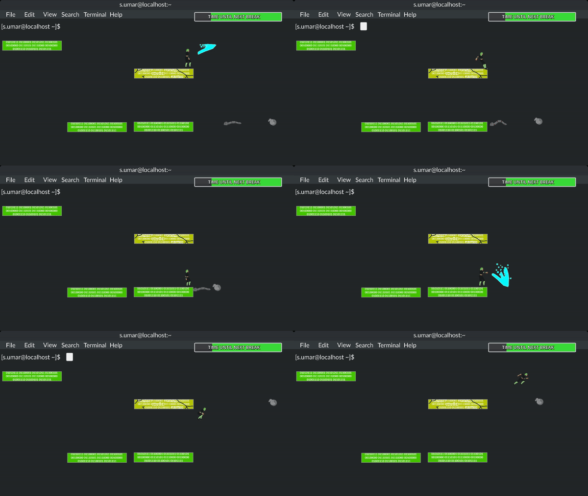
A fun take on the concept of hacking and cybersecurity in that its a platformer inside of a terminal. The movement feels a bit slow but I think the confined combat area works well.
Thanks! I'm glad you liked the overall concept. The movement is definitely something that still needs some polishing. I wanted to also add a light amount of acceleration/deceleration to give you a little more control over fine movements too but I couldn't quite get the right feel in time for the release. I'll try increasing the player's base speed too to see if that feels a little bit better.
I really like the idea and the gamplay. The controls seemed to be a bit too stiff for my taste.
Thanks for playing and the feedback! If you don't mind me asking, by stiff controls was it the choice of buttons/controls that made it feel stiff or how the character responded to your controls? I'm just curious what we need to look at the most for that. The controls are re-bindable but if the default controls feel cumbersome, we may want to use a different default to avoid that feeling. But we also currently lock movement once you make an attack so if that makes it feel stiff or unresponsive, I might want to revisit that. So I was just curious what made them feel the most stiff.
I had a hard time attacking the enemies. Often they were just a tiny bit above or under the hitbox to get them.
And I struggled a bit with the double jump, i haven't found the pattern how and when i can double jump.
I really appreciate the details! The hitboxes are definitely a bit finicky. I'm planning to add an attack that goes below the player so that will probably help cover the bases for attacking enemies a lot better than the current version. The double jump part makes me realize that I never mentioned or explained the double jump in the how-to or anywhere else, whoops! Essentially you get one mid-air jump that resets whenever you touch the ground. So if you fall off or drop through a platform, you only get a single jump. I'll have to put something in the page description about that to help clear that up too.
Epic game. I like how the viruses are represented as trojan horses and worms.
Thanks for playing! I'm glad you liked the visuals and that we got the idea across well. We wanted the enemies to remind people of actual digital threats.