Play game
Mission to an Eldritch World's itch.io pageResults
| Criteria | Rank | Score* | Raw Score |
| Overall fun and playability | #62 | 3.050 | 3.050 |
Ranked from 20 ratings. Score is adjusted from raw score by the median number of ratings per game in the jam.
Theme incorporation
"Ancient Ruins" theme (exploring ancient alien ruins), with some nods to "Solitude" (you're all on your own out there) and "Cosmic Horror" (mostly in later-level visuals).
Leave a comment
Log in with itch.io to leave a comment.


Comments
A very good game! I enjoyed the atmospheric music and the solidly implemented movement! Though it was a little tricky to understand, I also really liked the combat system, and the amount of freedom it gives the player! A solid entry, great job!
This was pretty cool, I watched it on Funbasealpha's stream and knew I wanted to try it.
I liked how immersive the sound is for movement, it genuinely feels like I'm moving a drone. I do think the movement would be improved by allowing the player to hold down a key to move though.
The environments had some ok variation between the temples, but did get rather confusing on the various levels within a temple. If I remember correctly the levels, items and non-boss enemies are randomly generated so they can't really be manually signposted much. The bright light clipping through the walls does actually help with navigation, so even if that's technically a lighting glitch/bug I would keep it.
The enemies I thought were neat, the sort of folded paper look was a great way to indicate the enemies direction without animating multiple sprites!
The combat on the other hand seriously needs more tutorializing. If I hadn't been present at the stream I would've had no idea how it worked. I believe I mentioned it in the stream but I also highly recommend making the tooltips appear instantly after mousing over inventory items, and have the tooltips explain what the item does or what stats it has. I know there's a lot of complexity and different combinations that can be performed but it's obscured by the confusing top level. And I know there was only 9 days to make the game, so it's understandable you couldn't get everything done (god knows I didn't). But I would say maybe next year to decrease the scope a bit so you can make it more polished and easier for the player to understand the game.
Overall there's a lot of neat stuff in this game and I enjoyed it. If you can remove some of the confusion around combat and polish up the movement a little this game would be awesome! Good work!
Figuring out what items do is something of a core concept of the game, so that's not something I plan to just tell the player directly. As far as scope... well, next time I won't need to build all the underlying basics!
MISSION_REPORT_END
I liked the exit teleporters that emit light, so you could see it from afar, even when partially hided behind a wall. This gives a pleasant feeling of “This way!”, and avoids the frustration of searching the exit for a long time.
It was nice to see a respawn system after the player death (not like in my submission where you have to restart the game manually...).
However, I didn't find the combat enjoyable. I think I figured it out after the initial confusion, but the lack of stats in the items tooltips, and the two-move (attack/heal) turn-based combat wasn't very interesting to me.
Even if it's not explicit in the game, I presume that you have already implemented several subsystems (like elemental resistances) which could be a good basis for a more interesting combat system.
Your assumption is correct - there's a good bit of complexity in the underlying systems... which is exceptionally hard to figure out from the bare-bones UI.
Interesting game!
I enjoyed the fast movement letting me zip around the levels collecting loot.
The combat however, I feel was very unintuitive. I kind of understand it now as the last gem/focus being set to either heal or attack but I have absolutely no idea how i'd tell what the other ones did. I pretty much just set it to whatever gems i'd collected most recently and hoped for the best and then just left it there until they ran out, which seemed to do the trick?
I was also not really sure what to the objective was until I randomly got stuck between the boss enemy and a wall and then found out the enemy with a red glow has to be killed to move on. After getting that down I didn't find it to be any worth to fight enemies and they were pretty easy to avoid since they rotated/moved very slowly.
I feel with a bit more polish and a better explanation this could be really good! I'm guessing the different gems could do different abilities but the presentation doesnt really make that clear, at one point the enemy threw some "zzz"'s at me, so I assume I slept it somehow? Maybe some kind of description in the inventory to show what attributes each gem adds would go a long way.
also probably worth noting this game was HAMMERING my GPU for some reason, like using 88% capacity of my 1080ti, not really sure what could be causing that as usually godot games run fine.
Completed the 3 temples. Here are my insights:
Combat. Ooof that one is a hard one! With no tooltips and only gut to follow through I got enough insight to see that "default items are not consumed, others maybe consumed, but sometimes don't" and "bottom lenses - one to heal and another is to deal damage". But there are so much STUFF. I see some heal/damage for more. And I don't know how to distinquish any of it.
I was mostly running away from mobs, collecting materials and engaging boss only. This is partly due to how hard it is to engage. They will only attack you if you are directly on their path and they move... so that was a lot of time needed trying to fight them and I am not sure if they got any loot in them or anything. Run and collect tactic worked like a charm anyhow...
I would love better explanation of combat system, more agressive mobs and... more missions to fly to :)
Pretty fun, combat managed to stay interesting despite being simple, I didn't instinctively understand how it worked but I pretty quickly found out it's set to heal by default. After that it took me a bit to figure out what the items did, but once I opened the inventory I could kinda get the gist of what the loot I was collecting was for. I found myself trying to avoid most enemies, to the point where I almost ran past the first boss not knowing I needed to defeat it to win. Once I did beat the first boss however I did realise that was my main objective. Definately a creative way to make combat interesting, I enjoyed it!
Great game! The combat was an interesting mechanics. Finding different combinations of items was fun. Finding a bright spot was also easy to understand and the search was not difficult. Thanks for a good time.
A complete package! You saw my play through so I won’t repeat everything we talked about. But, I really enjoyed this one. Thanks for sharing it!
VoD: https://www.twitch.tv/videos/2110888610?t=02h07m37s
Game complete. Recommendation proceed to next planet...
I really like the fast movement, but could have allowed held directions for some more fluency.
It was really hard to understand the combat system. I still don't know what those three level of items did, just know what made enemies die and me gain health. Apparently I understood enough to complete the game.
Keep it up!
That might indeed be a good expansion to movement. I'll have to put some thought into how to integrate that with the movement queue in a way that feels good. As you noticed, I didn't manage to implement much feedback on the combat system - something to potentially improve on after the jam judging session.
"MISSION_PROGRESS: COMPLETE"
The game was fun. Movement and control feel good and I like some good resource management-based combat so throwing whatever junk I just collected onto the next enemy was pretty satsfying to me.
This is a cool entry, thanks for sharing.
Enjoyed this! I'm quite a big fan of having to figure out systems and while it took me 3 tries, I think I got a fairly good handle on the combat and found it really interesting. I would however have liked a UI marker or something to indicate which items were single use as I didn't noticing anything to that effect, however I might have missed it!
The environments were nice, I certainly would've liked more to look at, but I understand the limitations of the time format and that's simply a nice to have and certainly not a requirement or affects my score.
You've absolutely the nailed the 'feel' of a rover or probe. The camera, movement and sound really worked well together for the exploration.
Finished the game with no issues in the end. Thank you.
You didn't miss anything, the catalyst UI is just half-baked. :P
The movement is probably the one system I was entirely happy with, so I'm glad to hear you liked it.
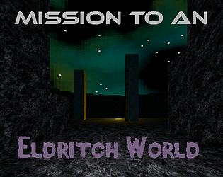
I wish there was a bit more information about the emitters and catalysts you find, as I don´t like the experimentation aspect, when that means I could die because of a bad combination. But then again, the system is a nice idea and has potential. I liked what you did with the enemy sprite, so the don´t just look flat. Nice graphics overall.
I tried to make the combat forgiving enough to allow for experimentation (especially reliable self-healing), but the lack of clear feedback as to what each thing does definitely really hurts how experimentation works & feels.
Nice and fluid movement and I love the old-school aesthetic. The combat system was cool but I wish it was explained a little bit better. It took a bit of trial and error to figure it out and I'm still not 100% sure how it all worked exactly.
There was indeed a lot of void space but not sure what the other comment was about having a hard time finding the dungeon. Other than facing the space ship when you start, even if you go in every nook and cranny in the initial area it takes all of 60 seconds with how quick you can move around. The big pillars with the large glowing portal seemed pretty obvious place to go but I play alot of games so maybe it's not intuitive to certain types of players.
Nice, good job. Like the Dungeon Master inspired battle system. Maybe less would have been more, I feel, like the maps could have been a bit more dense, especially, as I was short before giving up before finding the entrance to the actual dungeon. Maybe have a look at my entry, where I specifically chose a very small level as introduction.
...I'm not sure I understand what you mean by "finding the entrance to the actual dungeon"? The only maps that I can think of which preface the actual dungeons are the 'outdoors' maps, which are almost entirely flat and only require the player to walk in a near-straight line toward the glowing teleporter - so I assume you aren't referring to those.
Yes, exactly that. You really expect players to go on a straight line in an explorative gameplay, without a visual clue? ;)
I figured the shiny glowing gold pool would be enough of a clue, but clearly its purpose was much less intuitive than I thought. Good to know it needed more work on its readability.
There are multiple videos on YouTube about how Disney manages visitor guidance in their parks, an essential topic for level design. Like almost everything Disneys Imagineers do.
great moody atmosphere, good job!
The movement was really enjoyable, being as quick and fluid as it was.
The combat was pretty interesting and I think it was quite involved with finding proper combos. It would've been nice if it were explained, but I did manage to figure out that certain combinations worked better against certain mobs. Got to the end, completed the 3 explorations.
The movement is absolutely the mechanic I was most happy with, so I'm glad to hear that wasn't just all in my head. :)
Ideally, yeah, there would have been more feedback on elemental resistance/weakness mechanics and what, exactly, the various energy sources and catalysts were doing - glad to hear you managed to figure it out despite their lack though!
Just finished this and it is pretty neat! The solitary exploration vibes are definitely there. The combat could have done with some tutorializing, or the items with some explanations, as I didn't really know what I was doing, but I got through it first try so it wasn't too unbalanced. The pixel monstears were neat though didn't match the aesthetic of the dungeons 100%, I might suggest a slightly higher resolution next time
I wanted to add more visual feedback to what the various items did to facilitate players figuring it out on their own, and you can definitely feel the lack. Glad to hear that it didn't prevent you from getting through the game though.
In hindsight I 100% should have at least upscaled the monsters or something, they do kinda clash with the art style of the environmental textures.