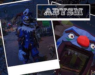
Play game
Abysm's itch.io pageResults
| Criteria | Rank | Score* | Raw Score |
| Art/Graphics | #46 | 3.263 | 3.263 |
| Audio | #56 | 2.789 | 2.789 |
| Fun | #68 | 2.579 | 2.579 |
| Overall | #86 | 2.537 | 2.537 |
| Originality | #105 | 2.263 | 2.263 |
| Theme | #112 | 1.789 | 1.789 |
Ranked from 19 ratings. Score is adjusted from raw score by the median number of ratings per game in the jam.
Did your team create most/all of the graphics yourselves?
No
Did your team create most of/all the audio yourselves?
No
How did you incorporate the theme "INSIDE OUT"?
You're trapped inside a horror carnival and must try to survive to get *out*
Leave a comment
Log in with itch.io to leave a comment.


Comments
You did a great job with the horror environment and the use of the assets, the pathfinding of the enemy is precise too. But I would like to see a more dumb-friendly gameplay :V
Thanks, I’ll see what I can do. Appreciate the support!
Nice Horror Game
the character speed felt a bit fast and i only found one prize, but the first time the clown crept up on me i did scream so congrats on the jumpscare haha
Yeah prize discovery is a bit challenging so I need to look at making that easier. Sorry about the jumpscare.
My feedback for Abysm:
What the game does well:
The fear factor. Horror games are so difficult to get right, and I definitely got scared when the clown was chasing me.
The running is at a good pace, and the scenery is well crafted.
What the game doesn't do well:
The theme is incorporated as just a narrative device. All things considered this is a first-person horror game where none of the elements of the game are related to 'inside-out'.
If there really were prizes hidden in the level, I didn't find them. Nor did they glow if I got close to them. It's likely they were too hidden, or the glowing did not trigger, (or I didn't look hard enough despite circling the level 3+ times).
The camera sensitivity was a little too high. The scenery gets harder to look at when its dark + the camera is shaking a lot.
Areas of Opportunity:
Make the prizes stand out from their hiding place a little bit. It doesn't have to be so easy to find them, but make them contrast in color or behavior from their surroundings. The player gets one image of a prize at the beginning of a level to go off of, but other than that they don't know where exactly they should be looking.
I hope this feedback helps!
Great feedback thanks! Yeah the theme is a bit thin so I didn’t lean in on that as much as I could have. Agreed on the prizes as finding them can be tough. Need to do some balancing and make them easier/better to spot since there’s a lot of “stuff” in the level to throw you off.
Sounds good. DM me on discord whenever you want to share any updates @salsero
I loved the atmosphere and vibe overall. Although, I was confused about what the objective was, and what I was trying to find. Maybe some kind of tutorial or visual to make it clearer to the player would go a long way. I didn't see any objects get highlighted when gotten close, and felt like I was wondering around aimlessly trying to figure out what to do. I could just be an idiot though lol
Thanks. I did add a help screen that pops up when you start. It wasn’t there in the first version so if you downloaded it early you might have missed it. It can be tough (there was no time for balancing) so on easy mode it puts out 3 prizes mixed in about 15 locations. On harder difficulties it requires more tickets but the number of possible locations is scaled back so I need to look at that.
Fun little scary game you made, nice job! One thing I noticed is when you go back to the main menu using the options menu, the main menu does not work except for 'quit.
Thanks and nice catch. I was down to the wire with this so very little testing was done (and all by me). Will make note of this and look to a fix for a future build.
I liked this game, it was fun and unique. The style (even though paid assets) sold it to me. Sometimes my frames randomly dropped when looking at a bunch of objects. Maybe try instancing objects next time! 9/10 pooped my pants and I never want a birthday clown again.
Thanks. Yours was awesome too and very atmospheric (although a little too dark for my taste). Will go back and look at optimization. I did one pass on the scene with some occlusion culling but that wasn’t enough obviously. Will go back and look at mesh merging and some other stuff.
Most generic horror game experience and doesn't relate to the theme at all. Why are people acting like you put in any effort yourself and didn't just use paid assets.
Sorry you didn’t feel it had any depth to it. The effort was all in code and atmospheric lighting, sound, etc. I don’t deny using paid assets but that’s what they’re there for.
You could have put even an ounce of effort into an original idea that related to the theme.
Good game! The scary atmosphere is increible!
Thanks. Lots of tweaking lighting (and a 1 hour last minute bake), lots of atmospheric sounds and music.
Great job with the scene layout.
The scary carnival atmosphere was nice, but the scene was kind of laggy. I suspect is had to do with all the objects in the scene.
Thanks. I did do an optimization pass. Obviously because of the GameJamTimeyWimey thing, it wasn’t good enough. I’ll take another look at it.
Great job. The environment is really terrifying. and the sky is also great. carry on!
Great game man... i can see the efforts u put to make it... great game with horror feel...
Thanks! Had a lot of fun making it.
Good Game Bro 👍
Thanks! So was yours.