Play game
Ruphand: An Apothecary's Adventure's itch.io pageResults
| Criteria | Rank | Score* | Raw Score |
| Overall Fun | #6 | 4.500 | 4.500 |
| Controls / UI | #10 | 4.000 | 4.000 |
| Sound/Music | #13 | 4.000 | 4.000 |
| Art / Graphics | #29 | 3.500 | 3.500 |
Ranked from 4 ratings. Score is adjusted from raw score by the median number of ratings per game in the jam.
If you have competed before, how has your game changed?
Have not entered this game in this jam before.
Game Genre
RPG
JRPG | CRPG | MMO| RPG
Leave a comment
Log in with itch.io to leave a comment.




Comments
TDLR:
Not my favourite game of the jam, but definitively the more interesting one, there are many things to say about this one, both good and bad. I played it something like 3h and half, and I actually didn't go very far into the story, there was just too many fun distractions on the way.
What I like:
-The battle system/the craft system
-The heroine
-The number of extra activities available right at the start (and the amount of content in general)
-The sense of exploration I felt on the world map
-The small details like the heroine chest opening animation, the doodads, the numerous interactions with the environment
-The fourth wall breaking humour that somehow doesn't become repetitive.
-The difficulty who is just high enough to keep the battles interesting (and the fact that a defeat is nothing more than a setback).
-There are both fairies AND treasure chests in this game!
What this game need (in decreasing order of importance):
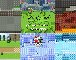
-Better looking maps. The mapping was the main thing that turn me away the first time I saw the game.
-A way to accommodate players who don't want to spend a good amount of their time gathering ingredients.
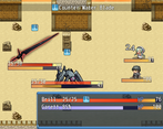
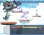
-The battle system need a better UI concerning anything related to the gauge. My main complain is that having both percentages and numbers (or Nan on defeat, for that matter) displayed on the gauge is confusing.
-A way to get the infos of already scanned enemies, other than having to scan again (alternatively, you could make scan instant or instant if the enemy is already scanned)
-A reason to fight the enemies more than once, as currently anything you gain from fights is offset by the resources you need to invest into items to kill the enemies.
-New SE, at least for the most basic actions like confirm, cancel or teleportation
-Mouse support. You already have the picture that can be clicked on for the resource gathering, so no excuse!🧚
Thank you for the very detailed feedback!
I do have a Sample rework planned for 0.3.7, so maybe I can solve two issues at once and add some kind of bonus to that based on having defeated a squad of enemies recently. Since I'll be fiddling with new menus in that update anyway, it'd also probably be a good time to take a second look at Check and add in some means to see the info of an already-scanned enemy.
Adding a "%" to the Action Meter when winding up would be a good idea, I'll probably have that in the next patch or update. Mouse support shouldn't be too hard either. Some new SE (maybe something a bit more low-key) is something I've considered for a while and I think next patch/update will be a great time to go ahead with it.
I'll give the old maps a look as well. What aspects in particular could use improvement?
I will never pretend being an expert in mapping, there are people way more qualified than me on the matter on the game screenshot thread of rpgmakerweb. I saw you made your best adding details with doodads and so on, so I can only encourage you to continue improving your mapping skills.
I wasn't expecting to ever make such a comment, but more ashes, please. 🧚🧚🧚
Gotcha. I'm definitely planning a Sample rework after I finish up Update 0.3.6, and you should be able to have more control over what you get, but until then I could definitely buff the drop rates for Ashes as well.
Now that I have found the pepperflask shop (I wasn't expecting anyone not in the Pokemon tower would sell that or ashes...), the ashes shortage has calmed down. I don't think you should increase drop chances (it will just cause something else to be in short supply), but rather increase the drop quantity. If you change the gather system, I would advice against adding too much extra steps at each gathering, as a good part of the gameplay is already pressing C to get ingredients, then run until more can be gathered. 🧚🧚🧚
A quantity increase is what I'm leaning towards. Next patch or update, whichever comes first, should definitely drop some more in the earlier dungeons that have them.
Hello! Welcome to Feedback Quest 5!
At first, I wasn't sure what to make of this game. I love turn based RPGs, but I wasn't sure how this was going to differentiate itself. It took me a while to realize that it does so by being more about resource management in all forms. Once I had, though, I started to realize some issues that can arise.
For starters, resource management RPGs typically make players not want to fight because it has no real effect besides using said resources. They just want to get from one boss to the next. This was a problem even for Nintendo, when they released Paper Mario: Sticker Star. As such, I would see it as important to have something to encourage some fights (though not needing to do all).
Secondly, the game feels exceedingly brutal by its design in the beginning. Because of the main character's lack of defenses, a single attack can kill her. I've had many times where even with Block, I would just die to enemies simply for lacking a single item or making a single mistake. While making a challenging experience can be a thing, the game already has a hurdle to overcome with its resource management gameplay. It'd be better to improve her base defenses in the early, until you start getting allies (as I see from the screen shots).
Other than that, the game's concept is fun and I love the choice of heroine. I also adore the comedy present in this. It acts a little self-aware, but less in a fourth wall breaking way and more in a playing things up way, such as the Earth Crystal not knowing about the place behind the library.
I'll probably play more on my own time at some point, because I want to see where this goes. :)
Thanks for giving Ruphand a look!
Hmm, adding more point to fighting enemies would be a good idea. There's already a benefit to battling enemies you haven't fought before, but I might look at improving the drops you get from enemies or factoring recent battles into the Sample rework I've been thinking about, and I could also add some kind of bonus to the "Spot Mix" idea that's been rattling around in my head (which would let you make a potion on the spot mid-battle, at the cost of leaving you open to attack).
The early game can be pretty unforgiving, now I think about it. (Basically every arachnid in the first dungeon comes to mind!) I'll give the early balance another look to be a bit less brutal. Is there any other enemy type that's giving you trouble?
I was pleasantly surprised by this one. I think the main character is a strong choice, and interesting as well. The combat gameplay loop was pretty interesting once it got going, but I'm not sure of the lasting power considering if you don't craft the right things you might find yourself in a difficult position.
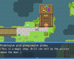
I had trouble finding the potion shop because it has no icon on the sign! It was odd having signs on other buildings but not here.
Overall though I think the writing is well done and the foraging/crafting was pretty cool as well. I do think the foraging would be a bit better if it seemed more like you were taking things from the environment. As it is now it feels like it's an extra drop after killing enemies or entering a new area.
Thank you for giving Ruphand a look!
That sign is getting an icon as soon as possible. I'll either patch the game or split the next update into two parts and release the first, but either way that thing is getting some work.
I've always wanted to put in a "spot mix" command that lets Brill make a potion in mid-fight, at the cost of taking up time and being left open. I couldn't get it to work when I started the project years ago, but now that I know more about RPG Maker and JavaScript, I may revisit this idea.
Sampling would be interesting to overhaul, especially given the basic code for it is like six years old now. It'd take some time to work out, but I think I have a few ideas for it that could fit right in with the existing code without requiring me to overhaul every single map's sample list.
I played this on Twitch: https://www.twitch.tv/videos/1917238596?t=01h27m55s
Overall, I liked that the main character is a woman, and the style of the RPG isn't the typical attack, items, magic style. Instead, the player forages items while wandering, crafts potions, and uses those potions for combat. It fits the apothecary theme very well!
The combat system was also interesting, I didn't really understand the 2.5% something for block, but I liked how every combatant has their timer thing, and attacking has a windup before it happens, so I had to time my blocks before their attacks, and that was fun. However, I think the UI for this can be streamlined somehow.. I'm not sure how exactly but it took a while for me to kind of "get it".
I played till the main character reached the city and was supposed to find the potion shop. I had a lot of trouble finding the potion shop, and eventually found my own room and stopped there. Maybe have more NPCs pointing the way, or have the potion shop have signs? I might have also missed something out that was very clear.. not sure!
The story felt somewhat standard, where the main character is the one who needs to save the world, the main difference being that she's an apothecary and not a typical fighter.
Overall, I liked the foraging/crafting system that links to combat, and I liked the combat "turn" system. My main suggestion is to improve the UI of the turns, but otherwise this is a great game to play!
I managed to find some time to watch!
Definitely going to add a more visible sign, and maybe a few other details while I'm at it, to the potion shop in the upcoming update. (It's the one in the northwest, next to the blacksmith shop.)
As far as the UI goes, I have a few ideas as to how I'd improve it, and I'll likely implement these shortly after the aforementioned update.
Thank you again for playing Ruphand: an Apothecary's Adventure!