Play game
Verloren's itch.io pageResults
| Criteria | Rank | Score* | Raw Score |
| Controls / UI | #10 | 4.000 | 4.000 |
| Sound/Music | #11 | 4.200 | 4.200 |
| Overall Fun | #18 | 4.000 | 4.000 |
| Art / Graphics | #21 | 3.800 | 3.800 |
Ranked from 5 ratings. Score is adjusted from raw score by the median number of ratings per game in the jam.
Game Genre
RPG
JRPG | CRPG | MMO| RPG
Genre #2
None
Leave a comment
Log in with itch.io to leave a comment.


Comments
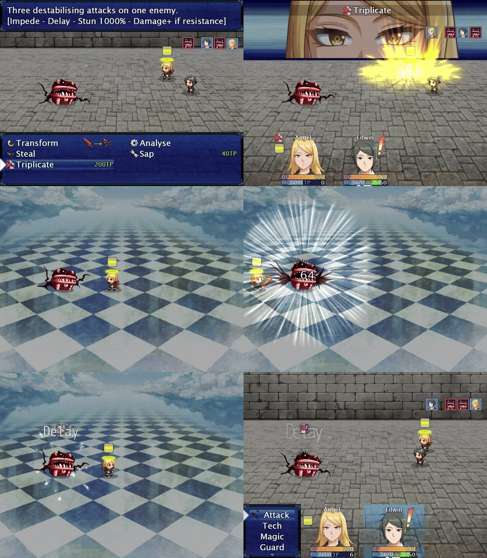
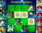
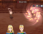
Very nice RPG, lots of custom sprites and animations (both in and outside of battle, love the little key opening doors in particular), lots of story, interesting combat system, puzzles and even a collecting card minigame!
Very grateful that there's multiple difficulty settings and the ability to change random encounter rate along autosaves and free healing at regular intervals. Also extra hints when you're getting stuck in a puzzle, yay!
I think there's however a bit too much meta humor which clashes with the game's serious story. Like when a moment we're going through politics and then there's a boss going "you cannot beat me, just look at how overpowered my stats are!"
Speaking of which, what kind of school even has a built-in casino? Why are all the elites just fine with letting their kids getting hooked to gambling from such a young age? ><
Nitpicks aside, excellent work, this is precisely the kind of game that got me inspired to get working on RPG maker myself!
Thanks for playing! 🧚🧚🧚
Out of curiosity, how far did you go into the game (and what was the playtime on your last save)?
I got to the point where you beat the school tournament and then are getting ready to leave the school, 2 hours and 38 minutes. Seems like there's quite a bit of other content done so I will probably play more if I find the time.
It takes usually 4 to 5 hours for someone to clear out the first chapter (the school competition), so you are definitely an efficient kind of player (I suppose you didn't activate the game aids, by the way?).
There's a great deal of content after the school, so I can only encourage you to continue your adventure. The next chapters are quite different from the first one: in Chapter 1 you are restricted to the school, but in Chapter 2 and 3, you are going to get some travelling.
Pros
Nick: Sound and art design feel great. Things are explained in a way that is easy to understand. Probably more, but we had limited time and haven't yet deeply dove into the game. The idea of losing battles expanding the narrative rather than giving out game over is the most interesting piece of this game that we encountered. Curious to see what it can do.
Ryan: Pacing is good. No big lore dump at the beginning. The player gets control very quickly and the game reveals itself through gameplay rather than just cutscenes.
Cons
Nick: It's a JRPG. Not anything you can do about that. Just not my thing.
Ryan: Con is we can't play enough of it.
Wishes
Nick: Nude bath scene.
Ryan: More time. Time wizard powers.
Thank you for stepping out of your comfort zone for a moment to play this game, a non-JRPG fan's analysis isn't easy to come by.
Verloren starts around 22 minutes-ish. https://www.twitch.tv/videos/1920629393
I was really confused by the start of the game. I thought I was Helen. Then I thought I was the Captain. Then it turned out I wasn't either of those. The way it is presented makes the jump to you playing as the kid, Sriracha was her name, somewhat jarring. I almost wonder if it'd make more sense to not know there was a baby stolen. It's just strange playing as a character that doesn't know as much about their story arc as we do.
The school is really, really big. I like that we have the teleportation system to get around, but some of the rooms don't necessarily have a distinct enough feeling to set them apart from other rooms. I think for the gym it might make more sense if we started closer to it? Teleporting into the Gym room but not seeing a gym was slightly confusing.
I did not go into the bathroom, but I was certainly tempted to choose that room since it was the first thing I saw.
Combat was entertaining, and having the ability to increase/decrease the random encounters is fantastic. I felt the tutorials for combat were well explained, and I don't think I was ever lost in it.
The writing is well done, and I liked the banter that occurred between all of the students. I also think adding in the sparkles to help point out the items you can take or interact with is a very helpful idea.
I don't know much about card games or gambling so I can't speak on how authentic those were, but from what I could tell the slot machine and Blackjack seemed to be pretty legit.
I've played a fair amount of RPG Maker games, so graphically it looks similar. I do think you've done a good job in placing items and decorations around the area to help it look lived in and not cluttered.
Congratulations, you are the first streamer ever who didn't try to open the door of the men's bathroom.
More seriously, thanks for trying out the game.
I have a question concerning your comment and the stream:
-You are not the first one to be a bit confused by the school layout, and I think you put the point on the main reason why:
some floor are at first glance quite similar to each other, notably the magitorium and the gym floor, as both have classrooms close to the stairs instead of the proper gym/magic room. I don't plan to completely redo those whole maps for obvious time/benefit considerations, but from my experience from another building where people sometimes lost themselves into, a simple sign can make a lot of differences. Was there any floors who were hard to recognise, or were the magitorium/gym the main culprits?
A sign I added to help people find a certain room: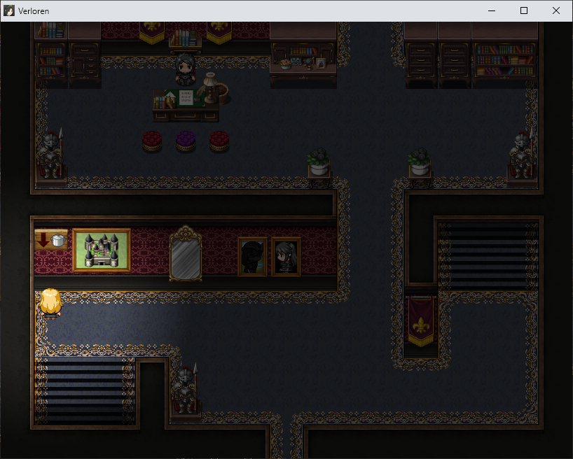
PS:
Don't hesitate to come back for more after feedbackquest if you want to. 🧚🧚🧚
The magitorium/gym, and the game room are the primary culprits. I think it was also called the resting room? I'd have to go back into the stream to look or jump back into the game to be sure. I think adding a sign would be of great help.
Are the three floors easier to differentiate now?
Yes! The signs are perfect. They fit in well, and instantly noticeable!
I played this on Twitch: https://www.twitch.tv/videos/1917238596?t=00h36m44s
I liked the introduction/prelude storyline, with Helen abducting the baby that you end up naming and playing. However, from there it was disjointed to the start of the game, where now you're playing the baby (grown into a young woman) in a magic school, with a dad?
I suspect that eventually the story will make sense, but the disjointedness was a bit odd. One possibility is to have more bits of the prelude lead into the magic school, or have Helen and the dad's relationship shown (maybe she passes the baby to him, maybe she's his wife?). Another possibility is to skip the prelude and start in the magical school, and the player learns about the backstory later on. I think the prelude is really cool though, and I'd be sad if it disappeared till later in the game.
The school itself is huge! 8 floors! I liked the teleportation system, which made it much easier to go from place to place without wondering which floor the gym is, for example.
The scope of the game also feels huge, and kind of overwhelming from the start of the game. Perhaps it's possible to start with a smaller bit of the school, like a single class, and slowly introduce different parts of the school till everything is unlocked.
Another minor issue I noticed is not being able to tell when a cutscene is over. There was places where I lost control of the character for a cutscene, and after the cutscene was done, I didn't realize it and waited for more. Perhaps something like black horizontal lines on the top and bottom, or some other visual signal would be great.
Overall, the backstory is really interesting, the jump to the start of the game was jarring, but I'd be very curious to learn how the backstory and the magic school is linked.
Thanks for playing! 🧚🧚🧚
As you pointed out, the game never tell you explicitly about certain scenario elements (like what's the link between Helen and David) for quite a while, leaving the players to use their imagination and the few more or less subtle clues to fill the blank.
I also had the impression you were a bit intimidated by the game's scope, which is fair, free time is a precious ressource and this game is hungry for it. If I had to make the same game today, I would probably choose a smaller scope for the starting area, as such a big playing field is long to make both for me and for the player. But now that it is there, I will probably keep it as it is for now.
I will keep in mind the end of cutscene thing somewhere. At first, I used a fade out/fade in to mark the end of most cutscenes, but there were many situation where nothing changed between the fades, so I removed them to respect the player's time. But may be a discrete quick animation like I said during the stream would be a nice alternative to just nothing.
Also, now that I have reviewed the stream, I should probably decide myself if I should qualify both male and female soldiers as either "Soldier" or "Male/Female Soldier" instead of mixing both.
Yes, I was indeed intimidated by the scope of the game :) I think there are plenty of people who love games with large scopes though.
Thanks for updating the soldiers, I appreciate that!
This is a really well made RPG maker game, great pacing and tutorials, fun storytelling, 2 hours in and I am still at the beginning of it. I can already feel the scale of the game, then again if I wasn't reading everything outloud, maybe it could have been a 30 min to 1 hr play. It has a pretty in depth card game within the rpg game, impressive dedication. I had fun voicing the characters with vivid personalities.
I do suggest, once you are able to, get professional level customized art, at least customized icons and character arts, the rest you can save on budget as they already look fine, so your massive amount of actual work in game design can shine. Right now they are either defaults from RPG maker or not professional enough for it to attract players outside of indie community, you want to strengthen those.
I thought you would appreciate this game, and I wasn't wrong. 🧚🧚🧚
I resisted for very long the idea of having professional art (firstly because I prefer doing everything myself, secondly because I had zero experience doing commissions and thirdly because spending a bunch of money for a game I don't plan to make any money from seems not very reasonable). But I finally decided myself actually start of Augustus to try out commissioning some visual novel-like CGs, and the experience was way better that I expected, so much so that I plan to have a full gallery of those (currently, there are only 2 of those illustrations, and they come later into the game).
I wasn't expecting icons would be one of the first things you would consider changing, but I guess there is nothing wrong looking at an alternative for those. For character art, which ones exactly were you referring too? Having a customised character CG for most main characters and use them on the game's page, on the title screen and in the in-game menu? May be you were suggesting to change the faceset of the main characters (and use VN style buste instead), their battlers, their charsets... ? And what about the NPCs who share the same style as the main characters?
Also, during my train jail, I missed the title feedback part. Basically, I made it myself, so I have a biased view of it. So a wanted an artist's point of view concerning it on what it does well, what it does wrong, and how it could be improved further. (May be it isn't good and I should just commission a new one?) I would really appreciate having your fairy advice on the matter. 🧚
PS: If you want to come back for more after feedbackquest, be my guest. 🧚
For a free game it is understandable you want to keep the cost under control. I would say if you want more people to play your game however, commissioning for title art, commissioning for key character portraits will be very important,, you can leave the pixel art alone and use default, and use default GUI and everything else, but character icons should be changed. You can pick an artist that can adapt this style but take it their own way to make it seem less out of the template, people can tell the templates easily because RPG maker is well known, to set yourself apart from other games to stand out you must have customized art. Another way is have your artist do a template of your own, so you can mix and match yourself, but that might be more expensive than just straight up character portraits, it could help your future games though.
I get that you would want to do everything yourself, it is the long way, but respectable, if you want to, post your title art on my discord "art leveling" channel and I will give you a very detailed critique. I don't want to do that here since it's very involved and specific. https://discord.gg/wYKghA7
As for taking further look outside of Fest, probably not at this moment since I am spending most of my current time outside of fest to finish my own game and productions. I will revisit in the future when I have free time to stream indiegames regularly again.
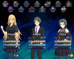
Just to be sure, the "character icons" you are mentioning are your way of calling the facesets (like the one here under), or is it something else?
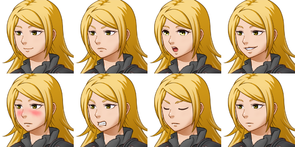
yep. these. 👍
Thanks for your initial impression, Mister Helmet. And see you soon. 🧚🧚🧚
The game is primarily a JRPG, but fans of visual novels will probably like it too.
The last stable build are Version 44 on Windows, 42 for Linux and 5 for Mac.
If there is any update after the submission phase, i will add a copy of the stable version on the game's page, that I will call something like Feedbackquest-Stable-Version.
I would love to be present live during a stream of this game; my time zone is UTC+2 (Paris' time). Any VOD are welcomed too.