Play game
Novus Orbis's itch.io pageResults
Criteria | Rank | Score* | Raw Score |
Controls / UI | #2 | 4.400 | 4.400 |
Art / Graphics | #9 | 4.400 | 4.400 |
Overall Fun | #13 | 4.200 | 4.200 |
Sound/Music | #13 | 4.000 | 4.000 |
Ranked from 5 ratings. Score is adjusted from raw score by the median number of ratings per game in the jam.
Game Genre
Strategy
Turn-based | Card Games | RTS | 4X
Leave a comment
Log in with itch.io to leave a comment.
Comments
Like your take on the Slay the Spire gameplay mechanic. Was playing this game a lot, and enjoyed yours as well. The pixel art is really well done. And so are the transition states. All changes are nicely connected by visual and audio effects - I LOVE how well you did that. The environment art is also really cool. Over all the game leaves a solid impression - the devs master their craft, that's for sure.
Some points you might want to improve / have another look at:
Thanks for your entry. It's a great one all in all.
Hey! I've been absorbed in development and didn't realize I had so many new comments here.
First of all, thank you very much for playing and for the compliments!
The devs is just me, I'm making all the coding and art and game design. The only thing I'm not making myself is the music.
Let me ask you, what do you find inconsistent in the art style? Do you mean between the game and the cards? Or do you mean that some monsters look more cartoonish than others?
If you mean between the game and cards, while the game's style is "final", I'm still not sure about the cards. Having pixel art in the cards would make them difficult to read (read the picture I mean). I could do a different pixel art resolution tho. Anyway, I know I'll have to redraw most of them anyway so any idea is accepted!
For your second point, it's actually fixed! I'm still testing the new build for bugs, but it should go live today or tomorrow.
As for end turn, my idea was to have everything related to the player close to the player. If I get more feedback about that I can think of moving it, but I guess it's just a matter of getting used to things? I sometimes open slay the spire to check how they made some things, and now it feels weird to me to have end turn on the right ahah
Thank you very much!
Inconsistent between game and carts, but dont have good suggestions for this. Found some pixel art games that also make that difference between game and UI, prob. for a similar reason.
Thank you! That will definitely be taken into account when I move to production of the actual game :)
I return for another Infinidagger adventure!
So before I dive into new thoughts, I just want to note I found a bug. I'm not sure how much of what was going on needs to match, so I'll simply state that I killed the last element, a Rock Elemental, with the rock that the elemental gave me. I had performed no other attacks that turn, and it resulted in nothing responding. XD
I also want to note that most of this was from the same version of the game I played before. Part way through writing, I did realize I forgot to update and opted to play more with said version.
With this said, I can now get into some of my new observations.
So I know part of your intent is that you want players to discover things and be surprised by what happens. This was something you brought up when I noted just being thrown in and being confused as to what to do (which I still think, for the first screen, you should indicate what the player should do). While this is a good idea starting off, when I have multiple visits to different things, have no idea what they do and ultimately just feel like they're having a more negative effect, I'm just going to ignore them. Some examples...
- The Training Dummy. As far as I can observe, I just lose HP here. What is training supposed to do?
- The Pond, the Campfire, and other screens where you're asked to discard a card. Save for one lucky time where I got the cat and somehow got a good reward, these things always result in me losing cards and getting those cards you can't use. What I would suggest is an internal check where, once the player has encountered it, say, three times, it offers knowledge of what to do.
The next thing I wanted to bring up was the amount of monster blood early on. The amount of blood obtained from enemies even a few boards over is way higher despite them often being easier than they were in the start due to just having more cards and options for fighting. I'd like to suggest that in the first few boards, monster blood drops higher.
(Additional off tangent note. At this point, I began playing with the latest version of the game and had another bug such as above, again involving a rock elemental. This time, however, it froze following the enemy's turn).
The last thing I wanted to touch on was something I felt just... didn't make sense. So some enemies are able to apply wound and bleed effects which remain in your deck afterwards. I don't recall if they remove after a fight (and if not, they should). However, I also feel like if you block the damage of the attack entirely, those effects shouldn't be applied. I mean, if an enemy hits you four times but you block it all, how would it make sense that you now have four deep wounds? You blocked them. They didn't actually touch you. :P
Hey! I've been absorbed in development and didn't realize I had so many new comments here.
First of all, thank you very much for playing and for the bugs report!
The game is for sure not bug free yet, but it's getting better with each update.
I admit that I haven't played the rock in a while now, and that's probably why I didn't know it had issues. Thank you, I'll check that!
Your input about the events is absolutely valid. I've recently added some speech bubbles to the character, but your advice about having them more explained after finding them a few times is something I'll definitely keep in mind when I'll have a progression system in the game.
The dummy is the only way to obtain special cards (the yellow ones). It has a random, increasing chance to drop a card. But I admit the chance may be a little too low.
The campfire is the only way to get rid of cards without getting one in return. Which is a viable option to make your deck lighter if that's the style you go for. Also, it will give you a special blessing if you give it five cards in one encounter.
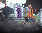
The other type of event (the Boulder, pond, hurt creature) all give you a different card depending on what you give them. They all kind of make sense if you think about it, while cards that don't make much sense will give you a bad result.
For blood, I may balance it in the future, but my goal was to make it impossible to buy the blessing in the first level, giving the option to save for the blessing for the next encounter, or buying one of the other options for an immediate boost.
As for the last point... I can't say you're totally wrong lol.
As the game is set now, you'll get status and affliction cards if you get "hit" in any way. On the other hand, you'll avoid both if you're evading.
It's something I'll think about :)
Thank you very much again!
TDLR:
My favourite game so far. It feels that when it will come out of its beta, it will be worthy of its inspiration (Slay the spire, that I will shorten to STS going on).
What I like:
-The gameplay in general. It is rock solid. The combo system and the enemy turn system are welcome addition to the STS-like genre.
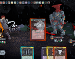
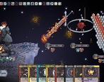
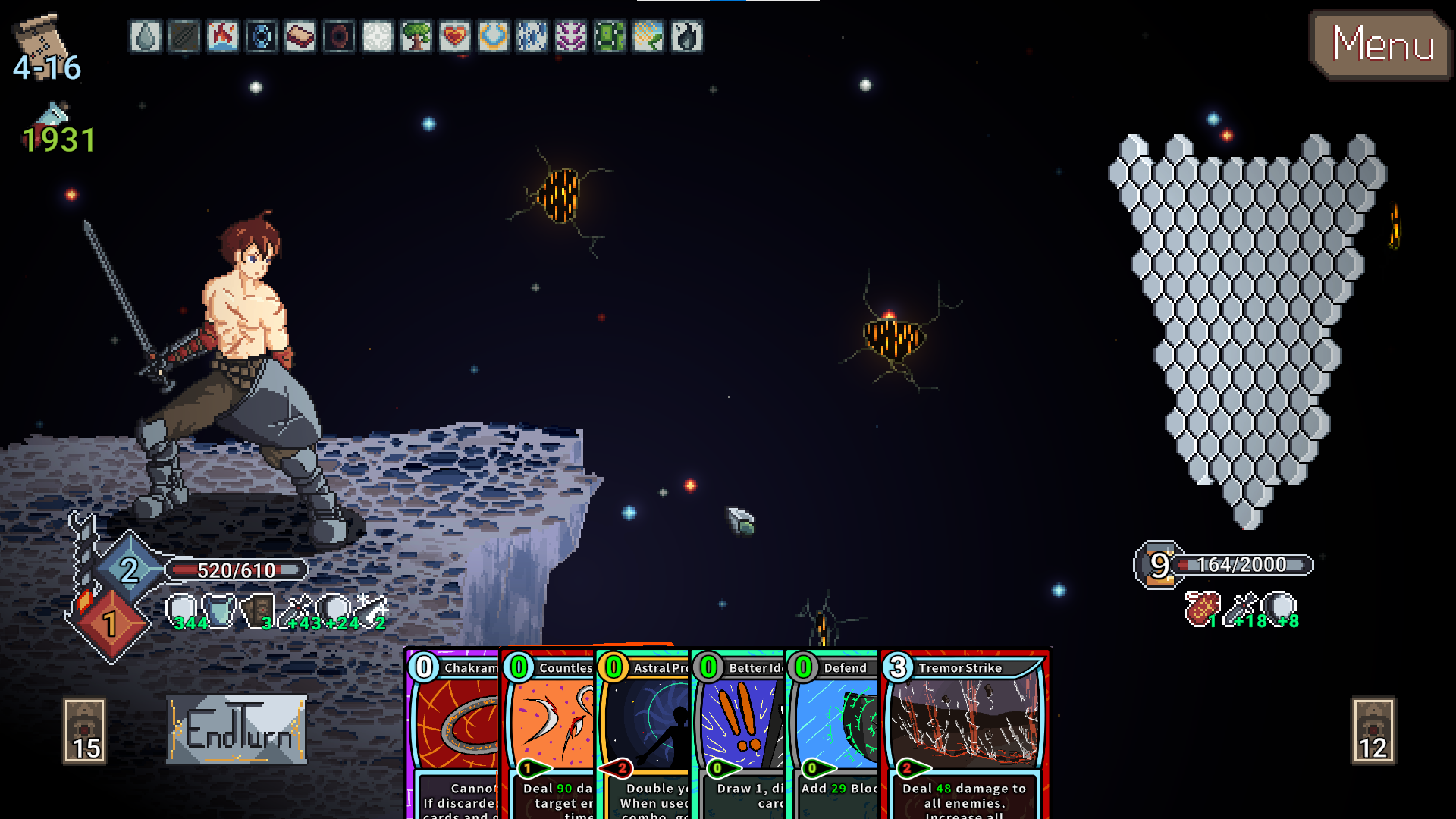
-The art. Sceneries and enemies are cute, the cards give a fun STS beta art vibe.
-The musics who are better than the ones of STS
-The gameplay, again. Gameplay is king.
What this game need (in decreasing order of importance):
-More content (more characters, more animations, more enemies, more musics...)
-Better balancing. It was pretty easy for me to setup an infinite with delays. The relics that give 3 extra cards per turn for an increase in items cost (who aren't very good anyway since they take a slot in your deck) and the one who reduce the cost of all skills by one (it has a huge drawback, but if you handle it...) for example seem they can really break the game. On a smaller scale, the equipment who gives +10 strength and dexterity is also busted, because, you know, I can just play it, press end of turn and play a new turn with a new hand, full energy and +10 strength and dexterity without the enemies even acting once. The 5 hits cards seems a mandatory pick to counter the encounter with the evasive elite. Being able to burn without drawback 5 cards of your deck (or even with the drawback if you can setup an infinite heal) is also pretty strong. On the other hand, some interesting mechanics like the focus system or the cards that gives strength x2 for a turn or dexterity down for enemies seem underpowered. Also, encounters in hallways feel pretty unequal, the difference between a one enemy room and a three enemy room is huge. Curse cards also feel pretty nasty, as the ways to get rid of them are not 100% reliable.
-A save and quit system. During the run I give the final screenshot from, I really would have wanted to do a break midway, especially since I had no idea when it will end.
-Something feels weird when playing the cards in this game compared with STS. I can not really explain it rationally. It feels less snappy.
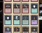
-An easy way in the deck screen to know how many cards you have for each combo value.
-A more in-depth tutorial
-May be a way to know the enemies' actions or at least their possible actions?
-More content
-Fixing some UI bugs I will post under when I find the relevant screenshots back.
-I forgot: more content
PS: By the way, I am a STS veteran, I reached ascension 10 and then took a break that still lasts today, as I was bored of always building the same deck.
Hey! First of all thank you very much for playing and for the supporting comment!
Starting from your last comment, yes, I LOVE slay the spire but it really feels, after a while, that all you do is building the same deck to beat the same monsters, just to unlock the same run with a little bit more difficulty. That was the main spark that made me start with this game.
To the points you like:
-I'm glad you appreciated the two key elements of the fights. I'm feeling very confident in those.
-Happy about that, getting a lot of good feedback about it, but at the same time I have very little confidence in the art, so, thank you very much :)
-Not many people comment about the music! It's the only thing in the game I'm not making personally, but I think my guy (st. GOGO) did a very nice job with it, and I'm proud of how we managed to make it transition between tracks depending on what you're doing.
-Thanks again for the gameplay lol.
As for what the game needs:
-Very important points. Even if it's just a beta/demo, I'm trying to make the game as balanced as possible, I guess I'm not there yet. But personally, except for very few things that are exceptionally better than others, I think in general most runs feel balanced overall. Especially if we're trying to beat the last boss.
After all my goal is to make the player feel increasingly powerful, and at the same time giving bigger and bigger challenges.
Personally I find the game "easy", especially the normal encounters after the 1st level, but that's because I play with all the game's knowledge.
You bring some good point anyway and I'll think about them!
-The game SHOULD have a save/quit system, added in the last version 1.6.0...is it not there? The game should auto save at every non fight room, and at the end of every fight, you can then just quit and load it! The save will be deleted as soon as you die tho.
-I will probably add more fancy stuff in that regard, thank you for pointing it out :)
-Never thought of that. At some point I'll probably set a way to sort by different criteria, and the combo value should be one.
-An interactive tutorial will probably be my next big update!
-Enemies intent is not shown by choice, but having a list of actions an enemy can do is actually a piece of advice I recently got and I totally agree it would be nice to have it!
-More content, yes. I know ahah. This is really just a demo, I wanted to have a strong base before moving to making more. There WILL be more characters and a very important thing to me is that I'll add branching paths for the different levels, to try and keep everything varied and fresh (and give more room to be able to unlock different stuff depending on what specific level you're in). For the demo I just decided to make ONE character and ONE level (I ended up making it like day-evening-night-storm, but it's basically the same level with just increased enemy stats).
-I probably know what UI bugs you're talking about and it's actually what I'm working on right now!
That being said, if you liked it I'd love you to join my discord server:
https://discord.gg/nuc9nCkEgR
And if you haven't, take a look at the game on Steam:
https://store.steampowered.com/app/2437330/Novus_Orbis/?beta=0
I'm actually always a little behind on updates here on itch.
I'm going to upload the latest update on here now.
Also if you don't mind me asking, did you beat the game? Did you beat the two mimics? Outside the two mimics, there are two other optional bosses, did you find them?
Also with the latest update there is another special last boss :)
Thank you so much again!!
I played the game in version 1.5.1.10, so there wasn't any save system (at least, I saw nothing at the usual Unity save directory)
I got that weird visual bug after removing a card from my deck for the rusted sword curio. The other UI bugs, you certainly already saw them during the streams.
I really thing adding a combo value visualisation would be a great thing, it would make balancing the deck to have the roughly the same amount of 0, 1, and later 2 and 3 combo cards. It is basically like planning the mana curve of a magic deck.
I thought the hiding of the enemy intent could be by design. Having played a good amount of Runic Done runs in STS, it adds a good amount of randomness. I don't know what to think of this, currently the enemies' patterns seems to be quite predictable, so I don't see the reason to hide them if the player could just find them on a wiki. Showing an action list could be a good compromise. May be you have ideas to build upon that particularity, in that case I wish you the best.
I beat the game, yes (see my previous screenshot against the final boss).
I'm at the discord server limit, but be sure I will be looking at the game in the future.
I encountered the mimic twice in early run. The first time I ran away. The second time I beat it, after a very difficult fight that cost me my revive relic.
I didn't saw any other secret bosses, at least yet.
Hey! I've been absorbed in development and didn't realize I had so many new comments here.
Oh ok, that build is a little behind the current game state.
There are a few bugs in game indeed, the specific one you're talking about is supposed to be fixed now :)
Atm I'm trying to make a fun demo, but I'm not stressing too much about it because I'll have to rebalance everything once I move to full game development. But you are right, I will for sure implement a better distribution of cards rarity and combo values through a run for the actual release.
Adding the possible enemies actions to be visible in game is in my plans :) But I'd like to stick to the no intent formula.
If you wanna give the game another try, just know that:
Once you beat a mimic you'll be able to find a second, stronger one.
You can fight the shop (you figure out how to do it :P).
There is a secret boss in the pond room.
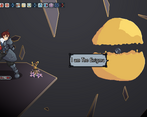
And if you beat all these enemies before the final boss, you'll unlock a special, final final boss.
Thank you very much for the feedback!
Very good game with a great idea!! I like the roguelike style than the game have making everytime you die you have to start again and you have to think all well to go further and further
The gameplay was great, only than will be great to have different animations for different attacks to add a bit more of dynamic to the gameplay Also it will be great to have something like a highscore to know how further you went so the player wants to get more and more further and beat it own high score Also having a story mode or at least a more detailed story of what happened, who we are and why we are doing that will be great And finally, having an interactive tutorial will be really helpful instead than text written of how the game works, so players understand it easily
For the rest the game is looking great!! Good luck working on it and improving it more and more :D
Thank you very much for playing!
Having different animations is in my plans :)
An interactive tutorial is also something I know I'll need to make, it will probably be my next big addition.
As for the story, it will have more of it in the full release, for now this is just a demo and it's more meant to showcase the gameplay.
Thank you very much again!
You’re more than welcome!! It’s great to hear than you have planned implement that feedback :D Good luck working on the game!!
Hello! Welcome to Feedback Quest 5! It's nice to meet you! My name's Hythrain. I'm part of the FQ team and a hobbystreamer. I'm writing this review live after having played your game.
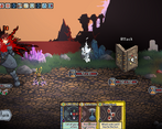
Due to forgetting anything the page had said or shown when I booted the game up, I had absolutely no expectations going into this. I just had the name in my head. When there was a pretty world and title screen, I thought it might be a top down horror game with cute sprites.. Then I got into the game and it was an anime pixel art dude with no shirt and two doors! I had no idea what was going on. It took me a good moment to realize it was a roguelite, then again to realize it was card based, then AGAIN to realize it was a deckbuilder! Multiple levels of SHOCK!
While I did notice the difference between how the cards look to the battlefield, I still find the artwork great. I loved how the music went in and out for combat and both in and out of combat tracks are giant loops.
There are a few things I think should be changed, however...
1. The tutorial should not just teach you how to read the card, but what the player is supposed to do every step. Going back to when I started, I was confused what to do on the very first screen. I tried to use the tutorial and it told me nothing in terms of navigation and what the symbols on doors mean.
2. If a player uses all of the cards they held and can use (so cannot use cards don't interfere, nor cards still in the deck), it should automatically end the turn. If they run out of SP and only have SP cards, it should also automatically end. That way, it can keep a better flow.
3. I might just be dumb, but I had a lot of enemies dodging my attacks. Not sure if it was because of me not paying attention or just low accuracy luck on my part.
Hey! First of all thank you very much for playing and for the feedback!
Thank you for the positive comments :)
As for the critiques:
1-while I understand what you mean, I believe that one important (and to me fun and interesting) part of rogue lites is discovery. Going in blind, guessing, failing, learning.
I need to make a better tutorial for all that concerns battles (I'll make an interactive one), but teaching about everything else, I believe, takes away some magic.
2-this one is on my to do list, thank you for pointing it out :)
3-evasion is a status that both the player and enemies can have. It's a charges based status, one charge evades one attack, and that charge is gone. Also, one charge is lost at the beginning of the turn. Enemies with evasion are designed to be fought with the goal of taking evade charges off. Did you notice the status? This is probably one more thing I'll need to focus on in the tutorial, I feel like people who know the genre have no issues with it, but people who are not used to it tend to overlook them.
I really enjoyed it. I put 30 minutes in, and there's certainly more content that I did not see. It has a very satisfying card battler feel to it, something similar to Slay the Spire or Darkest Dungeon.
The highlight for me is certainly the pixel art, everything from the enemies to the background are crafted so well that it really makes it stand out. It would be cool to see more animations from the various characters on screen. The hero/main character doesn't really have much going on.
I didn't quite catch on to how the cards stacked immediately, but once I did I was able to make use of it pretty well. It would be nice if the cards popped up a bit more when we hovered over them so they don't have to be selected to read exactly what they do. But, overall really fun experience.
https://www.twitch.tv/videos/1918886874
Hey! thank you very much for playing!
Some of the things you mentioned are known issues, sadly I have limited time and I'm fixing/improving little by little.
Sorry for the music, I had a lot of "it's too loud" feedback, I guess I went to heavy on lowering it lol
Glad you liked the visual style!
The reason the game kept telling you to check the tutorial is that..you didn't really understand how the combo system works :P
But I'm glad you managed to beat one boss!
Thank you again :)