Play game
Galactic Equilibrium's itch.io pageResults
| Criteria | Rank | Score* | Raw Score |
| Overall | #7 | 3.804 | 3.804 |
| Art/Graphics | #10 | 4.071 | 4.071 |
| Fun/Engagement | #11 | 3.714 | 3.714 |
| Audio/Music | #11 | 3.643 | 3.643 |
| Theme | #17 | 3.786 | 3.786 |
Ranked from 14 ratings. Score is adjusted from raw score by the median number of ratings per game in the jam.
Judge feedback
Judge feedback is anonymous.
- I was pleasantly surprised by that game. A super chill yet engaging game. The mechanic is super simple and easy to understand, very relaxing. The ambient is perfect, the visuals are great, the game design is pretty nice. Also the fact that most planet spawn in range of another valid planet meant that I never felt like I was screwed by the RNG. My only nit pick would be the little "+" sign on planets was a bit hard to click, having it bigger and easy to click would have helped. Great entry !
Did you work alone, or as part of a group? (If in a group, list their names)
Worked with artist - Quinn Fenton
Disclose if you used any public domain assets or not.
yes - font and music
Leave a comment
Log in with itch.io to leave a comment.


Comments
Music and Visuals were really on point!
Nice
As a fan of games like Mini Motorways, I enjoyed this. Good atmosphere and sound design. It did happen quite often that a planet spawned and it could either not trade or receive resources because the required planet color was not close enough or blocked by another planet.
I recall playing a similar game earlier this jam – SpaceLanes, was it? Anyways, I do like the management aspect of this game with you having to balance each planet between giving and receiving resources, although after a while it did get a bit overwhelming with so many planets (which sometimes didn't have access to planets of both the different types). Apparently my final total was 31 and I peaked with 33 (which must mean my empire was on the verge of falling...)
I loved the atmosphere and graphics! It starts really easy and chill, but it actually becomes quite a brainburner as time passes. My empire peaked at 29 planets!
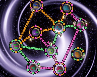
I had some trouble keeping in mind that the rings meant what the planet produces and the dots meant what it needs, so I spent a bit of time and mental effort trying to actively keep that in mind. If you can figure out a way to make it visually more obvious, I think it will be that much easier for players to enter the flow.
The idea is very solid and building your network felt really satisfying, I enjoyed playing! Thanks for sharing your game!
Thanks for the feedback, I’m glad you enjoyed it.
You’re not alone on the production/requirement colors being difficult to remember. ecaroh.games had a good suggestion to move the production color from the ring to the planet itself. I think that would have helped to make it visually more obvious.
Really relaxing and fun game, but near the end it was a lot to manage, and the colors got a bit difficult to understand / remember. Really well polished though, Good job!
Cheers, thanks for the feedback. Yeah the colors could have been more intuitive. I like ecaroh.games idea about moving the production color from the ring to the planet itself.
Love the sounds and art! Really gave me mini metro vibes, and captured that feeling of the genre!
Some feedback from my playthrough. The colored rings and dots were a bit tricky for me to intuitively grasp at a glance. Once it started getting faster in the end-game, I would have to say out loud to myself "Orange ring to orange dots" "Green ring to green dots" and really concentrate with tunnel vision to make the connections. I think it might be more clear if the "production color" was the planet itself, so there is more separation from the colors, especially when things got really crowded in the end of the game.
The designs were amazing though and I love the animations of the ships flying around! Had a wonderful time playing and enjoying the atmosphere. :) Amazing work!
Thanks for the feedback, I’m glad you enjoyed it.
I agree with you on how the production color should have been the planet color - would have made it cleaner and more intuitive. The procedural planets are cool, but ultimately don’t add any value outside of visuals.