Indie game storeFree gamesFun gamesHorror games
Game developmentAssetsComics
SalesBundles
Jobs
TagsGame Engines
A jam submission

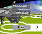
Moonshot: CommandoView game page

GameOff 2020 submission
Submitted by BackAt50Ft (@KyleTheCoder) — 22 minutes, 36 seconds before the deadline
Add to collection

Play game

Moonshot: Commando's itch.io page

Results

CriteriaRankScore*Raw Score
Overall#1283.1823.182
Graphics#1513.1823.182
Gameplay#1662.8182.818
Audio#1702.9092.909
Innovation#1942.6362.636
Theme interpretation#2062.8182.818

Ranked from 11 ratings. Score is adjusted from raw score by the median number of ratings per game in the jam.

GitHub repository URL
https://github.com/WolfgangSenff/GameOffJam2020

Theme interpretation
To be honest, I just had a ridiculously busy month, so in that sense, it was a "moonshot" of me to pull off something of this scope. I intended a lot more though.

Leave a comment

Log in with itch.io to leave a comment.

Comments

Submitted(+1)

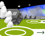
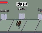
Cool game! I love the intro, the music and the landing scene sets a really awesome atmosphere. I like the Alien Storm kind of vibe!

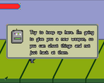
Just as a comment, I would suggest to be able to skip the tutorial messages from our friend Gismo with a key press, instead of the need to wait for the message to close.

Another thing is about the key mapping, I played the Linux build but I couldn’t use the WASD keys to move around, I needed to use the arrow keys.

Very interesting game! Well done!

Developer(+1)

Yes, that was my mistake! I thought Godot added WASD by default, but I was wrong. My bad! And yes, Gismo ended up being more annoying, and implemented almost entirely on the final day of the jam. :P But she will definitely be improved in future versions.


Also, I love your cat icon. Looks just like one of mine, named Nugget.

Submitted (1 edit) (+1)

Thank you for the explanation and your awesome review of my game! :)

Submitted(+1)

Nice art, and the landing intro was really cool. Regarding the gameplay, what I missed the most is some feedback on enemies getting hit. Great work!

Developer

Thanks so much! Yes, that feedback is in 2.0, currently in development. :)

Submitted(+1)

I liked very much that intro is present (the steam clubs look super). Changing weapons also adds variety. AWSD buttons don't work for me on Linux either, so I have to jump between the cursor keys, "z" and the mouse button. Overall, very good.

Submitted(+1)

Nice!

The text-bubbles in the beginner could maybe not pause the gameplay. So I could just rush  trough on my next run. Some health-drops would be nice.
DLC for the middle door coming soon? :D

Developer

Ha, DLC. :D I will definitely be improving this in the way you have suggested over time. The middle door was intending to have basically the end-guy of the game, and it was going to be super annoying, but sort of like a Mega Man boss, where there's a pattern that can be predicted, if with difficulty/randomness. Thanks for your feedback!

Submitted(+1)

Great art and music! This feels like a really solid beginning. Looks like other folks have already mentioned the gameplay areas to improve. So I’ll just add my compliments. Way to go!

Developer

Thank you so much, that means a lot!

Submitted(+1)

That's a pretty good start! I like your Git commit history :P

It's cool to have an intro sequence, and the gameplay and art work fairly well.

My main criticisms would be the same as others already expressed here, and mostly reflect lack of time I suppose: visual feedback on hits, difficulty (first corridor easy, second one OP :D), text goes too fast (and maybe too much of it initially, we're interrupted with every other step), maybe too many hits needed to fell an enemy (especially those bowling balls with no feedback on it, it's not juicy enough :)).

Overall it's solid though, and I didn't run into any actual bug that I could identify as such.

Developer

Thanks for the feedback, all agreed! Especially the commit history. 🤣 Each of those represents about two nights worth of work.

Submitted(+1)

I think you have a really solid base here! Attacking does feel unresponsive at times, and I wasn't actually able to use WASD to move (on the Linux version at least). But there's definitely something strong to build off of here, and the pixel art and music were nice as well.

Developer(+1)

Hm, that's weird. I went with the normal input map which I thought supported them. I'll double check because now I'm not sure - thanks for pointing it out, and for the feedback!

Developer

Well, you're right - my bad totally. For some reason I thought they were part of the input map by default, meaning WASD keys are, but they actually are not, so that was silly of me. I will fix that when I release this for real.

Submitted(+1)

The gameplay is correct but need some polish as we can hit enemy with sword just being in the bottom and enemy on top of the room.

Maybe the music is too much repetitive.

This is fun to play and it is done with GODOT !! <3

Developer

Completely agreed, about all of it. The sword was annoying for me to make, I'll likely remove it as a weapon altogether in future versions, unless I can come up with a better approach. Thanks for the feedback!

Submitted(+2)

Overall nice game :)  I like those "River City Ransom" style games.

Although you didn't had much time, the gameplay itself is really solid and feels bugfree.

I think there should be an indication about touching enemies in the y-direction, e.g. a shadow ellipse like @renato_grottesi 's comment suggested. I lost a lot of health because of it even though I didn't noticed.

Music and sfx are nice, but sometimes there seems to be sfx missing (e.g. bow, enemies)

I had the same issue like @renato_grottesi with the speed of the text boxes, I couldn't read it all in time.

I liked the text that showed up on the middle door :D Don't want to spoiler it for others.

Developer

Yes, agreed completely about the vertical nature of enemies. I had a hard time figuring out how to show that off, and in the end just ran out of time. And yeah, sfx and music were added within the last hour of the last day. :P But I'm glad you enjoyed the style of the game! Thanks for the feedback!

Submitted(+1)

I liked the gameplay, but it needs some polishing to make it more lively and as an aid. Fir example you can add shadows to characters and balls to make it easier to hit the balls and give them more volume.

Also I found myself not able to read the assistant's comment fast enough and some disappeared a bit too fast :-)

For the rest, great retro atmosphere and graphics!

Developer(+1)

Shadows are a great idea. I had not even thought  of that. Good thinking! As for the dialog, yes, I needed to go back and make it advance by interaction rather than automatically. That was a big mistake on my part. Will definitely fix that in my rework of the game. Thanks for the feedback!