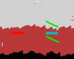
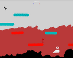
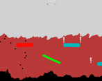
I liked the aesthetics and the music. Gameplay wise it was fun I think it was a bit too RNG dependent. Sometimes 3 or 4 enemies in a row would spawn above their "destinations" so I was left without much to do.
Play game
H&H Management's itch.io pageResults
| Criteria | Rank | Score* | Raw Score |
| Story | #163 | 3.000 | 3.000 |
| Sound | #177 | 3.219 | 3.219 |
| Music | #182 | 3.438 | 3.438 |
| Theme | #208 | 3.531 | 3.531 |
| Aesthetics | #361 | 3.281 | 3.281 |
| Mechanics | #422 | 2.750 | 2.750 |
| Fun | #484 | 2.656 | 2.656 |
Ranked from 32 ratings. Score is adjusted from raw score by the median number of ratings per game in the jam.
How many people worked on this game total?
1
Did you use any existing assets? If so, list them below.
TextmeshPro, Music from Darren Curtis website (free CCO).
Link to your source?
na
Comments
5/5 on the screaming of souls! I'm glad I read your comment about them only sticking to the small platforms. I played an earlier release you posted in the forum and couldn't get anywhere with it because they'd be sliding off the platforms. When there are no more souls I think it should tell the player and ask if they want to reload rather than sitting waiting for a soul that isn't going to come.
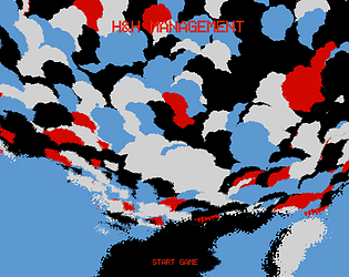
The aesthetic is very interesting and unique, I'm feeling a bit funny now, like when you play guitar hero so long it looks like the walls are moving!
You have a strong idea here that needs refinement. The other comments went into it already, so I won't repeat it, but you should be proud of this because it's extremely ambitious. It's impressive you got done as much as you did, it works as well as it does, and looks as good as it does. I like the aesthetic -- it reminds me of a children's doodle, which is a good thing. Great job.
I feel like the gameplay is very rough and in need of some refinement, but this is such a strong entry otherwise. I would recommend updating the tutorial as soon as possible with more clear information.
The game is very difficult to predict, largely because when each character spawns I am expected to both grab and release a platform in the correct place. I feel that the loop asks too much of the player and could do with either streamlining or better signposting of what type of falling soul will come next.
Presentation-wise, I’m rarely ever surprised by a game. I’ve seen good looking entries this jam, but this game’s visuals caught me off guard. I haven’t seen particles used like this in Unity and I was impressed by your use of color in the scenes.
I think there’s a lot about this entry to be extremely proud of, and that’s ignoring the fact that you made it solo. What’s a jam game without some jank? I think you did an amazing job with this entry and the core loop is solid enough that you could probably refine it into a larger game if desired.
Congrats on submitting!
Pretty cool! Love the concept, and the mechanics were pretty cool too. It was however a bit confusing to play, I would've like to have the game tell me when no more guys are going to fall, or maybe have a count on how many more of each time will fall? or maybe a timer, somthing to tell me how much time I have left. But overall a great submission! Good job. :)
This game has some nice unique gameplay mechanics. It took me a while to get the hang of it and genuinely thought it was a bug when certain souls wouldn't stick to some platforms. I later realized that some platforms stick to the souls and some don't. The visuals, while very basic, still have a charm to them and fits the overall aesthetic of the game. I like the menu music and the effort you put into making a functional tutorial as well. All in all, you had some great ideas executed nicely, and only need a little bit more polishing :)
Very interesting concept! I find this game quite difficult but it was fun positioning all the platforms just right to cover as much ground as possible.
To make this game even better, I would suggest more visual cues to separate different platforms. For example, the souls will stick to the shorter platform when moved, but visually the shorter platforms are the same as the larger ones. Another suggestion is to let the souls drop down infinitely. Having to reload because of 1 mistake can be quite frustrating. You can introduce a fail count if you want to reflect players' mistakes.
Overall a very good game with a simple but fun design. Nice attempt!
Played and rated.
Nice little game, was fun to play for some time. I liked the music and ambient. The visuals are simple but do the job for a start.
At first I didn't understand we had to bring people on the side to the stair or the road. Once I did it made more sense lol! Well done for this game jam, keep it up :)
Would appreciate if you check out and rate our game as well: https://hadilepanda.itch.io/rise-of-necromancy
Really enjoyed this, nice concept! any feedback I had is covered in the comments below I think, give people a bit of warning about where souls will drop from, some other differentiator about which platforms are sticky.
Hey there, that was a really fun concept. I think the two suggestions mentioned in the comments below me cover the only areas where I had a little difficulty, but it definitely kept me wanting to play more. By the way, the art for the intro, title screen were very cool.
This was a great game! I like your idea with the H&H management. Only thing I would say is to make the controls a bit more clearer and add som sort of pre-spawn effect so people know where to place their platforms.
I like the background. The falling souls don't stick to the longer platforms was that intentional?
Cool game, the idea is definetely original and fun! You should make a little clearer where the guys are, or where they are spawning (with a pre spawn effect or so), since now it's a little confusing.
Nice music!
Also, in the instruction you say to drag with right mouse button, but it's left button
Good job! :)
I like the music and the artwork, but I found this slightly confusing on what I should be doing, maybe some guidance, or maybe I missed it. Otherwise I enjoyed the way it feels.
I really love the art on this game that background is very impressive! I did run into an issue that the souls sometimes would not "stick" to my platform at all. So if I moved it to the side they would just stay put...
I played the game and eventually, I think I got an understanding of what I was supposed to do. At first, I didn't understand that you were supposed to move the platforms. I thought it was a platformer and I was really confused. On the second level, things just stopped appearing so that's as far as I got. I also tried reading the text but it was really small I could barely read it.


Leave a comment
Log in with itch.io to leave a comment.