Great, let me know if you still have issues! Many thanks :)
Vitbull88
Creator of
Recent community posts
Oh sorry to hear! I'll have a look, you're the first person with this problem. Did you try a controller?
Edit
Maybe I know what happened! Some tutorials have multiple sheets. You must look at the bottom left of the panel, and if you see a 1/2 it means that you must read a second sheet before being able to close. To change sheet, you can use Q and E (previous and next). After reading all sheets, you can close the tutorial. Sorry, I'll try to make this more clear in the future!
I played this game for a little bit. Honestly, the movement is a little frustrating. It is difficult to control the player, the jump is not precise. Also, the combat feels wrong, since there is not much I can do to defend myself against projectiles.
The art is very nice! Work on the core mechanics, and you can build a nice product
Art and music are on top level! Very nice done! As in your other game, I still find that the sword should stick into the walls without you holding a button. I really think the playability would benefit a lot. Sometimes I just can't double jump pressing A on my gamepad, while holding X. It's not ergonomic. Overall, a nice game
I appreciate the effort, but, take this as a suggestion, you should work a little bit on implementation of mechanics, since it is very difficult to control the player and to fight. Also, you introduce all the mechanics at the beginning, and it's very hard to remember what things are meant to do when you encounter them during the game.
Anyway, keep going!
Hi, I went through the game, and, wow, you put a lot of stuff into it, very well done! The main issue I saw is that it's always difficult to figure out where to go to proceed, I found myself running around with no scope several times. Moreover, you put a lot of mechanics into the game! They're ok, but no one of them is memorable. I think you should try to work on an outstanding mechanic, and leave the rest as secondary.
Anyway, this is an impressive job overall! Nice!
I went through all your game. First of all, well done on the art side! It's very polished on all aspects, and a pleasure to look at. I appreciated also how much refined the dialogues are.
The things you should definitely work on are gameplay and level design. The gameplay mechanich of using your spear to use it as a base to reach out platforms is very cool and promising, but you should probably develop it a little further, since it becomes repetitive pretty soon, and you can't rely on that for a whole game. Also, the combat is a little too simple, enemy AI is not challenging, and you get damage only because enemies get too close to you and you don't have enough "reload" time for the attack. The level design is ok, but it's hard to understand where to go, and, mostly, why. I didn't feel any urge to explore the map, or any reason why doing things, if not concluding the game. You can definetely improve the narrative, trying to catch the player attention towards something, etc.
Anyway, the game is really well done, outstanding, and definetely worth improving! Take my criticisms as a way to improve it! Good job!
The idea is crazily good! The difficulty, at least for me, it's too much though. It is hard to correlate what I see on the screen with what I need to press. I guess if you play more, you probably get it though. I reached the end in the easy mode. That's what I feel is the most appropriate level of notes to hit, at least to begin the game. I'll give a try to normal, but there is a lot of notes :D Nice game!
I read FMOD documentation, and found out that they require a player interaction to load the banks into the browser. Not sure why they do. I am working on adding one more screen in the WebGL version of the game, so that the player is forced to click to start the game. It's very annoying, but at least I am sure people will hear the music :D
Ok I understand what is going on, but I have no idea why. Immediately after the game loads (unity bar), you must click on the screen, and the music starts. It seems that the window is seen as inactive or something like that. It seems that clicking on the window allows the reproduction of the audio to the browser. Honestly, I never saw anything like that. I guess it is due to FMOD, it is the first time I use it
Consider reducing the screenview size, and adding the fullscreen button from Unity settings. The game is too large, I was missing the button. How is this a 20 second game? I think the gameplay lasts much more. The cutscenes and dialogues a fine, but the gameplay should be shorter, in theory.
Anyway, it's an interesting concept. However, it would be much more fun if the arrows would follow the rhythm of the music. Now they are just random, and it becomes pretty boring
The art is well done. First suggestion, the player health is on top of the player head, not above :D
Also, I really feel that the game should be a ranged weapon game, a gun or sort of, not a sword. The point is avoiding the bullets, if you are close to the enemy you basically can't avoid them. You can't really wait, since you have 20 seconds. Or am I missing something?
Anyway, well done!
The game is very well done and fairly fun. To my opinion, it would be better to avoid shuffling the controls though. The point should be to get the muscle memory, and bound each fruit to a certain key. If you keep shuffling, you just end up looking on the top corner, and you easily get frustrated.
Overall, a nice game
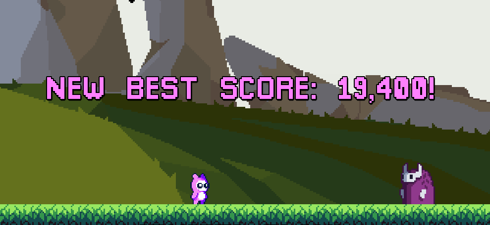
Fun game! I scored 19400, but I see people could score more than 20000, how dare they XD
Loved the controls, while a little less floatiness would be beneficial, but not much! A floaty character is appropriate for the game. Very well polished, and nice art!
Another suggestion, consider changing the color of the first text. It is hard to read write on a clear background ;)
Thanks so much! Can't wait for your feedback 😄 yeah, I wanted to try something different since it's more natural to produce a "casual" game with a 20 second time limit. Just wanted to provide something different. It has definitely been a big challenge, and probably the game is a little unclear, but I hope I made it in some way


