I like the concept. Needs some work but was still fun despite that! I didn't have time to do audio either. lol
Play game
Monsters Horde - The Last Stand's itch.io pageResults
| Criteria | Rank | Score* | Raw Score |
| Mechanics | #225 | 3.300 | 3.300 |
| Theme | #302 | 3.500 | 3.500 |
| Fun | #382 | 3.100 | 3.100 |
| Overall | #448 | 3.000 | 3.000 |
| Aesthetics | #630 | 2.700 | 2.700 |
| Story | #753 | 1.600 | 1.600 |
| Music | #782 | 1.400 | 1.400 |
| Sound | #802 | 1.400 | 1.400 |
Ranked from 10 ratings. Score is adjusted from raw score by the median number of ratings per game in the jam.
How many people worked on this game in total?
Just me
Did you use any existing assets? If so, list them below.
My own (uploaded in my profile)
Comments
Fun! I laughed when I got a Good News: Damage +50%, Bad News: Damage -50%
Fun and enjoyable.
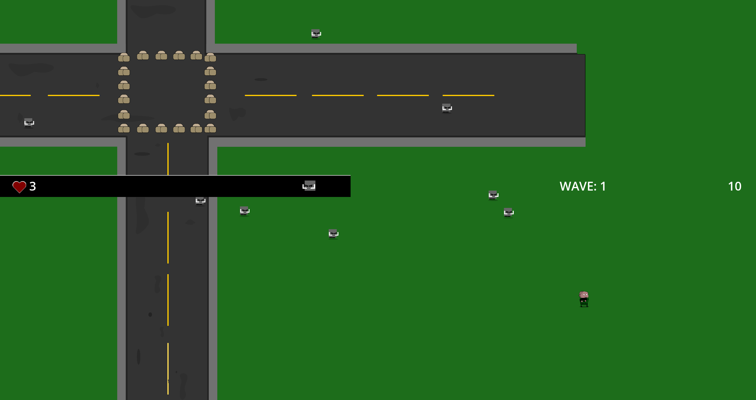
I think fullscreen is broken somehow. This is my starting position when I launch the game. Is that intended?
Good job ! Love the bonus and malus upgrade its a very nice idea, also the ally that help us fighting is nice :)
Very nice work !
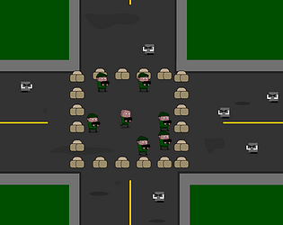
Fun game, I got to wave 15. I liked the good/bad options at the end of each wave, could have done with spawning the enemies in a bit more random way, I found I could just stand in one place and fire upwards and hit most of them just as they spawned. Also sometimes the good effect was identical to the bad effect, could do with a quick test that they're not the same. I had trouble with the grey-on-grey colour scheme. The green grass in your cover picture would probably have worked better. Being picky- aside, overall great job for a one person game!
Thanks a lot for your feedback.
Yeah some bugs here and there, I was racing against time to deliver before the deadline. Even the audio was missing as well :D Most of the time spent on this game was working on this good/bad game mechanic, I was learning by myself, trial and error for days, but gonna use this for other games.
The grey squared monsters were just a prototype, they were supposed to be zombies :D I'll work on this after I delivered in time.
Truly happy that people are playing, commenting and giving me feedback. Thanks. Made me hyped for making other ones.
Nice 2D survival game, with a fun game design element, where you must choose one of 3 options, each including a bad an d a good modifier. Nice original idea


Leave a comment
Log in with itch.io to leave a comment.