Play game
Cheboom's itch.io pageResults
| Criteria | Rank | Score* | Raw Score |
| Graphics | #1 | 4.350 | 4.350 |
| Audio | #23 | 3.350 | 3.350 |
| Overall | #28 | 3.410 | 3.410 |
| Theme | #35 | 3.400 | 3.400 |
| Originality & Innovation | #50 | 3.300 | 3.300 |
| Fun & Game Design | #129 | 2.650 | 2.650 |
Ranked from 20 ratings. Score is adjusted from raw score by the median number of ratings per game in the jam.
Leave a comment
Log in with itch.io to leave a comment.


Comments
Cool game! I bet this is great on mobile I had to zoom out my screen on desktop. I really liked the music and sound effects and it is tricky to keep the ratio up. I think adding a leaderboard would have added a lot to this. I think to add difficultly you could also add in another color. Great work and keep it up!
Cleary need a leaderboard :)
Well polished game!
Very polish and beautiful game
I love the art style ! :0 so cool ! :D
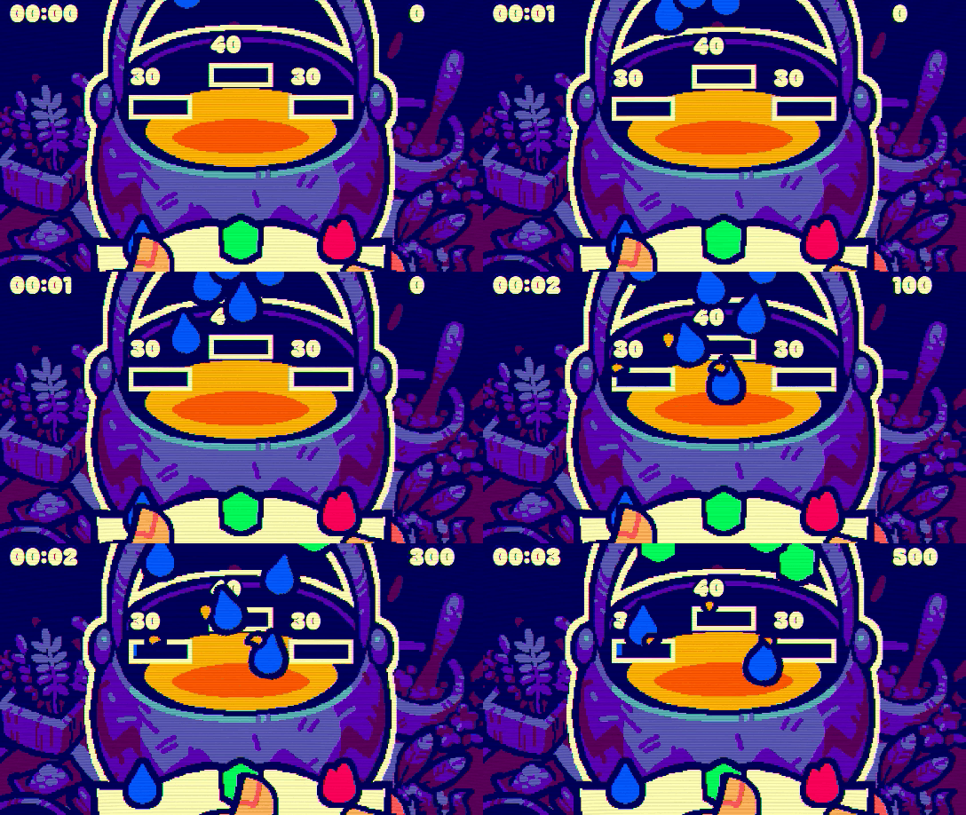
The game looks so cool but i didn't understand what exactly i should do other than pressing the buttons to full the bars with the right color :o
overall, well made !
Overall a good game.
Some starting tutorial can help.
Really cool art style, but I felt a little lost =(
Great art and music, the concept perfectly fits the theme. Only one thing: it would be nice to have a visual feedback in the corrisponding bar when you reach the max of a given ingredient. Good work!
Very nice graphics! I wasn't sure when I win or not, but it sure fit the theme! The music was also pretty nice!
Nice game!
A thoroughly enjoyable game with great attention to detail. It kept me engaged from start to finish. The graphics perfectly match the game’s theme.
Wow, definitely the prettiest game in this jam! The art is truly amazing, and the sound and music are lovely. The whole game gives me WarioWare vibes. I hope you continue working on it after the jam. My only critique is that it's hard to catch the grey ball because the distance between the camera border and the pot is a bit small.
Amazing art style! I'm a sucker for these colors you used ^^
I gotta admit that I was abit confused how to play, but I can tell that I an original idea well excecuted!
Great job!
Very fun, love the art
Very original nice work
I love the art!
Forgot to drop a rating for this nice game.
Interesting concept using magic to stabilize a potion. Only thing is the screen is way to wide I also think that the CRT effect was not needed here it hurts my eyes. But good concept. Some design feedback maybe put the amount and progress bars above the ingredient and make it smaller. Also would be nice to know when the amount has gone over. Keep the colors but maybe change them to red if I go over the amount that way I know how much I have to add or subtract from the potion. But great job art style is awesome well done.