Play Platformer
The Lonly (Prototype - GMTK Game jam)'s itch.io pageResults
| Criteria | Rank | Score* | Raw Score |
| Design | #946 | 3.120 | 3.120 |
| Originality | #991 | 3.420 | 3.420 |
| Overall | #1282 | 3.060 | 3.060 |
| Adherence to the Theme | #1698 | 2.640 | 2.640 |
Ranked from 50 ratings. Score is adjusted from raw score by the median number of ratings per game in the jam.
Leave a comment
Log in with itch.io to leave a comment.


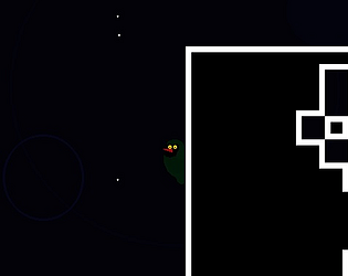
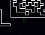
Comments
its compelling ... coolest thing i saw today... it has great potential.... rated
return the fvaour by Trying mine and leave your feedback : https://itch.io/jam/gmtk-2019/rate/431948
The Game has been released, it's on a 100% sale right now and I would love it if you would claim it and leave a review or comment on the page. if you miss the sale just send me an email and I'll get you a key.
At first it's a bit frustrating, but *SPOILER* when you realize you can climb on walls it becomes very interesting. I admit I didn't finish it, I got frustrated when i fell back to the start. The movement system is something you should improve to make it more responsive, also the dark background makes the character less visible, but you get used to it. Nice game though
Thank you very much! do you mind clarifying what you mean when you say "responsive"?
It's hard to understand when you can dash, sometimes i can't move right at all while in mid air but i can dash left, or things like that. Maybe it was just a problem of understanding of the movement, in that case i think you could find a way to make it clearer
oh ok, I completely agree, i did not give the player enough to go on, so by the time they get up to a more difficult spot, they still don't get the controls. it's a little silly to expect the player to just stop everything and take time to practice and figure out how your mechanics work.
It is good work that you did it alone!
Please check our game too: https://itch.io/jam/gmtk-2019/rate/461656
I really like the graphic aspect of the character. I also like his range of movements : jump, dash, climb... It would be perfect with a little sound atmosphere :) Good job ^_^
sound atmosphere was just more thing i had never done before, next time for sure though! Thanks for playing! ^_^
I liked the movement system, but the screen size was a little to small and it was also a little difficult to see the character on the dark background.
i agree, i did not think about that while making the background. thanks for playing!
I downloaded this out of curiosity and because i found the character cute and ended up being, no joke, one of the most compelling things i played today.
Alright, how do we start. There are some things that are FANTASTIC and others that are quite infuriating, hahahah
Right from the start i took a feel for the controls. The character has like, crazy mobility. It's incredible what you can do with him, and that's awesome. Every jump you have to think of your resources, two side dashes, one for each side, one extra jump and and upper dash. You can also run to gain extra momentum but that's just for the first jump.
All of that's awesome!
However, dashing with the arrow keys is really weird. It goes kinda against standards and it just makes me panic press and dash away to the bottom with dreams broken and feeling quite dumb. I'd suggest something like spacebar, or shift to dash!
Adding indicators of what jump resources you have left would be awesome too, like little arrows to the sides and over the character.
Another thing i'd recommend is a downwards dash, because the amount of times i fell due to not being able to stop the momentum of the side dashes felt kinda unfair, though again it was my own error.
Another really weird thing (though one that changing would mean a big rebalance) is how you lose all momentum when you dash. It feels strange, though i know some puzzles are designed around it. Though i do think it's important, as it would make the movement feel really satisfying.
Also, a sin of platformers: you always need to know where you can move. Maybe adding a key to look around, though it'd probably require for you to stick to walls too.
https://i.imgur.com/jYdLfk2.png
this is me and my friend playing the game! He speedruns Celeste, so he had quite an easier time with it. I just had to share it with him, he quite liked the mechanics! though he did point out quite a few things i added to the review.
If you want to polish and update this, hit me up: Stopsignal#2168 - I can help with art and animation and some tips, though i'd need time as i'm usually really busy!
Also would be nice to have WASD too, hehe.
Whoa, i'm humbled dude, thank you so much for all the feedback, I love everything you said. I can't say for sure if I will continue it, but the control scheme was actually a way to practice design for another game i am making. The desire to continue has been growing over the last 24 hours though as i think about it, so maybe i will put that on hold and make something out of this. Thanks again for playing!
I've reworked the game and added a ton of polish, I'm play-testing now if you want to check it out.
https://samuelsolomon.itch.io/the-lonly-wall
Well i wanna scream into a pillow because i had an essay written here and refreshed the page because it's 4:am and i'm not thinking well, oops.
ALRIGHT. Let's do this again, but more concise.
Gotta say, it's got a cool atmosphere, nice sounds, an awesome menu, it's all cleaned up. Can totally see you put a lot of shine on this, and i love that! The tutorial got me up to speed quite nicely and i was soon playing again like i was before.
Artistically it looks fantastic and the decorations with the walls are perfect. It feels way sleeker, the text boxes tinier, the inputs customizable and everything polished. Particles, jump effects, it's great!
Hooooowever i couldn't finish it. It kinda beat me, hahahaha. It got hard. Well, not actually. It's complicated. The thing is that the difficulty curve not only gets hard really soon, but it stays hard. It doesn't get harder nor it gets easier at all. I don't feel like i am getting past a challenge to go to a greater one, it's mostly all hard challenges all the time, and this coupled with the punishing falls (which got a bit more punishing now, more on this later) gets really stressing.
Now, stress can be good (it's supposed to be hard!) but i do remember not having this much trouble with the other version. I must guess that you got way better with the game and therefore are able to make more challenges and don't fall that much, and so don't get to see just how long certain sections can go where you can fall all the way down to the same spot. The one spot that killed me was this one: https://i.imgur.com/42dIcNT.png
I could get past it! I did, many times. However the part after that, that was relatively easy, i still got stuck in a blue wall and fell, and oh god then it was just a struggle to go all the way around just for the chance to even see if i could get past the screenshot part.
I think part of it is the new blue walls. They work perfectly compared to the old ones, and that's good, however sometimes you don't seem to touch them but the hitbox disagrees. Specially when dashing. That coupled witht he fact that it absolutely stops you on touch makes it feel really weird. Also, you can't seem to move at all if you are falling through them, and that leads to trying in vain to escape, wasting dashes to save your life that could have been used to, uh, save your life. (suggestion: make the player unable to dash while touching these walls, and make them tinted or something to show that they can't dash).
Also there are some decorative blue walls that can absolutely screw you over. I particularly remember a vertical climb part that was white columns between protruding clumps of blue wall that was there as an obstacle, but would have small parts of them out to decorate and i seemed to always get stuck on those, which wouldn't be bad if it wasn't *just* a few pixels off from falling safely. However, absolutely love the decorations between white walls and blue walls, they look fantastic.
However it's mostly the falls. I feel like it's gotten way more vertical than before, and therefore way more punishing. Also i can't seem to somehow save myself from falling all the way as much as i could before, the platforms seem tinier, more apart. More vertical.
I still really like it! Doesn't seem like it probably from all the complaining but i'm here as a playtester, hahahaha However, it got wayyyy too punishing way too fast. I still like the story snippets that build atmosphere and have little jokes, i'll probably go at it again when you release it, so i get to see them all!
suggestions:
Another outward zoom level. Just to be comfortable.
Make a sign here (https://i.imgur.com/9rbIApj.png) that reminds the player that they can still jump diagonally after dashing forward. I totally forgot about that (i'd just press "up" instead of "forward+up" because of training with regular platformers that would use the momentum of the dash) Sounds like i'd die of starvation there. Dangit.
Probably a particle or something to tell the player they got their jumps back. Sometimes you can't really tell!
The blue wall anti dash thing.
Probs more safety from fall measures, specially earlier on. Also probably more horizontal parts that aren't caves, to fall but not really lose that much progress, or be able to get to a platform instead of falling all the way.
Try to make the earlier parts a bit easier, not because it's too hard (i mean, it is, but it is kinda the point) but to make the player feel like they are getting better and getting to earn the hard parts, as now it's just hard all the time. Doable, but hard, and every time more punishing.
Also, did you end up adding the downwards dash or was it there before? I suggested you to add it, but asking my friend he says it was there before, and i can't really remember! I played with my friend again, he also stopped, though he got a little further.
I forgot a few things with erasing the whole post. Dangit. Still, hyped to see what you do with The Lonly Wall! It's prettu good as it is, but it totally beat me, hahahaha
Gotta say, it makes me really happy that you came back to this, as i had gotten the feeling you wouldn't. It's great to see the game develop slowly but surely. This is some good stuff, man.
btw i am doing a really really short platformer, if you wanna check it out: https://stopsignal.itch.io/infernal-hog-pizza?password=pizzahog
i actually uploaded what i have already just for you to check it out, so feel free to feel obligated (?
just kidding, of course, hahahah
Also, i really need to make fanart of this o:
Awesome, this is great, thank you for writing all this out!
Everyone seems to like the tone and the writing style, it so funny to me because so very much of it is just the first thing i thought of, I've barely had to change it at all.
I'm glad the visuals work, and that I've gotten rid of almost all the quality of life problems as well.
Things I'm taking
I was hoping I wouldn't need to fix that dashing hit box problem. but sounds like I need to.
I also like the idea of disabling jumps in barriers.
Another sign explaining the hold forward mechanic for the second jump is a good idea, i explain everything else after all.
The difficulty curve problem: I'll give the player a few breaks where they can make progress easier. I can't really take away any of the challenge, as if i don't have it they definitely will not be prepared for later, but i will try to give them more breaks.
Fan-art (I mean...you know...if you draw it)
Things I have Questions on
I'm very unsure about how i'm going to add indicators for jumps you have left that don't look horrible, any suggestions?
Why another zoom level? right now the zoom out lets you see as far as you can jump horizontally and vertically.
Questions about your experience
did you find ANY shortcuts? because if you didn't, then i can see how things would have gotten way to frustrating at the end. Doing the caves over and over would not be very fun.
have you explored much? (ie. found the mysterious hatted kew statues? or the Noe A. Tablets?)
how long did you play?
Again, thank you so much for writing all that out, it's so very helpful!
p.s. The down dash is new.
OK I FINISHED IT.
First i'll answer your things!
-I was hoping I wouldn't need to fix that dashing hit box problem. but sounds like I need to.
I'm really sorry for that, because i know how tricky it can be to have varying hitboxes. My suggestion would be to have a different hitbox only for detecting blue walls, and leave the normal one for white walls (as they'd just give you back your dashes anyways)
-I'm very unsure about how i'm going to add indicators for jumps you have left that don't look horrible, any suggestions?
I would probably avoid them completely (they'd take away from the atmosphere): i'd just make an small subtle effect when you *get back* your dashes rather than when you use them. So you would know if you touched that wall or not, in those cases where the hitbox maaaay have touched them!
-Why another zoom level? right now the zoom out lets you see as far as you can jump horizontally and vertically.
I'd say just to be comfortable in those edge cases, as they can happen. https://i.imgur.com/SZboCKK.png (supposed to go down in that part, however the stakes of the fall make it really uncomfortable)
-did you find ANY shortcuts? because if you didn't, then i can see how things would have gotten way to frustrating at the end. Doing the caves over and over would not be very fun.
Found a few! Biggest one was from the lonly heart to the part i struggled with. Then there was also one from the "forward jump" part i talked about, by jumping under a big platform to the left instead of entering the caves on the right. There might be more, but i can't remember. Saw a few cheeky ones in those last parts, but they were too risky for me.
-have you explored much? (ie. found the mysterious hatted kew statues? or the Noe A. Tablets?)
Found them indeed! Most, at least. Most on shortcuts, I skipped the king in the last screenshot because i didn't know it would still let me continue.
-how long did you play?
The really tired me at 4Am played for about 2 hours, and now i came back and after a few podcasts i finished it in 50 minutes, starting from the lonly heart.
That last part is killer indeed, that i can say. Discovering the Lonly heart shotcut made everything quite easier. I had gone down there up to the king when i was just exploring, but i didn't realize that it connected downwards. Maybe with zoom out i would have seen it, can't remember!
https://i.imgur.com/RxKrvu4.png
This is my proof. Also, you should probably center the texts from the interactables. Like, the ones that appear on the world, not the textbox ones. Nitpick!
Spoilers, in any case.
Is there something supposed to happen at the end? I walked up to the big golden statue and i just went through it, and then to the border, and then it closed. It was kinda cool, but the statue makes me feel i missed an interaction.
Also, fun thing; I was listening to a video podcast and when the game closed this popped up in my face https://i.imgur.com/suE5mMf.png and for a second i really thought you had put a scary face at the end, hahahahahah
Hope it all helps!! I really enjoyed finishing this game, man. Hard as nails games like this always leave you with that sensation at the end. Ahh, nice. I need a beer.
Hopefully this is the last update!
I added a second hit box for the barriers, and added a better explanation of the forward jump, plus a hint near the top (right before you have a chance to fall waaaay back down) that indicates the player should be looking for shortcuts.
I decided against the indicator for when your jumps are used up, I didn't like the look of it and decided the system was simple enough to grasp not to need it. (and by extension I also am not turning the jumps off when you fall through barriers.)
I fixed that edge case with the camera zoom, Another zoom out level would require more redesigns than I am willing to do at this point. (and there shouldn't be edge cases like that anyway, I want the player to be able to see their next jump at all times)
And the big one, the difficulty curve.
Instead of adding easier parts, I decided to go the opposite direction and ratchet up the difficulty in the first half. I made it much easier to fall back to bottom, so now the tension should rise appropriately the further you climb. Whereas before the tension was more of a straight line, now it should spike at each interval. I also made the very last stretch as hard as i possibly could, while keeping the layout the same, now the jumps required of you at the end are very precise and use your entire move-set.
p.s. I don't expect you to play-test again, I just thought you would appreciate an update.
The Game has been released, it's on a 100% sale right now so i can get eyes on it, and I would love it if you would claim it and leave a review or comment on the page. if you miss the sale just send me an email and I'll get you a key.
Just did! I'll leave a review later, too busy with the holidays and work! Thanks for telling me!
also, happy holidays! :D
My Take on Pizzahog - it's Great! a interesting mechanic and consistent tone
Good Atmoshpere - everythign fits together to create a fun tone, i especially like the cozy cheerful homes in hell.
I love the take on "Only one Projectile", making trick shots is satisfying
Advice and my Experience
for the first button in the game, because it was placed some distance away from the door, it was not immediately obvious that it would stay pressed, I assumed it would unpress and died for it, you might consider just putting the button closer to the door.
I exited and changed the controls so that W was jump after reaching the first checkpoint, things happen so fast in the game that the extra effort needed to press space instead of W to jump was detrimental to me, i personally had an easier time after i did this.
I ended up throwing the box at the green guy to discover the entrance the hidden room 1, not a criticism, just a note
that is awesome that the box comes back a little when you are close to it, really helps lower that difficulty curve without the player even noticing the help, i didn't see it until I was near the boss.
I beat it! missed 6 coins somehow. found 2 secret rooms. I presume the :( means you aren't mad, just disappointed
If I were making this, I would focus on interesting level design that involves trick shots more than swarms of enemies, and spikes. If you do want more enemies, then try slowing the game down, a little, it will make the combination of one hit KO, spikes everywhere, and enemies to avoid easier to manage in the beginning.
Bugs
there is a pixel wide gap you can see through at the bottom of the panels that cover the hidden entrances and exits
i managed to get stuck in a wall, could be a fluke, could not repeat it
sometimes when i fall on spikes, two sets of NOOOOO! will appear (indicating that my pizza is screaming i guess? ;) )
it's possible to leave the fire hazard at the last possible moment, your pizzas will catch on fire but the game will keep going without resetting
you can get two failure sounds if you die and then your pizzas or vice versa.
The list of controls when configuring the game contains duplicate entries for certain commands, not sure why.
I could not figure out how to get a controller working right, I couldn't seem to map anything but the mouse to aiming, and i couldn't trigger the fire action with the controller either.
First of all, thanks a lot for playing it, really! It seriously needs more stuff and polish, but the basics are there.
-for the first button in the game, because it was placed some distance away from the door, it was not immediately obvious that it would stay pressed, I assumed it would unpress and died for it, you might consider just putting the button closer to the door.
You know, that is actually a really really good idea. The player throws the box, the box hits the button, the door opens, the box just rolls away through the open door and the player realizes the buttons are only pressed once. It's good!
-I exited and changed the controls so that W ...
That's good! Personally i have a better time using AD and spacebar, which really shows in both games different designs, hahahah. Might need to add a menu to change stuffs easily when it's done, or at least keyboard presets.
-I beat it! missed 6 coins somehow. found 2 secret rooms. I presume the :( means you aren't mad, just disappointed
i'm happy people play it to be honest, hahaha. That one secret is quite a nasty one, i'd probably make it a little bit more easily found. Just a tiny bit, so it still feels secret.
-If I were making this, I would focus on interesting level design that involves trick shots more than swarms of enemies, and spikes. If you do want more enemies, then try slowing the game down, a little, it will make the combination of one hit KO, spikes everywhere, and enemies to avoid easier to manage in the beginning.
That's a good idea, People really didn't like the enemies, and myself i got to say they slow you down way too much, specially with double speed. They are better when they are kind of a puzzle, like the ones where if you bounce them wrongly they end up in spikes.
BUGS
i really really need to fix all of this before even continue making the level.
-there is a pixel wide gap you can see through at the bottom of the panels that cover the hidden entrances and exits
Luckily that is a really really easy fix, i actually knew about it but ran out of time and just made the build, dang
-i managed to get stuck in a wall, could be a fluke, could not repeat it
It happens, Unity sheananigans. Problems in the way the game generates the colliders. It's weird, as it does not let me fix it manually: the character bugs out with the new colliders and doesn't give back your jumps.
-sometimes when i fall on spikes, two sets of NOOOOO! will appear (indicating that my pizza is screaming i guess? ;) )
-you can get two failure sounds if you die and then your pizzas or vice versa.
its a l i v e. Ok, actually that's because of my spaghetti coding when making the instances of the box and the character. I will probably overhaul the whole death system, or at least put a lot of tape on it, i really need to. It's easily replicable if you die from the spikes on the last vertical moving platform. The body is still there, invisible, yelling, while the decoration body that falls down also appears.
-it's possible to leave the fire hazard at the last possible moment, your pizzas will catch on fire but the game will keep going without resetting
oh that's bad, i absolutely thought i had fixed that. Noted.
-The list of controls when configuring the game contains duplicate entries for certain commands, not sure why.
I haven't touched that one at all, though i think i tried to do a two player version very early in development. To explain, this was a work for class that i intent to continue, at least just a bit, and then release for free. So it mutated a lot from the very beggining. I really need to clean up all those things. I don't even think that starting unity box will be there at the end, though we'll see!
-I could not figure out how to get a controller working right, I couldn't seem to map anything but the mouse to aiming, and i couldn't trigger the fire action with the controller either.
I don't have a controller, so i can't really try it, though it must be simply because it's hardcoded to those. It does not even check for a "Fire" action, it just checks for the mouse button outright. I hadn't thought of playing it with a controller! I need to get on that. I wish it was as easy as in Gamemaker, because in unity stuff like that is kinda weird, at least coming from GM.
Thanks a lot for playing!!! I'll probably won't work on it for a while (i somehow landed a first job as a pixel artist and though it's kinda awesome, it eats up my time like no other) but i have a file with stuff i need to work on for it. This is all going there! Thanks again, man!!
Also, just for my own ego: it was actually way harder, with more spikes and missing the last checkpoint, and with the boss having more life and stuff. But juuust in case (class project, after all) decided it was better to smooth all of those things over, hahahaha >:)
Your welcome!
If i had spent money on the game, i'm sure I would have gone back and scoured the level for the last secret. Probably not to much to worry about there.
With the controls I could get working on the controller, the game actually felt very nice to play, the movement wasn't to fast when it was a controller setup, probably because it takes less thought to use it, I'd be very interested in seeing what full controls feel like.
Congrats on the Job!
The game looks intersting, but needs a little bit of polish
I would love if you could play and rate our game as well https://itch.io/jam/gmtk-2019/rate/462492
Could've been better if I would've been able to resize the window. The main character reminds me a somewhat of Plaque Knight from Shovel Knight!
your character looks so dope! you have pretty nice animations too. the game window was a little small for me.
Thanks! yeah, window size...not my smartest decision.
As others have said, the movement is really the highlight of this game. It's not exactly fluid, but it's precise, and I'm amazed at how you only used the arrow keys for everything, while other games would have used way more buttons.
With that said, I don't see how the theme "only one" applies to the game.
Thanks for playing! I really enjoyed fine tuning the controls, so I'm glad it paid off.
the relation is admittedly kinda weak, Only One Level is what I was going for. Originally it was going to be not just a wall, but a creature that you where climbing, which would have fit a little better but i ran out of time.
It takes a while to get used to but once you do the controls feel pretty great. Though the way to progress wasn't always clear. Overall its pretty nice
This game is GREAT and the movement system feels polished but once i got on top of the wall but i really liked the game on the bottom. I also found an erro if i talk and there are no npc the game says: deafult + examine value... But nice game
Great job! The movement system was super cool and felt very polished. Unfortunately I didn't really understand how to progress past the tallest wall (which could just be me being bad at puzzles). Some more direct hints about how the movement system worked would have helped me I think.
the tallest wall? hmmm, i remember putting a dead end with a grave next to it saying it was one, mind sending me a screenshot? as long as you can reach a roof you are able to progress by sticking to it.
Not sure why but it's opening in a tiny window and I can't see/read anything. Is there a way to go fullscreen?
Sorry, I made it so dang small that i just knew some people were going to have trouble reading, but i ran out of time to fix that. sorry. I suppose you could change your screen resolution, not a good solution, but i didn't build another one in. :(
Will give it a go on my desktop with screen magnifier :)
The movement system is really awesome!
Thanks! I spent a Lot of time on it.
The game was certainly atmospheric, and I liked the design of the main character. As the movement mechanics were quite complex I think maybe a little more could have been done with the level design to cater for it. It felt pretty rewarding figuring out the movement mechanics to climb the wall, so that was cool!
I realized half way into design that i needed to spice things up, so i made a object that bounces you away from it if you touch it, i wish i had introduced it earlier so i could have used it in the design all the way up. Thanks for playing!
Pretty Cool movement system!
The movement system is pretty interesting and gameplay reminds me Getting other it.
thanks! I admire that game, it was so exactly what it wanted to be.
You've got a great result!
BUG REPORT:
early on a creature tells you it saves the game, this is a lie, don't believe it, the first draft had saving, but it was to buggy so i ran out of time and cut it.
I like the idea of discovering this weird movement mechanics, and discover that you can indeed always go higher. It's a big too obscure maybe, as I sometimes fall unexpectedly without understanding why.
I don't see the relation with the theme though.
Thanks for playing! the relation is admittedly kinda weak, Only One Level is what I was going for. Originally it was going to be not just a wall, but a creature that you where climbing, which would have fit a little better but i ran out of time. sorry the mechanics were to obscure, i tried to make them easy to figure out, but hard to master.