Play game
Controlmen's itch.io pageResults
| Criteria | Rank | Score* | Raw Score |
| Fun | #616 | 3.473 | 3.473 |
| Overall | #944 | 3.374 | 3.374 |
| Presentation | #1178 | 3.451 | 3.451 |
| Originality | #1254 | 3.429 | 3.429 |
Ranked from 91 ratings. Score is adjusted from raw score by the median number of ratings per game in the jam.
How does your game fit the theme?
Directional Control and attacking drains stamina!
Did your team create the art for this game during the 48 hour time slot?
Yes
We created all art during the game jam
Did your team create the audio for this game during the 48 hour time slot?
Yes
We created all audio during the game jam
Leave a comment
Log in with itch.io to leave a comment.


Comments
Really cool idea! You literally run out of control!
Also really cool art and music!
Thank you!!
This game has a great premise and was a lot of fun to play! The moment of realization when one of my directions blew up was great! The one thing that can be kind of frustrating is the randomly-generated-ness but that's just part of it I suppose. I think it could really benefit from a wave system or just some way it increases in difficulty over time. Great game!
Thank you! I'm glad you had fun! Yes difficult is my main priority after the jam, need to learn how to manage it better.
This was alot of fun and I enjoyed the mechanics and take on the theme :) The art is also awesome considering you did it yourself in 48 hours :)
Nice job!
Thank you so much!
Nice and simple gameplay with a lot of potential. Aside from the mild issues with UI and balancing, it's overall a pretty solid and fun game :)
Thank you for the feedback!
If you get hit after the game over screen, the game over screen just shakes... why???
I like the concept of the game, but the fact that the main mechanic isn't explained well enough and the rng is brutal (when i need a specific thing, usually there isn't...), and probably some other reason (that rn i don't feel like searching it) made me not enjoy the game overall... 🙁
EDIT: That's a shame too, because the game is very well polished too, so can't even say that the game hasn't even been taken care of properly...
Yes the game over shake was a bug after I launched it, did not have time to fix it, as for the rng and game play, I have heard many time that it was too difficult should have spend more time on that! Thanks for the honest feedback!
Nice job! I really felt out of control with this one because I always lost my directions. Well done! :D
I don't know why, but I'm getting really low framerate, making this game unplayable in the browser, wish you uploaded downloadable version too :(
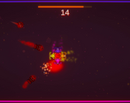
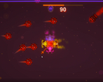
Nice idea, but I couldn't tell how much fuel I had. Now that I'm looking at the screenshots I see these bars at the edges of the screens, which probably are the fuel gauges. I would recommend showing the fuel levels on the directional arrows of the vehicle. So, an arrow starts full and then the top gets transparent, then the middle, etc.
Thanks for the feedback, I've heard many time that the UI was confusing, will work on that after! thanks
I like the theme of the game, the art and music are great. The background moving along with the player sometimes confuses me, it feels as if I wasn't moving at all, but moving the camera instead. But nice work overall!
Thank you! I tried to make a parallax bg last minute, and it was a fail lol, that's why it looks like that. thanks for the feedback
Great take on the theme!
I think this game should start a little easier and build up from there though.
The controls were good and I liked the music.
Good job.
Thank you! Yes I have heard many time that the difficult is a problem!
I really like this idea of you managing the engine for movement. It made you strategize out what you need to press before thing get out of control. Enemies do seem to spawn way too much though i think, and the drop rate based on RNG sometime can make or break the game.
Overall, I liked the direction you took for the game. Would love to see you work on it post jam. Great job!
Thank you for the feedback! Yes, the difficulty is a huge problem in the game. wish I had more time to work on it, will fix after.
Cool take on the theme! A game where your controls have bars that break is actually an idea I seriously considered doing as well. I think you did a great job implementing this idea, and the game both looks and sounds really good! The main issue I had while playing was that the game seemed to always be moving towards my demise, so it was really just a question of how long I could last before losing too many of my thrusters. Also, as a more minor suggestion, it was a bit difficult to judge my velocity, so having some slight movement to the backgrounds stars (or some foreground particles) would really help in that regard (although I realize that's unrealistic).
Thank you for the feedback! You pointed out my two biggest setback lol I love it. I attempted to make a parallax bg last minute, which was a fail obviously haha, and I did not have much time to mess with the difficulty. Thank you again!
Neat! I felt like this game really shines when you realize you're about to lose an engine. Definitely makes you rethink your strategy!
Thank you!! yes, it gets really chaotic really quick lol.
Thank you so much!
Hey, neat concept and it works pretty well! The balance seems like it would be really hard to design, but it seems both fair and challenging. For me, it did feel like things would explode and I didn't realize their health was low, probably because managing five health bars at once is a difficult task. You can keep the health bars, but as an additional visual aid it might be nice to have the part that's low on health glow red to give you a warning before it actually runs out.
Thank you! Yes the UI and managing the parts need to be done better, I will work on that after, thanks for the feedback!
Simple concept, but it works pretty well! The main problem I ran into was that since the background didn't scroll, it was often disorienting, and making it feel like I wasn't moving when I was
Thank you, yes I had a last minute attempt at a parallax BG, then that happened lol, thanks for the feedback!
A very punchy experience. For some reason, that's the main phrase I can think of to describe it. I like the background music, and the overall aesthetic of the game is just really nice! I found it slightly difficult to notice the orange bar at first, considering its scale in comparison to the ones at the sides of the screens, but I can imagine that bar being a strange one to find appropriately prominent screen space for. I also liked the use of colour here, and the visual effects look great! Of course, I like the gameplay as well - I can honestly say that I've not seen too many games that have done this concept, and I liked what I played of it. Apologies that my comment doesn't have much substance, I'm very tired, but nice work! :D
Thank you for the great feedback!! yea the health bars need a rework.
very neat game! took me a second to get my bearings, but once i did it was awesome! it's a really cool mechanic to have to balance the stamina of each engine and the gun and try to survive! can be quite tricky at times, but never feels impossible. great job :D
I like the way the game mechanics are balanced and work out together. Really good job.
Thank you!!
Gg for the game ! It looks and sounds very good :D
Thank you!