Play game
Cubenet's itch.io pageResults
| Criteria | Rank | Score* | Raw Score |
| Fun | #2976 | 2.429 | 2.429 |
| Overall | #3636 | 2.310 | 2.310 |
| Originality | #3766 | 2.357 | 2.357 |
| Presentation | #3933 | 2.143 | 2.143 |
Ranked from 28 ratings. Score is adjusted from raw score by the median number of ratings per game in the jam.
How does your game fit the theme?
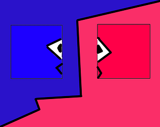
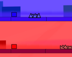
You have 2 player control joined and you can get taste of 2 levels in just 1 level
Did your team create the vast majority of the art during the 48 hours?
Yes
We created the vast majority of the art during the game jam
Did your team create the vast majority of the music during the 48 hours?
No
We used pre-existing audio
Leave a comment
Log in with itch.io to leave a comment.


Comments
Nice approach to the theme for the jam! The only issue I had was that sometimes while moving the cubes wouldn't jump and I would run into obstacles (could have been my computer, not sure), but overall nice platformer!
It was problem of code(movement) When i knew it was too late haha. Thank you for playing Have a great day ;)
Great use of color and overall nice and simple art style. Only grip I have with the game is sometimes I'm not able to see whats going on for the red character cuz the camera follows the blue guy
Thank you for playing ! Glad you like art, will work on camera Have great day :)
It would be nice if the camera was locked on the y axis because when you jump you stop being able to see the ground.
Thank you for playing !Will work on this idea , Have great day :)
It was fun to play. Liked level desing! Time to time it felt like the jump was a bit unresponsive however, I enjoyed the playthrough! Good job.
Thank you for playing ! Glad you like game, movement was unresponsive till the time I knew, I was late haha Have great day :)
I really like the game design. Good idea, playing with 2 characters with 1 controller. Who controlling the player felt weird. I wish the controller was a little more precise.
Thank you for playing ! Glad you like level design ,Will work on more precise movement. Have great day :)
Simple but effective concept! I think it would be better if the items you had to avoid looked a little more dangerous, so you are more aware of them. But good level design!
Thanks for playing ,suggesting . Nice to hear you like level design. Have a great day :)
This was TimDev's idea, right ?
I dont know. This idea came from pontypants ( Youtube channel) Thanks for playing. Have a great day :)
Rate Inverted Duality by TimDevs for GMTK Game Jam 2021 - itch.io
Very simple concept but the double jump could be used more I feel like. Honestly for a one-dev game, it's pretty nice!
Overall, there are a few things that I think could make the whole experience way better without too much work (try them on your next game and tell us how it went):
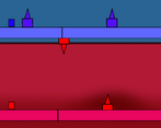
- The game is themed around two-colored worlds, but both the enemies and platforms are in the background's color. Maybe make every platform blue in the blue world, but the enemies in blue world are red. Some enemies are spikes, some are circles, and there are at least 3 shades of red used for enemies making the whole thing not very recognizable.
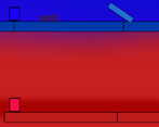
- The placement of the whole scene is a bit weird: we don't see the sky part of the blue world when not jumping, but when jumping the red floor is completely hidden and I landed on enemies/empty spaces I didn't know existed. To fix this it might be wise to have the camera be a bit less zoomed and fixed in place? or moving in another way I don't know. Also it's very easy to have a square out of the screen, and basically lose the level like that.
- The enemies could have cleared trajectories, maybe dotted circles showing their start and end positions with dotted lines in between? It's a detail though.
- There is a bug that I haven't seen mentioned in the comments before me: If the red cube picks up a diamond before the blue one, it sometimes locks itself in place: the blue one could go forward but not the red one.
- Something to quickly restart the game might be helpful, maybe pressing on the R key reloads the scene? Or add a pause menu, that could be nice too.
All in all, the idea is cool, some misc changes would improve the experience greatly.
Congrats on your submission, and good luck for next times!
Thank you For playing! Really appreciated this review, This will help me so much :)
Cool design game. Jump button need to improve. Maybe use GetKey (not GetKeyDown) or use in Update
Thanks for playing. I used all code in fixed update ,I had fixed it by putting it in void update! Have great day! :)
Nice Game But UI Could be Better
Thanks your feedback! I will work on it ;)
Neat level design. Controls are bit unresponsive at times.
Thank you for playing ! Glad you like level design, Have great day :)
I Know the issue of jump input not working, some bugs and recommend me what should I add more in next update. As per rule of Gmtk i cant update it so i will published updated version after 7 days!
Was frustrating that the jump input got lost sometimes, but I liked the art and the level design.
Thanks for your feedback! I am aware of that issue and working on it
I liked your level designs! The movement was weird, though. What I mean is that sometimes pressing a key would do nothing. This happened randomly though so I don't know what the cause would've been.
Thanks for playing! I figure the issue and working on it
Your controls are a little jank, but I liked the gameplay. The music got repetitive quick.
Your scene transitions are abrupt, maybe add a fade to make them less jarring
Thanks for feedback surely I will work on it.;)