Play game
Soultern's itch.io pageResults
| Criteria | Rank | Score* | Raw Score |
| Presentation | #658 | 3.800 | 3.800 |
| Originality | #783 | 3.675 | 3.675 |
| Overall | #1083 | 3.400 | 3.400 |
| Fun | #2287 | 2.725 | 2.725 |
Ranked from 40 ratings. Score is adjusted from raw score by the median number of ratings per game in the jam.
How does your game fit the theme?
You are tied to your Soultern
Did your team create the vast majority of the art during the 48 hours?
Yes
We created the vast majority of the art during the game jam
Did your team create the vast majority of the music during the 48 hours?
Yes
We created the vast majority of the music during the game jam
Leave a comment
Log in with itch.io to leave a comment.


Comments
I really enjoyed the game! the exploration and mood is outstanding and i liked how you set a mood with the intro sequence. My only small critique is that I spent half my time running from all enemies because I didn't know I couldn't attack while holding the lamp. once I figured that out I had a great time!
I love this! Great interpretation of the theme! And especially great art! I would love to know your tips for making great looking pixel art! It reminded me a little of Dark Souls and I really enjoy that!
Thank you for your kind words!
What helps me a lot is looking up some pixel art for reference and taking inspiration from it. Also having a cohesive colour palette can change the overall feel a lot! So I always start with thinking about how I want the pixel to feel and then based on that pick colours. You can also simply find some colour palettes online and than change it a bit to your liking! And then it all comes down to practicing!
Awesome advice, thank you!
Awesome work! I loved the tradeoff between leaving the light to have stronger attacks, but also slowly losing health. It made for some good strategy and risk-reward scenarios.
I have experienced the web lag issue before with Godot 3.2.3, I have found that the most recent engine version seems to have fixed it, maybe give that a shot!
Ohh thanks for the tip! We'll surely try it!
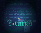
Really cool art and vibe. The text reveal with the lantern light was super neat, always love an in-game title reveal!!
Hehe thank you!!
I would have liked a better indication of where should I go. I really, really liked the pixel art and the music (but from afar ;) ) It reminded me of Hyper Light Drifter a bit. The concept is nice, I especially liked that your life AND the light are related. I found out that sometimes, dashing away from ennemies was the safest option, maybe closed rooms would have been nice Also, it would have been cool to have a different animation when you are far from the lantern, to signify more the power up !
Thanks for playing and the feedback! Oh yes, great ideas!
Very nice game but kinda difficult to find the right way. I didn't find the miniboss :(
Ooof, sorry to hear that. We made the map too big with no clear directions. If you go south-west, you should get to the boss room eventually.
Thanks for the directions!
Cool game!
I liked the introduction via discovering the texts on the floor. It looks pretty neat too. The music had some weird crackling that prevented me from enjoying it and I got killed by the flying guys all the time and couldnt figure out how to get them.
Thank you!
The flying monsters weren't originally supposed to go beyond the ground so you could kill them easily. We changed it on last minute, but it wasn't the right call.
Very pretty entry with hyper light vibes :D I got lost a bit but was nice to wander around and enjoy the art!
Thanks! We're glad you enjoyed Soultern!! :D
Loved the atmosphere and the art style, though I did have to mute the audio. It was hard to figure out where to go after a bit because I ended up running past all the enemies, but I was engaged from the beginning and think it'd be neat to see this concept developed further!
Thank you! We are considering working on Soultern further!
Really liking the Hyper Light Drifter vibes from this game, you guys did a good job with the atmosphere and I'm impressed with how big the world is. Music made me want to puke though, was way too high-pitched, unquantized, and repetitive. Gameplay is easily cheesable, I just dashed past everyone, and the combat feels really clunky and slow, I'd suggest allowing the player to attack while moving, then add some incentive to attacking monsters like powerups.
Thank you for your feedback!
it shows a lot of work and care to many details! Dont be too harsh on yourself about the sound, that kind of thing happen, and now you are more knowledgeable about it!
Thank you!!
There is a lot of thinks I like about this, but there are more that ruin it. The music is way to loud and sharp, which was uncomfortable to listen to. The mechanics are poorly explained, leaving me to try to fend off enemies with way too much health before encountering the text that explains how to do more damage. The projectile enemies are very unfair when you cannot see them coming. And it is also not clear when you take damage.
Overall it is a great start (the art is definitely pretty!), and I hope next year it'll be even better.
We appreciate your feedback! Played the game again and I can definitely see where you're coming from.
Love the art and the concept.
I didn't see all the written text explaining the controls, so I avoided the enemies during my first run ^^
Thanks for playing! ^^ Technically, you don't really need to kill the monsters. Just the mini boss at the end.
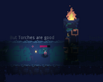
When the tutorial was being created it wasn't that dark so you could still read the text outside the Soultern area. Though then we made it too dark
Super cool concept, love the art style!
Thank you!
The music is definitely WAY too loud and the graphics seemed to glitch out at times, but other than that the game was super fun.
Thank you! And sorry for the loud music, I thought I changed it.
I like the idea a lot, the controls are a little strange and not well explained, also dashing is to powerful, maybe it should cost little, I literally avoided every enemy and kept running, maybe but doors that don't open till the enemies are dead. other then that good job.
Thanks! Yeah, the tutorial is quite badly executed. We thought the same about the dash, originally we planed to make a light button which would activate a door if your Soultern is near, however, time was running out so we left it that way for the player to play however they want xd.
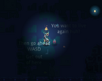
I love the idea. The controls placement could be earlier and easier to see. I was hit a bunch of times before seeing the "Press J to attack" and "You can't carry your soul to attack". Maybe have it on the bridge area leading up to the first enemy? Just so there's time to read it, look at the keyboard, etc. Music was loud too. But I enjoyed the game overall. Just some game design and balancing needed. For 48 hours, great work!
Thanks for playing! Good points. We'll put more care into the tutorial next time!
I love the namedrop near the start, that was done extremely well
Thank you!
Really nice graphics. The game was a bit difficult since you dealt so little damage close to your Soultern, but I could not see very much outside of the range. Could do with being a bit brighter!
Thank you for your feedback! I agree, Soultern has quite a lot of balancing issues. There's never enough play testing! We wanted to make it more 'spooky', however, probably made it too dark.