Play game
Please Don't Skip!'s itch.io pageResults
| Criteria | Rank | Score* | Raw Score |
| Creativity | #567 | 3.947 | 3.947 |
| Overall | #1656 | 3.368 | 3.368 |
| Enjoyment | #2270 | 2.947 | 2.947 |
| Presentation | #2302 | 3.211 | 3.211 |
Ranked from 19 ratings. Score is adjusted from raw score by the median number of ratings per game in the jam.
How does your game fit the theme?
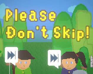
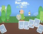
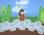
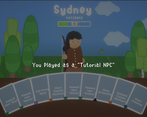
Player play as a NPC, have to explain the game to the "player (computer)".
Did your team create the vast majority of the art during the 48 hours?
Yes
We created the vast majority of the art during the game jam
Did your team create the vast majority of the music during the 48 hours?
No
We used pre-existing audio
Leave a comment
Log in with itch.io to leave a comment.


Comments
Probably the most unique and well-fitting game on the theme so far, had a great art style and simple but good mechanics. Thanks for giving me the experience of being an npc, something i never thought that I needed, but glad I could experience it
Thanks a lots!!!
neat game, i really like how its a balancing act b/w using "good" cards and "bad" cards
Yeah, I think most of the cards can both be good or bad, depending on the player you encounter.
I like the idea but i couldnt really figure out what the symbols meant, maybe im just missing something. Good work though!
Very very unique game , And I am a Good NPC , today I understand the pain of NPC's when I skip them , Good work,
I request you to please review my game also
Thank! I will check out your game too.
Cool idea. It was interesting figuring out what the icons meant for the topics the players were interested in. I enjoyed it a lot!
Thank you!
This is a really cool idea, I'd love to see it expanded upon. Sometimes felt a little stuck with the random card draw, so maybe a redraw mechanic could be introduced.
Good job!
The outcome of the game depends too much on luck indeed. Thank for the feedback!
Very creative idea, and the art style was lovely. However, I couldn't make out what the icons meant. I ended up guessing and was pretty successful... but some hints or clues as to what those mean would be helpful. Or just make them bigger, use some of that tree space.
Also wonder if it would make sense to need less cards for the first people, make it harder as the game progresses. Or maybe a specific order that the cards need to be played. That said, I liked the game, nicely done!
Thank you! The tutorial and progression is a bit weak for the game. Mostly counting on player to figure it out themselves.
Interesting concept and an intriguing puzzle game. It wasn't clear in the beginning (and still a bit now) what the icons mean and what they like and don't like, so I would recommend having a popup when you hover over each icon. Also I would recommend having a larger diversity in characters, as most have the same skin-tone and eye-color and I ran into the same ones multiple times. I would recommend splitting them up into different chunks to make it easier (and random tip, outlines make everything look better). Overall quality game and quality idea.
Thanks! The icons and the character’s sprites can definitely be done better XP.
I like the concept, sort of reminded of the Uno card game!
Pretty Intresting Concept! It was really fun!