Play game
Lights, Camera, Bullets!'s itch.io pageResults
| Criteria | Rank | Score* | Raw Score |
| Enjoyment | #1198 | 3.368 | 3.368 |
| Creativity | #1486 | 3.579 | 3.579 |
| Overall | #1613 | 3.386 | 3.386 |
| Presentation | #2302 | 3.211 | 3.211 |
Ranked from 19 ratings. Score is adjusted from raw score by the median number of ratings per game in the jam.
How does your game fit the theme?
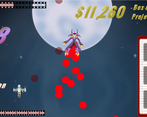
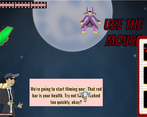
You control the villain of a shoot-em up and try to make difficult but not impossible bullet patterns, in a role reversal from how bullet hells are normally about dodging the giant patterns.
Did your team create the vast majority of the art during the 48 hours?
Yes
We created the vast majority of the art during the game jam
Did your team create the vast majority of the music during the 48 hours?
No
We used pre-existing audio
Leave a comment
Log in with itch.io to leave a comment.


Comments
An interesting take on the genre.
The art is amazing and the setting is really nice. I like the game. At first I was a little confused which character the player was that should not be hit, but that's part of reversing the roles, nah? xD
Lol, nice play on boss reversion. I think tho that adding more bullet patterns for both characters could make the action even more interesting. Also, I would keep the control to either mouse or keyboard only. Either way, good job.
Love the art to this! This was well executed, I had a ton of fun!
Thank you! I'm glad you liked it.
Super fun game! Art is really nice and I like the humour. Mechanics work well, the 'player' ship AI was really impressive
My partner pulled out some wacky math to make the AI work. Many thanks!
It wasn't that wacky! It was just trigonometry to find perpendicular angles and the direction the bullet is going to miss on, plus a weighting function to move more in response to close bullets. (okay, the weighting function was a little wacky, but that's only because it could be anything as long as it was an inverse function.)
This guy wacky af
Very cool idea!
I wish the play space was a little bit bigger so we had some room to move around a bit, but other than that great work!
Thanks! We agree about the spacing being a little tight. I think some UI tweaks and shrinking the boss bullets could’ve made a big difference.
Super creative and well-executed concept! Great touch with adding different game-over dialogue for each of the three different lose conditions.
Thank you! We’re flattered you decided to play multiple rounds!
Really cool idea!
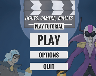
This is a fun idea, I was a bit confused at first and I went to go try the tutorial and the button wouldn't work and I was gonna leave a comment about it, but then I saw the comment her telling me to click just right on the bottom of it, and then the game was a lot more enjoyable because I knew what I was doing. I love the vibe and theme of this though, it's very creative.
Thank you.
We have a build with the button working, but we were not able to get it onto the page in time.
Oh well.
THE TUTORIAL BUTTON WORKS but you have to click on the absolute bottom edge of the button.