Play game
The Architect's itch.io pageResults
| Criteria | Rank | Score* | Raw Score |
| Style | #3165 | 3.000 | 3.000 |
| Overall | #4536 | 2.556 | 2.556 |
| Enjoyment | #4822 | 2.292 | 2.292 |
| Creativity | #5360 | 2.375 | 2.375 |
Ranked from 24 ratings. Score is adjusted from raw score by the median number of ratings per game in the jam.
How does your game fit the theme?
Grow and Shrink this puzzle platformer and explore the 'Beginning,' in The Architect.
Development Time
96 hours
(Optional) Please credit all assets you've used
See Description for full credits to the amazing people who unknowingly contributed to thus game!
Leave a comment
Log in with itch.io to leave a comment.


Comments
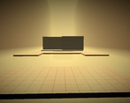
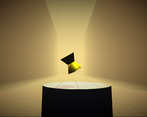
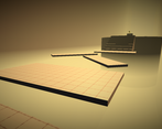
I really like the atmosphere, it feels like being in a sand temple !
Yes, the temple vibe was really what I was going for. Thanks for playing!
Nice work!
Thank you! And I LOVED your game by the way! One of the best for the jam!
Liked the mood and theme :)
Thank you!
Beautiful style, though! Even though the gameplay concept is maybe not the most groundbreaking.
Thanks for playing!
I will say one reason the game is not very good (among others), is that I tried to write clean code the whole jam.
Nice artwork I love it
Thank you!
Atmosphere is on point. But then there are no checkpoints and doesn’t lose when fall?
After you fall for awhile you go back to the top, and there is a checkpoint for the first level, but it is near the end.
A very serene atmospheric gameplay. Tad a bit confusing on what to do in the first place. I understand that the dev might want to achieve the minimalist UI feels, but short non-intrusive tutorial would be nice to walk me down before I experience my first long fall into the abyss before I even grasp the mechanic and almost closed the window thinking that I broke the game. But after awhile, I grew used to the mechanic and felt the nice experience dev wants to achieve. Thank you for making this game. :)
I’m sorry about that. My plan was to add a text tutorial in the beginning, and I forgot until the last day. I loved your game by the way.
Definitely got further than our game did xd. I kinda liked how it didn't gave me fullscreen as it was like a different perspective (I swear I'm not stretching). I will give the style higher rating because my favourite colour is light orange <3 (but actually the contrasty like lighting is cool), also I like how you don't fall forever and get teleported back up which you could probably use as a future gimmick in a game :P
Thank you for playing! You gave me an idea for the game should I continue working on it, such as falling onto different levels!
I liked the atmosphere but the gameplay felt difficult and unclear, especially in the beginning section where I wasn't sure what to do. I like the falling back into the stage upon falling off, but I wonder if it's better to shorten the fall because the first time I fell off I thought I had glitched past the respawn since I was falling for so long and I ended up restarting my game. The spinning platforms in the tutorial also spin your camera around with them, which almost gave me motion sickness and made it very difficult to pass. Overall I really liked the style, but the gameplay needs some improvements
Yeah, the falling was something I thought would be awesome if done right. Unfortunately, I had to make the respawn-point really far down, so it didn’t look like you teleported. And I almost removed the rotating platforms because it was hard for me to progress.
Hi there! This concept was really interesting, I liked the shrinking and growing mechanic a lot. However the introduction section without the growing mechanic was long, and the goal in that section was a bit unclear until I saw the object at the end.
I really enjoyed that when you die you fall back down to the start in that way- that was a great touch! Overall good concept, I'd be interested to see more of that growing mechanic!
Yeah, a lot of things happened so I thought about scraping the growing and shrinking mechanic because it broke, but I decided to hastily add it back in yesterday via level 2.
Liked the style. The intro was a bit long tho without using the theme.
Also I didn't include this in my rating but the font is very hard to read.
Overall cool idea with cool visuals but the pacing needs work
sry if you got 2 notifications I hit send twice my b
I realized the font was hard to read pretty soon after I added it, but it was 4 am by that point so I didn’t have much time.
And about not using the theme, the game went through a couple changes and I lost some progress halfway through. So, my idea was that the theme is explored through the huge world you live in, but I do regret not adding a shrinking and growing mechanic more.
Thank you for the feedback.
One question did you play the downloaded version or the WebGL version? The downloaded version has an audio effect filter that enhances the game so you could play that and maybe give it a better rating? Wink Wink ;)
I will try the download version
Thank you. Now I can have your credit card info.