Play game
trinket tower's itch.io pageResults
| Criteria | Rank | Score* | Raw Score |
| Presentation | #54 | 4.547 | 4.547 |
| Overall | #808 | 3.535 | 3.535 |
| Enjoyment | #1855 | 2.925 | 2.925 |
| Creativity | #2021 | 3.132 | 3.132 |
Ranked from 106 ratings. Score is adjusted from raw score by the median number of ratings per game in the jam.
How does your game fit the theme?
It's all about the dice, baby!
Did your team create the vast majority of the art during the 48 hours?
Yes
We created the vast majority of the art during the game jam
Did your team create the vast majority of the music during the 48 hours?
Yes
We created the vast majority of the music during the game jam
Leave a comment
Log in with itch.io to leave a comment.


Comments
Okay, the intro is actually really unsetling for a cheerful game.
But other than that, it's really slow and eerie when all of the ennemies are dead.
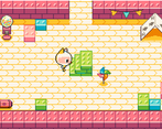
I thought the Legos that formed a staircase was part of the blocks.
So I am a little cat, wandering around, vanishing toys and little babies with dice... sorry what?
Visual is nice tho, and music. But I just didn't get the idea
this account here posted a lot of negwtive comments on all reviewdd submissions. Plus he is not linked to any participant
This account here is posting what he wants based on what he see in the game. What didn't you understand in my comments?
And I post what I see based on your comment history, activity and on your account's unaffiliation with any game posted in a jam. As you are free to express your "opinions", strangely, only in the last 7hours of the voting period, on people's games, I guess I am also free to express verifiable observations.
Is that some kind of fairytale where you are not allowed to leave negative reviews?
Are you actually serious?
This is the fairy tale: an account created 9 days ago with little to no activity, and absolutely no association to a game submission. Then all fo the sudden 7 hours before the voting deadline, leaves unconstructive, distasteful negative comments. You are free to do what you want, I didn't stop you from posting comments. But I find the above conjunctures highly suspicious. I don't know what to think of your purpose. And why does it bother you then that I am highlighting these very specific, but public details about your activity on this GameJam? A bit strange that it's okay for you to leave negative comments about someone elses work, but when it comes to you, you get defensive.
Other developeres somehow managed my sharp comments. Grow up
That intro scene was scarring :P
Gameplay was simple but very effective.
The artstyle and story will surely pull you in.
And glad to read in your description that the baby was plastic!
A highly enjoyable and well made game !
This game was cute....until the ragdoll husks....thats gonna haunt me lolz.
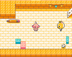
Presentation: The game looked beautiful. The level of work that went into making this one look pretty payed off. More than that though, the design sensibilities that went into the general design with interactable always being in the middle of the room made for a elegant solution in ensuring that I the player didn't spend to much time trying to interact with the props while also additionally telling me that the thing in the center of the room was what was important(this is good design) . Audio wise, i love the sound that played every time i entered a room with an enemy, much like with centering everything important in the game, this sound gave me vital information about the room i had entered and allowed me to easily interpret that information. (this is good design). More than that though, the sound effects across the board felt informative and pleasant. The music sounded beautiful and stayed enjoyable for multiple play attempts. I especially like how it felt sweet and child like but also a wee bit sinister at times....(looking at the ragdoll husks). Finally the character designs, I just loved all of them. I honestly do not have much in the name of feedback on the presentation of the game. It looked great, and sounded great.
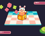
Gameplay/Game Mechanics: I think the mechanics are pretty simple but fun. I like that the rooms changed with different runs, and I think that was a nice subtle inclusion of rng in navigation. Moving, fighting and interacting all felt really good as well, so good job there. I think perhaps the combat is a bit too simple, early on I often ended up in situations where I would deal a point of damage, the enemy would heal a point of damage, rinse repeat. However, when I got to those higher levels and the monsters got harder, I got really stressed about having only one die, and then just then i get the second die. This felt really good, and idk if it was scripted or not, but well done because it arrived at the perfect moment and that got me hyped. Once two dice were introduced the combat started to feel more engaging and I was always was. In terms of feedback, I don't have much however i did observe a few bugs. (no big deal, but just wanted to give you a heads up)
1- In one of the rooms I for whatever reason got stuck in a corner and could not leave that corner no matter how hard I tried (this was very early on so I restarted, and it was no big deal.
2. Sometimes my dice would land on the one dmg side and deal two or more damage points to the enemy.
3: At one point one of the enemies rolled 3 shields and did 3 damage to me, killing me.
All in all this is a really fun little game, and i would love to see how you(meaning all the team members) would expand upon it. Great work, and thank you so much for sharing.
Loved the aesthetics and general theme for this one. Getting new dice that can do more things is also a really neat reward that made getting farther more interesting. Good game!
super cute presentation! loved it
I miss some extra strategic choices in the gameplay
The art is incredible and the music is great. The gameplay is a little shallow, and the game is way too RNG dependent. I would often go 2 floors without a single healing room and just die, even with good dice rolls. It would be good to be able to customize you dice sides or have some kind of other element in the battles that allowed you to at least win if you have decent look. However, you guys should be proud of this game. It is one of the most impressive visual styles in the jam.
Loved the opening, and the concept is fantastic -- best RPG setup I've seen! The art is great. The gameplay was a little clunky (I had trouble telling what I could walk around and what I couldn't, and my die looked strange in the battle scenes). But overall, this is a really impressive entry.
Great to see another RPG. This game is so cute! Love the art, and the intro cutscene was the cherry on top. I wish there were a little more to the battles - some other element instead of just clicking the dice button, to add some strategy. Enjoyed the randomly generated overworld to explore, though - very impressive!
The backstory and style are extra charming, would love to experience more depth in the gameplay, but overall, it was nice to crawl around, thanks!
Loved the art style, the characters and the story!
Really well presented game! Personally I wish there was an element of strategy in the game, but watching the game play itself was made fun by the amazing art and sound (: nice work!
SUPER CUTE! Great job with the graphics, the story and the gameplay. Can definitely use more enhancements to the game to make it challenging, but it's fun to pick up and play, well done!
A game with a hell of a lot of charm and great animation but this gameplay loop doesn't feel like a game in any capacity. Losing to a completely luck-based system and having to replay everything again is really not fun. A lot of potential here in the visuals and idea but this needs a real gameplay concept to get it off of it's feet.
Starts out as horrifically cute and then that ending ended up being a horrific. In a good way. What a great ending!
Hmm, what can I say? The game is so charming. I think the little story and the graphics are cutely designed. Unfortunately, the battle system is quite boring. Don't get me wrong, the music and atmosphere are good, but I'm not convinced by the gameplay.
This is very cute, and seems like a lot of work to have fit into 48 hours.
I would have loved to have more agency in the battles. I didn't manage to find any more dice in the tower, and couldn't modify my dice in any way. So I got stuck hoping for the best rather than being strategic in any way.
My favourite is the 'dah dum' sound effect over the cute soundtrack.
Good job, folks!
Really cute game! Yes, even the husks were cute!
Art So Cute :D
I loved the cute art style suddenly taking a dark turn. I wish there was a little more input from the player with combat, and I seemed to be stuck in a dead end on my playthrough (but that could be me missing something). Otherwise a really well presented game!