Play game
6-ATO's itch.io pageResults
| Criteria | Rank | Score* | Raw Score |
| Enjoyment | #1642 | 3.000 | 3.000 |
| Overall | #2451 | 2.880 | 2.880 |
| Creativity | #2700 | 2.880 | 2.880 |
| Presentation | #2863 | 2.760 | 2.760 |
Ranked from 25 ratings. Score is adjusted from raw score by the median number of ratings per game in the jam.
How does your game fit the theme?
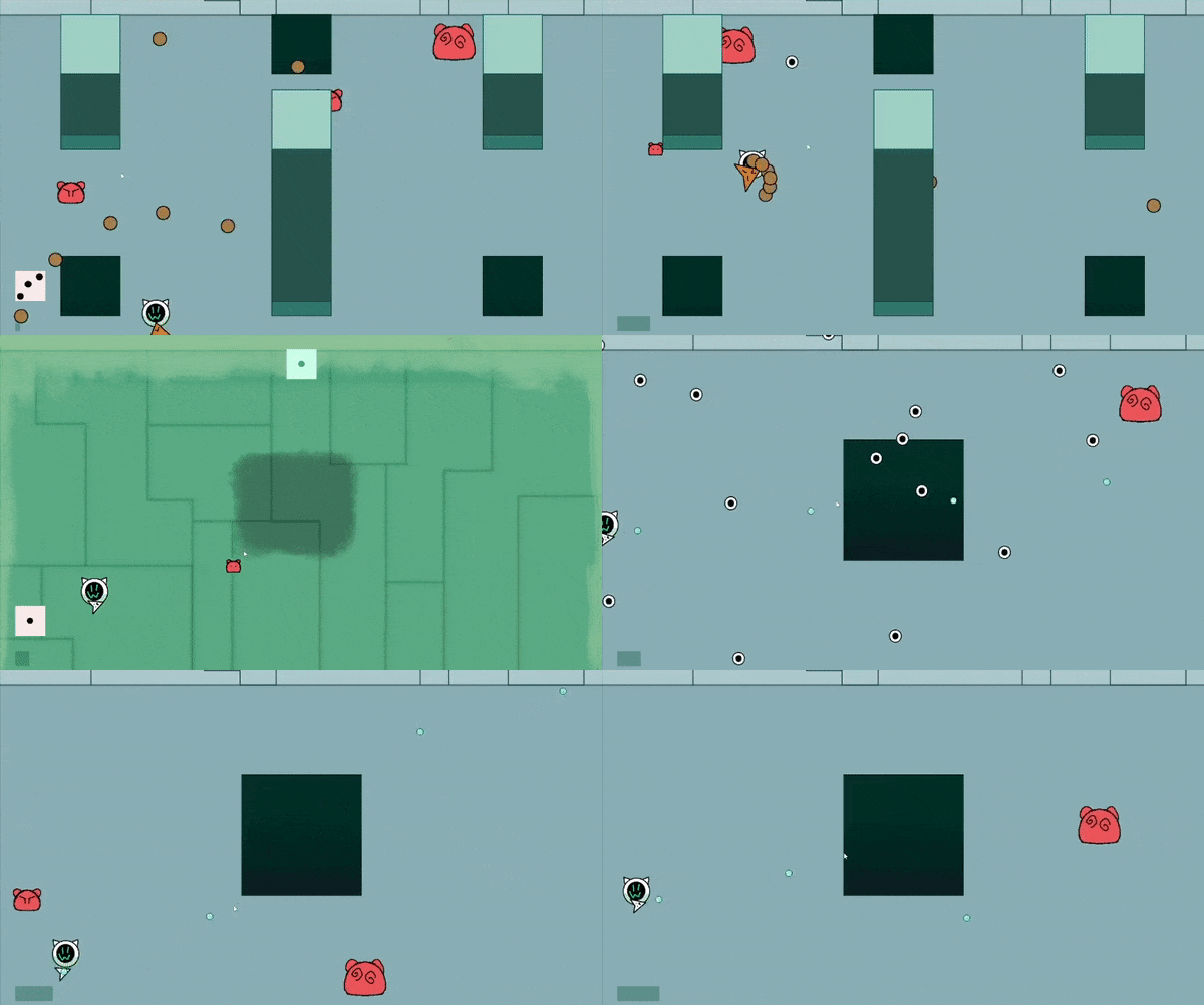
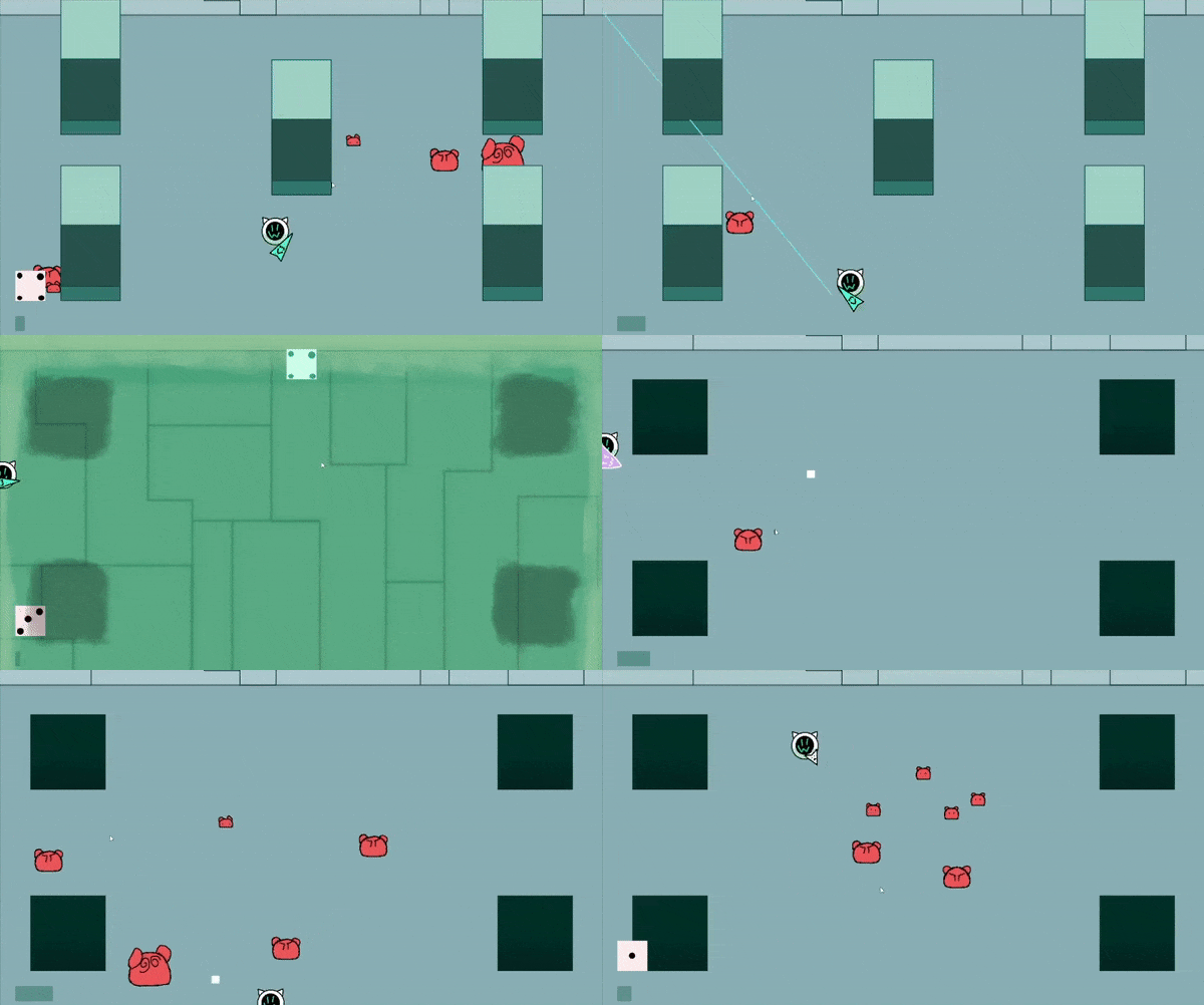
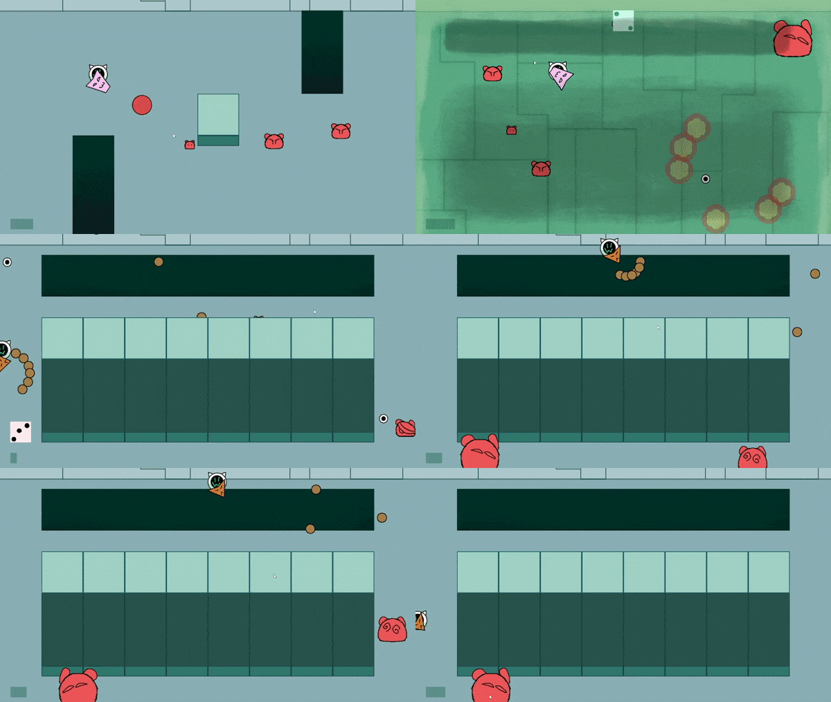
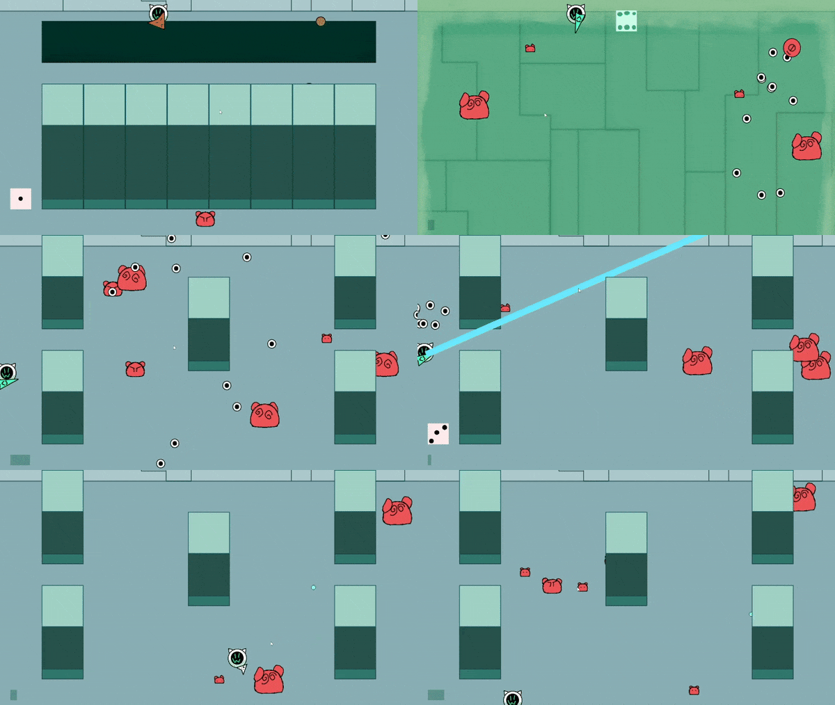
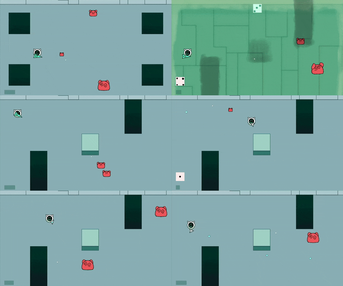
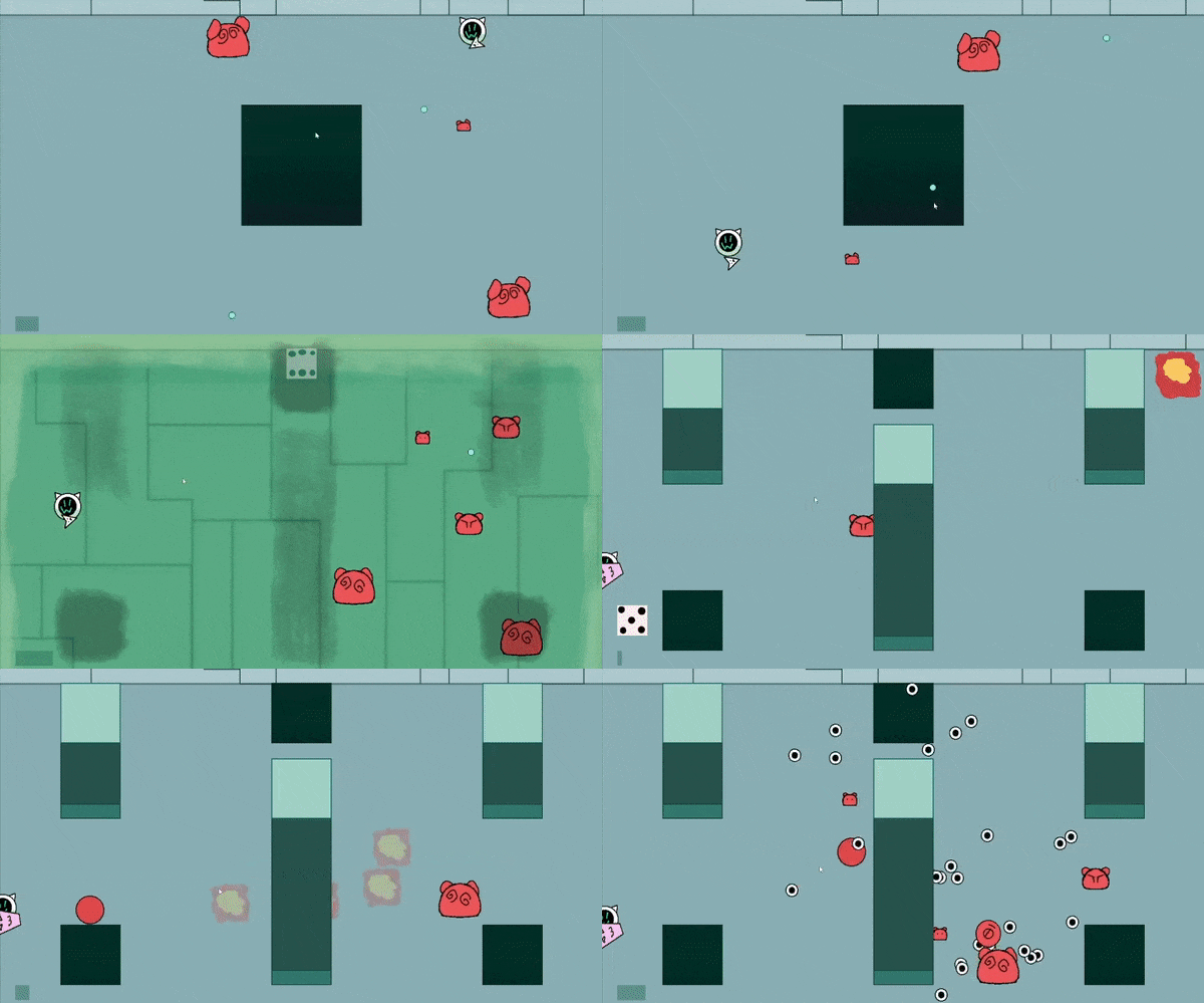
the player's weapon, enemies, and stage layout are constantly changing at random, also 6, the highest number in a regular dice, is a recurring element in the game
Did your team create the vast majority of the art during the 48 hours?
Yes
We created the vast majority of the art during the game jam
Did your team create the vast majority of the music during the 48 hours?
Yes
We created the vast majority of the music during the game jam
Leave a comment
Log in with itch.io to leave a comment.


Comments
I like how the game is fast and that the variety of weapons feels consequential :) Good stuff, will play more!
Wow! The art, style and effects are really great( and 100% unique)! I am really impressed with the quality of work!
Nice job!
It's fast and unforgiving, but I appreciate that the game tells you where the new walls are gonna be in advance instead of potentially spawning them right on top of you
Very fast-paced and pulls you in immediately! I would've liked to see a quick tutorial in the beginning as a refresher but otherwise very creative and fun!
It's a fast pace topdown shooter, and I died very quickly, but still very fun.
Many people made the design that character have a weapon that changes over time like , but I think it is confusing in a fast battle and it should change After emptying the magazine.
Unfortunately I couldn't actually start the game. The title screen says "press B to start". I assume it's picking up a controller? I do have some attached to my system, but I was trying to play with KB and mouse. :-(
oh gee that didn’t even realize that could confuse people
it’s the b key on the keyboard, not the controller button, sorry, I should have made that clear more clear
Oh no, I tried the b key first with no result.
I see, if so then the problem is probably somewhere on your end, sorry
It starts fast haha! Had fun playing, i think my favourite weapon is the rocket launcher (the one that does the flame burst), it's OP. The blue wave is good too! I had a hard time seing the area where you can fall the first time, but you get used to it. Thanks for the game!
The game is fun to play.
The enemies spawn sometimes too close to the player not giving you time to react.
Simple, but fun! It still feels a bit prototypey, with just one hit before game over, no waiting time between rounds, and the super short instructions - but it was still fun for what it is. Good work, that's the hardest part. :)
I hit B to start, and before I had my fingers settled back on WASD I was hit. I tried again and I was able to move around, but ow, walls hurt too it seems. I played a few more times, lasting a little longer each time.
The game moves really quickly, maybe too quick. But I wanted to keep trying, so there's definitely something to it.
Good work!
weird, walls aren't supposed to hurt you, there was probably an enemy sneaking behind it
thank you for the nice comment, there was a lot of cut corners and ruff code in the making of it, so it's nice to hear that the game at it's core design can still get your attention and investment in spite of it
Cool idea with, unfortunately, questionable execution.
I think the biggest things that the game does that shoots itself in the foot is the level design. I'm unsure if it's intentional that many of the stages obfuscate enemies behind walls, but these end up feeling quite awful to play. If this *was* intentional, I think you would be better off changing the affordances to something else like the level being in the dark. There's a pretty significant strategic cost to limit the information the player has by so much, however.
There are also cases where (it at least would seem) that level transitions can instakill you by dropping you in a pit. Or maybe spawning an enemy on you? I'm unsure of what exactly is happening, but I suspect it is one of those two things.
On a minor note, I think that the enemy hurtboxes and/or bullet hitboxes should be bigger? There were multiple cases where the small enemies seemed to phase right through a projectile- at the very least it definitely seemed as though my attack should have hit them.
It'd be nice to see this with some of the most glaring issues cleaned up and maybe with some more strategic variety between the weapons- could be pretty cool! Nice entry, regardless 👍
what foot? all the characters in the game are blobs or circles :>
Jokes aside, thank you very much for taking your time to play my game and writing your critique. To answer some questionables; yeah, walls were meant to block your view, with the layout with the huge wide wall in particular being meant to be unfair, to give the player one area to dread getting (I guess the theme put me in a party game mentality). But if other areas with thinner walls are also causing a problem, then that’s definitely something I’ll consider if I ever expand upon this game
I’m pretty sure instakill issue is from enemies spawning, I did make a failsafe to have them not spawn too close to the player, but it was made when the only enemy type I had where the ones that run towards you and never went back to adjust it after creating other types, some can sometimes still be at close enough range to shoot you before you can even react
Ah alright :) If you plan on continuing this project any, I'd recommend changing the way the obfuscation is themed, as right now it feels frustrating that I would assume the character can see, but I as the player cannot. As I mentioned earlier, having something like a dark room would make it more clear to the player that it is very much an intentional design decision rather than feeling like I'm fighting with the game rather than the challenge it presents, if that makes any sense.
nice game, more life and a life counter could be cool, cuz is kinda anoying that you die in one hit.
Great fun! It's a bit brutal how you lose in just one hit lol, but I really enjoyed it overall!