Haha, I'm tempted to make a terrible mr. Freeze ice pun, but I'll resist. Glad you enjoyed the game! 😀
BricksParts
Creator of
Recent community posts
Wow, thank you for the detailed critique 👍 I'm not sure why the music (or sound entirely?) did not work for you, but I'm glad you enjoyed it regardless! As for the future of the game, we are currently in the process of ironing out various issues and expanding the game with some ideas that we didn't have time for during the jam. Hopefully it turns out well 😀
Thank you! As you mentioned, the corpses can make it a bit hard to tell where a live enemy is- The exact speed of the fading out was unfortunately one of the many things near the end of the jam that we simply didn't have time to address. As for the dice selection, that is definitely one option. There was another mechanic that we could not implement in time that would have also helped address locking onto the dice that you wanted- not necessarily the closest one to the player.
Ah alright :) If you plan on continuing this project any, I'd recommend changing the way the obfuscation is themed, as right now it feels frustrating that I would assume the character can see, but I as the player cannot. As I mentioned earlier, having something like a dark room would make it more clear to the player that it is very much an intentional design decision rather than feeling like I'm fighting with the game rather than the challenge it presents, if that makes any sense.
Cool idea with, unfortunately, questionable execution.
I think the biggest things that the game does that shoots itself in the foot is the level design. I'm unsure if it's intentional that many of the stages obfuscate enemies behind walls, but these end up feeling quite awful to play. If this *was* intentional, I think you would be better off changing the affordances to something else like the level being in the dark. There's a pretty significant strategic cost to limit the information the player has by so much, however.
There are also cases where (it at least would seem) that level transitions can instakill you by dropping you in a pit. Or maybe spawning an enemy on you? I'm unsure of what exactly is happening, but I suspect it is one of those two things.
On a minor note, I think that the enemy hurtboxes and/or bullet hitboxes should be bigger? There were multiple cases where the small enemies seemed to phase right through a projectile- at the very least it definitely seemed as though my attack should have hit them.
It'd be nice to see this with some of the most glaring issues cleaned up and maybe with some more strategic variety between the weapons- could be pretty cool! Nice entry, regardless 👍
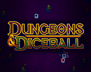
This one is tough for me to critique- for what it is and the time it was made in, this is pretty good! There are certainly some issues with it, but as you were working solo it's hard for me to really fault you. I don't know if you plan on updating the game, but below I'll mention some suggestions if you were to do so:
As it stands, there is very little telegraphing. Eventually I realized the main premise- that the dice affects the attack pattern being used- but this makes me wonder why the boss isn't itself the dice. I think this would help make it much more obvious that the two are related, and as an added bonus, you wouldn't need the dice UI taking up the corner of the screen.
The general difficulty of the different attacks seems quite unbalanced. Several of them seem to be very unpredictable, while others have very obvious telegraphing that makes them easier to play around (such as the meteors). I suspect that you planned on doing more stuff to help with this but simply ran out of time though- I know all to well what that is like, including in the game I worked on this jam 😂
The graphics are simple but serviceable and feel intentionally minimalistic, which I think works well for what this is. Anyhow, nice entry!
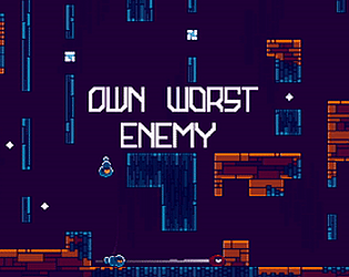
This seems promising, although it's hard to tell since- as others have mentioned- it's quite difficult to play. The jump is so fast, and (at least on browser) there doesn't seem to be any way to even full screen the game. As you use the mouse to aim your dash, I can't help but imagine that it would feel more natural if you used left or right click to activate the dash mechanic.
That said, if you can manage to get the player controller to be more amiable to the platforming/dodging, I think the premise of the level changing as you progress could be cool!
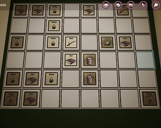
Interesting little concept! I think with some tweaks to the design, you could have something kinda fun here. I think one of the biggest issues with the game right now is that there's no apparent reason not to just spam roll the dice until you get the door open, and then go to the door, so it ends up feeling a bit like it's just randomly generating the level until the door unlocks.
If you were to update this project any, one idea might be to simply have goals that spawn around the level and each time you collect a point, it rolls the dice to spawn another hazard, so the level organically becomes more difficult as you play. In any case, nice idea!
Creative idea, if a bit hard to play outside of just using trial and error, especially with the enemy stages. If you were to make any updates, one suggestion I would have is to allow you to simply left click with the mouse on a tile to move to it, as WASD in a 45 degree perspective is always a bit difficult to get used to.
Furthermore if you were to expand this to a sokoban-y puzzle game, It would probably be nice if the game starts with a simpler dice and slowly builds up level designs/complexity of the dice to allow the player to build up some heuristics of ways to maneuver a dice to get it to face the way they want.
Cool concept that I can see having some more potential with some more time in the oven 👍
I'm glad you enjoyed it! As far as the limitation goes, it definitely ended up becoming less of the core mechanic as the development progressed. I'm not entirely sure I understand what you mean about avoiding the mirror pieces though?
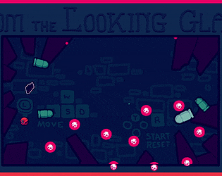
Basically the way the bomb placement (and thus the theme implementation) works is that every cycle, a new clone copies your movement of the previous frame, and periodically drops bombs. Originally you were actually able to directly see the enemies, however later on in development (upon adding the mirror background) I made it so that you could only see the clones in the reflection. As far as showing the player how the game works this is probably not super good to be honest, but during playtesting I found that the enemies ended up being more distracting than helpful. I think that if I moved forwards with this project, I might honestly scrap large parts of that aspect and focus more on the bullet grazing as the core mechanic. Anyhow, hopefully this gives you some more insight to the implementation of the limitation (although it's admittedly a bit weak haha)
Thanks you! Yeah the game could certainly use better feedback in various regards :) As far as gaining energy, you actually gain more energy from fresh bullets as opposed to bullets which have significantly shrunken, but admittedly this is something that would be extremely difficult to discern for various reasons. I have some thoughts about how to make this more clear if I continue this project.
Glad you enjoyed it! The thing you mentioned are already pretty much at the top of the list if I do continue on this project. As for the score, there actually is a score, however it's easy to miss since I couldn't figure out how to make the text bigger in time for the jam :D (The score is on the right side of the screen)
Nice concept, if a bit brutal haha. I guess it's sort of like a peggle bullet hell? I think the main recommendation I'd have would be to give the player some more leeway in dodging the projectiles, right now they're often incredibly fast and often too difficult to predict with the player's attention split. It definitely felt like winning or losing mostly came down to if luck was on my side haha. Nonetheless, nice entry- definitely fits the limitation well! 👍
We'll definitely work on adding juice in post jam versions of the game, but we weren't even able to accomplish all of our main goals due to time restrictions. Hopefully the upcoming versions of the game will add a lot of game feel as well as improve the overall design. Thanks for the feedback and for checking it out!


