Play game
Lord of the Dice's itch.io pageResults
| Criteria | Rank | Score* | Raw Score |
| Enjoyment | #2065 | 2.833 | 2.833 |
| Creativity | #2243 | 3.056 | 3.056 |
| Overall | #2790 | 2.759 | 2.759 |
| Presentation | #3747 | 2.389 | 2.389 |
Ranked from 18 ratings. Score is adjusted from raw score by the median number of ratings per game in the jam.
How does your game fit the theme?
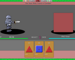
This game is inspired by a combination of board games, deck building games, and Mario Party. Use the dice to traverse the board, but also in combat rounds. Gain more dice and the ability to use more per combat turn. Defeat the enemies, bosses and the final boss to win the game!
Did your team create the vast majority of the art during the 48 hours?
Yes
We created the vast majority of the art during the game jam
Did your team create the vast majority of the music during the 48 hours?
No
We used pre-existing audio
Leave a comment
Log in with itch.io to leave a comment.


Comments
Nice game. Is there more to the gameplay than choosing the highest rolled die, or am I missing something?
Thanks for playing! Right now I think the combat basically boils down to choosing the highest rolled die like you said, although if the die is "enhanced" it always rolls the max value. Also dice that you don't select stay in your hand the next turn and get rerolled. I know we don't convey that or enough information to the player, we unfortunately ran out of time before we could do any real play testing. We would like to add some mechanics to the combat with items, where you could freeze the value of a dice, or face enemies that could only be damaged by certain values like prime numbers or something. Glad you enjoyed what we had though!
This game had me counting and strategizing lots - great submission, well done!
Thanks so much, glad you enjoyed it!
A fun board game style entry. The combat mechanic has a lot of depth and potential! The game could use a bit of love in the presentation, but overall a solid entry :)
Completely agree on the presentation front, ran out of time there. Thank you for taking the time to comment and for trying out the game!
Super unique concept! Theres heaps of depth here for a game jam game! Definitely needs a little sound but other than that this game goes hard! Nice work :))
Thank you very much, I definitely agree we could've used some sound. When it's not there it's a very obvious missing piece. Thanks for playing!
What? Why? How?
These questions flew around my head as I tried to play this game. I’ve got a lot of criticism to give (and a bit of praise too) so I’ll try not to be too rough.
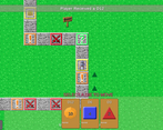
I want to open up with the fact that the art was pretty good. The grass texture was so good, in fact, that I thought for a second it came from GRASS+, a pixel art grass pack I downloaded a while back, but it’s an original. The knight texture doesn’t really fit with the rest of the art, though…
…Which leads to criticism #1: Art style. Pixel grass and board tiles combined with Arial (or whatever plain font Unity comes with) and a low-res knight JPEG is… certainly a look. If I were you, I’d redraw the knight at a resolution that matches the board and grass tiles, and swap out Unity’s default font for something like Matchup or Compass from Humble Fonts Free by Eeve Somepx.
I actually won’t criticize the game’s lack of music, given my game didn’t have any music either, but I will second the notion that it would be nice to have.
Criticism #2, however: UI elements. The “USE ARROW KEYS AT JUNCTIONS” text is hidden behind the dice tray in such a way that I can see there’s something there, but not what the thing is, leading to a moment while I was playing where I straight up asked myself “what is that text under the dice tray?” and had to remind myself what it was. Maybe you could have just a “USE ARROW KEYS” that pops up whenever the player is at a junction and hasn’t pressed an arrow key? Also, the HP bar should be full when I have the same current and max HP values, instead of weirdly having a bit of red bar at the end despite me not taking any damage. Finally, the bar for the text never goes away and never gets reset to empty.
Criticism #3: Bosses. This one’s kind of a hybrid, being a) the bosses are extremely difficult for something I can experience as early as turn 7 and b) some of the names are just… man, why did you have to name some of them Chungus? It dates the game immediately. As for point (a), I can literally encounter my first boss with the basic 50 health (take 2 lefts at the first 2 junctions), and it can do tons of damage. I barely was able to get the boss down to half health on all 3 of my attempts. There are also side paths I wouldn’t expect to have bosses that do (and I can’t see the whole board, so I have no advance warning that “hey, this side path features a boss!”)
This game has lots and lots of potential to be something amazing and worth playing, but in its current state, it could use a bit of TLC. I can’t wait to see if/when/how you move forward with this concept.
Thank you so much for your detailed analysis! Yeah basically all of what you mentioned we'd like to address, we weren't able to do much play testing and refinement in time for the deadline so some things went by the wayside. I'm glad you were able to figure it out, despite our best efforts, and see what we were going for. As for the Chungus, well that's the result of late night tired ideas creeping into the game, haha. We've got a lot we can do to make it better and a lot to learn. Thank you for taking the time to play it!
Didn't quite make it to turn 100, but I adored your dice upgrade mechanic ;)
* I do wish there was sound
* I wish there was a way to speed up the animations (moving forward 19 spaces takes a hot second)
* I wish there was a way to discard dice in a battle... I started with a 19, a 2, and 1... and then I had a 2,2,1... and then a 2,1,1... but I guess that's the *ahem* roll of the dice
Solid submission, good work :)
Thank you for trying out the game! I wish there was sound as well, unfortunately that was last on the priority list and that list got cut off when we ran out of time. Speeding up the player movement is a good idea, or even having an animation at all haha. There are definitely a lot of mechanics that could probably improve and tweak things.
Quick to jump in and fairly intuitive despite the absence of tutorials. 100-turn limit caught me off guard, but it makes sense to prevent stagnant gameplay. Big Chungus is still a threat!
Glad you enjoyed it! We debated having a turn limit, but it probably is a good idea to keep a sense of urgency to the game. But we need to indicate the turn limit to the player for sure. Thanks for playing!
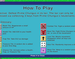
I didn't understand how to play but there's a good way to improve
Yep, we've got some room to improve in the how-to-play department. Thank you for giving it a try!