Play game
Sight's itch.io pageResults
| Criteria | Rank | Score* | Raw Score |
| Audio | #3 | 4.000 | 4.000 |
| Theme | #10 | 3.692 | 3.692 |
| Fun | #11 | 3.538 | 3.538 |
| Originality | #12 | 3.615 | 3.615 |
| Overall | #12 | 3.359 | 3.359 |
| Controls | #24 | 2.462 | 2.462 |
| Graphics | #24 | 2.846 | 2.846 |
Ranked from 13 ratings. Score is adjusted from raw score by the median number of ratings per game in the jam.
Godot Version
3.2.1
Source
Yes
Game Description
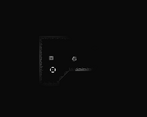
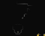
A top down shooter where you discover the world through a short sight
Participation Level
0
Leave a comment
Log in with itch.io to leave a comment.


Comments
I think the graphics could use a little more work. The flashlight cone was so cripplingly short that I'd only have half a second to react to the zombies. This game could be really fun but it doesn't feel that scary to me so the enemies feel a little unfair.
Hey man! I thought this was really fun! I died a few times but kept wanting to progress, until something started shooting at me? I panicked. This had a nice horror vibe! The zombie gurgling noises were great, it really pulled me in.
One regret over your awesome aesthetics otherwise is your use of color in the game. I really liked the black and white aesthetic, and find that the green for the health bar, and the colored bullet icons, really took away from the aesthetic you were otherwise nailing down.
I noticed you use a AZERTY layout, so I had to press Z on my keyboard to advance (I don't like using arrow buttons like this). However, there seems to be a quick solution for your control schemes, since you say it's too much effort to put a user setting for it. Notice how ZQSD and WASD share the SD but not the others? In your Godot actions, it's really easy to set 'forward' for both Z and W, and left for both Q and A, if you don't have other actions needing those keys. May be a tip for your future games.
Thanks for your comment, glad you enjoyed it! Yes, the shooting enemies where a bit surprising to say the least!
I didn’t thought of that, but yeah, to keep the immersion, I could have use a black and white HUD.
Indeed I could have done that! It would have been easy… I was speaking of user settings, where the user can define it’s own key. I’ll definitely do what you suggested next time!
Challenging game for me, but looks pretty well executed. One issue I had was that I'm not used to QASD controls and I kept wanting to use WASD. I switched over the arrows, but I'm not used to using arrows with my left hand while my right hand was on the mouse, so I had a really tough time killing zombies (since I repeatedly found myself rushing headlong into the group of them).
But the mood and aesthetics feels pretty well done and I was definitely trying to creep along as carefully as I could, which was fun. nice job.
Thank your for your comment, I’m glad you appreciated it.
I know the controls can be tricky, and it’s too time consuming for me to put some user settings for it. Because I use an AZERTY keyboard I chose QASD, and thought arrow key replace that, but I agree it’s not very comfortable!
It reaaaaaly creeped me out, even if it is a simple concept.
I enjoyed it, but for my taste it was almost a bit too creepy :)
You tutorialised some stuff really well (stationary zombies to start with and blowing up crates to progress), but I had no idea how to beat the guys with guns. They didn't take long to kill you and getting to them again after death took quite a while so experimentation was difficult.
Overall though, I loved the atmosphere - the short sight cone and well-used sound really gave it a tight, oppressive feel.
First, thank for your feedback. I agree with you about the guys with guns, especially robots (the ones with red lasers). I should have taken some time to balance the enemies, but I started creating them too late.. Right now, they attack you 1s after seeing you (even through walls and obstacles ^^) and then they fire at a certain rate. This is obviously too hard, and would need some tweaking!
The sound design was really good and made the game scary. I disliked the controls a lot and ended up only moving forward. I loved the mood of the game. It was original to do such a game with the theme "discovery" and to me it's a success. The game was fun and the theme is respected.
Thank you for playing and for your message. I appreciate that you liked it. Indeed the controls are not so great. I thought adding strafing left & right would be useful but the world is to small and doesn’t require that. Any idea on how to improve that?
I struggle in games where your movements depend on your orientation ^^. Making the directions you move unrelated to your orientation would solve the problem in my opinion. Though it was fine to move forward and backward, it enforces the scary part of the game without being really hard to control. I don't know if it was intended but I liked the fact that you can light up areas by shooting at the walls !
Yeah true, it’s not the most easy to apprehend. I agree, only forward and backward would be enough.
Yes it was intended! I should have gone more in depth with the mechanic, but I was missing time. The goal was to make interactions with the world (bomb explosion, bullets, moving objects) light up the world. The idea would be that you try to discover the world by bringing light to it, and at the end, it lights you up (internally, in a spiritual sense maybe).