Play game
ThisPlaceMustBeForgotten's itch.io pageResults
| Criteria | Rank | Score* | Raw Score |
| Theme | #37 | 3.623 | 3.800 |
| Originality | #43 | 3.337 | 3.500 |
| Graphics | #82 | 2.860 | 3.000 |
| Overall | #92 | 2.574 | 2.700 |
| Fun | #98 | 2.288 | 2.400 |
| Controls | #112 | 2.193 | 2.300 |
| Audio | #113 | 2.193 | 2.300 |
| Accessibilty | #138 | 1.526 | 1.600 |
Ranked from 10 ratings. Score is adjusted from raw score by the median number of ratings per game in the jam.
Godot Version
4.2.1
Wildcards Used
Gridlock, silliness switch
Game Description
Point and click strategy, built around controlling your opponents
How does your game tie into the theme?
Most of the core mechanics are built around the parasites and the symbiosis effects.
Source(s)
nope! not cause I wouldn't just havent before/horrifying spagetticode
Discord Username(s)
Robot
Participation Level (GWJ Only)
1!
Leave a comment
Log in with itch.io to leave a comment.


Comments
Dude finding a non-vampire survivors inspired mix and match interesting stats for cool combinations game is difficult to find. Thankfully, you pulled through I mean this is cool!
Aw thanks! I do like how it turned out, even if its a bit opaque at first glance lol
I was a little confused and couldn't survive one turn :')
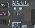
I like the parasites a lot, and how they look when you drag them into the jar
very fair lol, I think I should have made the difficulty curve more of a curve fs. I did make a tutorial if ya think that might help!
Congrats on your first GWJ. Cool to see a tactics game! I really struggled to read the text, but enjoyed killing the enemies. :)
Definitly hearing ya loud and clear on the text, ty for playing!
I agree with the other critiques about the new player friendliness of the game, it was definitely a challenge for me to figure out. However, I will say this is an awesome idea for a game! It's fun to be able to try to power yourself up, and then go fight the baddies with your juiced up form.
I think trying to work more detail about what everything does into the UI might help the game be more accessible. Maybe having some sort of animation showing the parasites being drained into the player might have helped, or having the syringe be smaller (or labeled?) I couldn't tell what it was until I watched the tutorial.
If possible, having somebody playtest who is totally new to the game seems to go a long way. I wish I would have done that more because there were a few times I shared my game with someone after it was completed and I regretted a few design choices because I realized it might be too hard for some players at first blush. We made our games, so we know exactly how everything works. Just because something is perfectly clear to us, doesn't mean it'll be clear to someone else.
I have to say, though, I don't know how many games you've completed outside GWJ but this is really an impressive first/early game to have made. Although it took some time to get comfortable with the mechanics, this demonstrates a lot of technical skill and I look forward to seeing you in future jams!
Thanks for the good critique and advice! And yup, this was my first nose to the grindstone kind of game, though I did one 3-day gamjam with a group and did a little test game built off of tutorials before that. Godots just generally really fun, and though I definitely am seeing where there's room for improvement in this one, I'm happy with where it ended up.
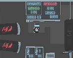
interesting parasite-based turn based strategy. unfortunately it is a very hostile experience. The font is barely legible and the UI hopping around with no clear marking of what is interactible and what isn't making the gameplay really rocky. I'm not sure how the actions I'm taking affect the world (like the parasites, what buffs / debuffs do I get from them?)
Pretty cool concept though! I'd love to try it again if there is ever a post-jam update adressing the issues
I’ve been getting a lot of similar feedback, yeah. I made a video tutorial to hopefully provide a bit of a bandaid to some of those issues, as one of the core mechanics (identifying parasites) definitely could use a lot more clarifying. The “i” for information symbol on the vials ended up just looking like part of the texture. Also adding a hover indicator to the buttons/making stuff only move when you click on it could definitely be helpful yeah
interesting parasite-based turn based strategy. unfortunately it is a very hostile experience. The font is barely legible and the UI hopping around with no clear marking of what is interactible and what isn't making the gameplay really rocky. I'm not sure how the actions I'm taking affect the world (like the parasites, what buffs / debuffs do I get from them?)
Pretty cool concept though! I'd love to try it again if there is ever a post-jam update adressing the issues
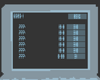
It’s hard to read the texts, and I’m not sure what anything does. What do the stats mean? How do they influence me (who/what character am I?).
you're the character in the center of the screen, if you hit the ready button you'll have a turn where you can move by clicking. spd is the number of spaces you can move, att(attack) is the number of times you can attack, def (defense) is a more disposable form of hp. Disc is discards, if you hit the trashcan icon on the left the parasite in the vial with be replaced and disc will tick down. init is initiative, the higher it is the sooner you go in the turn. I'd say the last two def could use some in game explaination yeah fssss
I think the tactics gameplay with the parasite stat effects is a cool core concept, but the font makes it pretty hard to understand what's going on.
lol second person to say that! Guess I just got used to it, probably not a great thing when talking graphic design