Play game
A Harold Between Worlds 2: Reid Shift's itch.io pageResults
| Criteria | Rank | Score* | Raw Score |
| Overall | #1 | 3.913 | 3.913 |
| Music | #2 | 3.783 | 3.783 |
| Story | #3 | 3.652 | 3.652 |
| Gameplay | #3 | 3.957 | 3.957 |
| Graphics | #5 | 3.522 | 3.522 |
| Comedy | #12 | 2.739 | 2.739 |
Ranked from 23 ratings. Score is adjusted from raw score by the median number of ratings per game in the jam.
Leave a comment
Log in with itch.io to leave a comment.





Comments
Never got to finish HBW1 and couldn't repeat last year.
Overall: It's a Mooglerampage game; of course it's gonna be awesome. Gameplay obviously delivers with a genius combat system which leans into the dimension-traveling story. This formula is supported by a classic 16-bit feel and a great blend of serious storytelling and some lighter-hearted comedy. If there's a game that embodies the overall category, it's this one.
Gameplay: The different battle systems per character is so cool, and I love how the Dark Realm has you use every character to get rid of the force field. Had to go into the final battle with my boy Chip of course. Crafting looked cool as well but I ultimately didn't use it.
Music: Love the classic 16-bit soundtrack which perfectly compliments the graphics. It almost leans too Uematsu, although that's no fault of your own.
Comedy: Love a serious game that manages to sprinkle in some comedy here and there. Great balance of both.
Graphics: Big fan of the SNES aesthetic you always pursue in Harold Jams. Are the player sprites custom? If so you did a damn good job with those.
Story: One of the longer stories of the jam but definitely worth the time. Some HBW1 bits were lost on me but I loved seeing all the other universes created by members of the RPGBT community.
Thanks for taking the extra time to finish this installment DJ!
The sprites could take up a dev log of their own haha.
The "abridged" version is: Sawyer made Chip's battler graphic; townspeople and monsters' map sprites were 2k3 RTP (some with palette swaps from me); Sarah was from Tiny Tales (with another custom palette swap); and every other actor battler or actor map sprite not mentioned elsewhere was custom, using some combination of Tiny Tales and the 2k3 RTP as references. It definitely took longer to make those than any other element of the game, but it was freaking worth it IMO.
I know some of the soundtrack is a bit too on the nose (ruins battle theme!) but I think it helped the vibe more than being a detriment. Still, I'd want to go with bespoke music in a long-form project as I've used pretty much all the good 16-bit stuff I could find in one or more jams.
Was super fun being able to jam all of the guest characters into this one! (Chip seems to be a popular sidekick choice - I wonder why? :D)
This is one of the Final Fantasy Pixel Remasters, right?
Jokes aside, this plays like a complete RPG. It may be short by the genre's standards, but it's actually quite ideal for me, and I enjoyed every minute of it. Shifting between worlds is a cool concept and I loved how you used it to tie in various community members' games. And it's not a mooglerampage game without a T3F3 reference! 😛
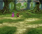
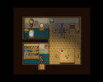
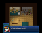
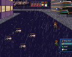
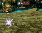
The graphics are on par with the FF Pixel Remasters, what with the blending of 16-bit-esque sprites alongside beautiful particle effects. The weather effects were a nice touch, too. Maps are compact enough while still having plenty of secrets and surprises. The only sour spot for me was the portraits: since there are some non-retro graphics in here, I don't think it would be too out of place to have some nicer-looking face graphics.
The 16-bit styled music was a great move, too, and is leveraged expertly. While you could have gotten away with full quality instruments for a total Pixel Remaster aesthetic, I enjoyed them too much as-is to complain.
I felt like the writing was pretty strong, too. Sure, there's Therese's aggressive "PLACEHOLDER TEXT," but aside from that I felt like each character got to express their personalities in fitting ways. Good use of the required elements, too.
Overall, I feel like this is a great entry. Truly a remarkable work of passion paired with skill. Not as long as last year's entry (thankfully), but still epic by jam standards. And most importantly: a joy to play. Well done!
Aw man, thanks KV!
I guess I am gravitating more towards that Pixel Remaster style as time goes on. It just feels like a natural aesthetic to me, so I am glad it's largely gone over well! :D
Yeah, totally agree on the face graphics. I was going to try 2x pixel scale instead of 3x but I already had about half the characters in the x3 scale already, and it would've been too time intensive to redo a bunch of them. (having inconsistent scales seemed worse than living with a bit of quality variation, at least at the time). I might try full HD faces in the future and see how it goes.
Therese is such a wordsmith! LOL
Honestly that gaffe with her recruitment dialog makes me cringe every time I see it. If I do a post-jam update, fixing that scene is gonna be top priority for sure.
Minus the placeholder snafu, constructing a satisfying narrative was basically my biggest "growth" effort for this jam, so I appreciate the feedback on the writing and characterization.
Thank you again for playing! It was a ton of fun (albeit stressful AF) to put together and reading all these comments has been great as well.
So far the best entry I've played. I love the RPG Maker 2000/2003 throwback look. I wouldn't mind playing a full game like this.
Thank you, CrocPirate!
2k / 2k3 definitely have my favorite RTP sets of any RM engine and it was a blast to adapt and expand on those sets for this project.
Dude, this was fantastic. Great work.
Thank you so much Lochraleon!
Moogle made a game with two party members!!!? Your powers have doubled!
This was such a fun entry, I played for two hours straight. The combat was varied (if you wanted it to be), extremely creative, and held more depth than I think any of us could explore fully. I can't believe you crammed so many different combat styles into the game, along with the move altering party members. Balancing this must have been insane, but I never found it too tough. A bit too easy perhaps, but that sounds about right for a tricky game like this.
Story was really good too, and a great follow up to last year's entry, and the music choices were quite fitting (needed more metal for Infinity Beating down :))
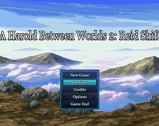
There were a few little things that must have been unexplored due to time. I used some tutorial item, which led to an immediate crash. The title screen credits are pretty funny too. Therese gave me some stand-in dialog, although the game did break the fourth wall a few times, so I will pretend Therese was ironically saying those things in game.
The scope of this game was off the charts, and maybe the biggest flaw was cramming so much awesomeness into a jam game. I will attempt to judge on the first hour! It might have been possible to cut this game a bit into a smaller package, but perhaps it is even better totally ignoring the jam time limit. Once again one of my favorite entries.
Thanks so much Human. You're absolutely right about some of those details that didn't get a full coat of paint, so to speak. Therese is a woman of few words, but "placeholder" is apparently one of them!
I am both ecstatic that the game was fun enough to play for two hours, and a bit miffed at myself for going so far over the playtime allotment (but more of the former if we're being honest). Still, there wasn't enough cushion left to trim anything unfortunately, so I will have to put that under the "lessons learned" column.
Balancing was... well let me leave that for a future dev log / itch.io post. I will say that most of the party members did intentionally skew towards the easy side, as I wanted folks to be able to complete the story should they decide to commit to the full 1-hr+ experience. Not sure if I'll make a post-jam update or not, but if I do, a "hard mode" and a super boss (regrettably cut for time) would both be on my radar.
It was a pleasure to participate in such a cool jam with lots of great games. Thank you for hosting it, as well as all the other cool stuff you've done for the community (too big of a list for this Comment section).
What if it was Harvest Moon, but you are Harold who has fought thousands, possibly millions of monsters and world-ending threats, but now you're stuck on a farm milking cows and pluckin' raddishes and the boredom of farm live is slowly driving Harold insane.
That's not this game, but that's the game I want to play.
I didn't think of the Harvest Harold angle.
Missed opportunity, perhaps?
I got stuck on the Katina part. I couldn't activate the escape pod. I went in every room like 30 times and couldn't figure it out. Overall, not a bad game. I liked the combat, and I also liked you could just heal back up at the crystals. The enemies looked cool too.
Thanks Nova, sorry you got stuck!
The solution to that part is a bit obtuse I'm afraid but I didn't have time to make it clearer. Check the item vendor once you reactivate power.
I think you'll dig the boss fight for that level :)
Moogle is best Moogle. This is a very good Moogle game, ten Moogle points!
I only had time to go through the ice crystal quest, but I will play the whole game!
Thanks for playing, kupo!
I hope you enjoy the rest of the game as well.
Well game game, enjoyed and wish to see more in the fture with cameos from other projects
Not a bad playthrough D7. Thanks a ton for featuring it on stream.
Yep, I have more cameos in mind for future projects - stay tuned!
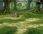
I really enjoyed this entry! The pixel art style for the characters and battlers was amazingly done! I never thought the Rm2k3 and Time Fantasy assets would merge so well in an MZ game! I also love the usage of animations and action sequencing that made it fun to look at! Btw, I love that we can swim on the water! Yay! :D
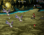
The battles were fun and very versatile depending on the characters you choose to partner with! I especially love how we can unlock a combo input system when partnering with Michelle! Everything else in the game works well as it is like crafting.
Story was fun and has a good pace to follow. I love each of the unique worlds from different party members! I am mostly fond of the alien ship world as we get to see a glimpse of some futuristic stuff in a pixel world!
Overall, this was a fun retro pixel-style experience but modernized with some smooth animations and mechanics! Amazing job, mooglerampage and congrats on finishing this entry! <3
I really appreciate the feedback Starmage!
I'm really not a fan of the usual classic and retro style games, but this one is just beautiful.
It has a good looking retro style to it, the pixel style portraits look great as well.
However, what carries this game for me is the very good writing and the amazing music.
I genuinely enjoyed reading through the intro scenes and I found the individual characters to be very well written.
Combat is simple and pretty standard as far as I could tell so no big points from me here, but it is in line with the retro style.
The battlemusic though was an absolute banger so I did not mind fighting at all. You know you're doing something right in your game, when your player starts nodding their head to your game's music.
I also enjoed the little cameos I found and the Fight3Take3 reference had me giggle.
Once again I would say this could be an "official" game in its own right and you can clearly see someone knows what thy're doing.
Thanks for the kind words SG, means a lot especially not being quite your usual "jam" aesthetically!