Play game
Death's Challenge's itch.io pageResults
| Criteria | Rank | Score* | Raw Score |
| People's Choice | #58 | 3.308 | 3.308 |
Ranked from 13 ratings. Score is adjusted from raw score by the median number of ratings per game in the jam.
Leave a comment
Log in with itch.io to leave a comment.


Comments
nice art, but the way this game shifts between tones looks like this and i mean that in a bad way considering the subject matter:
Death's Challange
by Classic Review
Hey there Classic Review, thanks for submitting a project to the 2022 IGMC. I was asked to judge your game in round three of the IGMC 2022 game jam. Here's some feedback about your project.
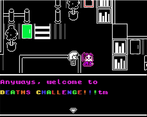
I'm not sure why you chose to make the resolution of your game half the size of a poker card, what is this like 300x200?
This is going to make most everything blurry when you stretch it out to HD/FHD/UHD etc. I'm playing it on a 2560x1440 monitor for reference. Most people are probably going to be stretching it out over a 1920x1080 resolution.
Default sound effects are very noticed. The slowed down BGM that plays on the the title screen sounds like a terrible dirge.
You shouldn't ask people if they want to see a suicide content warning. You have to decide to put it on there or not to based on the content of your game. When you present it the way you did you basically gave the story away. Not a good approach in my opinion.
The font is blurry and hard to read in most cases, it hurts my head to read. The dialog is crass and not really that interesting.
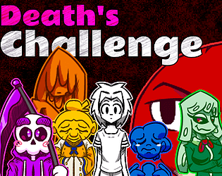
The artwork is about as minimalistic as you can get without making an ASCII game. While this doesn't actually bother me that much, it does make it hard to understand what I'm looking at.
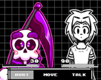
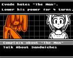
The combat system is customized and unique, but not really all that fun.
The puzzle aspect of this game boils down to walking around an escape room trying to find the correct event that switches the next door open, over and over. There are quite a few doors, all of which are locked except the first one. It's not the type of gameplay that I personally enjoy, but I've seen many games like this with the same concept.
You should allow people to save anywhere in my opinion.
While this game has it's own style, it does feel very rushed and 'defaulty'. I like the attempt at a customized battle system, but this one didn't quite do it for me.
Good job on putting a project together and congratulations on making it to round three of the IGMC.
-Drifty
This game has a gorgeous consistent art style that really serves the game well, but the gameplay / pacing are VERY slow. Which meant about 75% of the way through, I was just ready to be finished because things just felt a little same-same for me. I think you did excellent getting a lot of content completed within the time frame and things feel very polished. There are a few translation / grammar things, but nothing too distracting. Overall, nice job tackling a heavy topic (thanks for including a warning at the start!)
Overall -- outside of the pacing, I think this game is very high quality and a fantastic addition to IGMC. :)
(edited to fix some bad syntax on my part!)
I'm really happy that you enjoyed my game. Also, thank you for the feedback. It really helps.
I streamed this with the dev present, so just leaving my notes for posterity:
Overall the game left a bitter taste in my mouth due to the final boss making me ragequit.
Thank you for playing my game, streaming it, and giving me detailed feedback on it. I do generally want to improve as a creator, so your suggestions and critiques are greatly appreciated. I explained it to SeaPhoenix’s comment below why the resolution is so tiny, but rest assured I do plan on fixing that if I ever update the game in the future. Sorry about making you rage quit.
Wow! I really like the story and the characters, each one has someone to say and I think it's important to the meaning of the game. This art style reflects my taste so I enjoyed playing! Well done!
Thank you! The story and the art were the things I took the most pride in with this game. So, I'm happy that you enjoyed that aspect of it.
The game's concept sparked my interest, and the art matched the mood of the game very well. I thought the puzzles and battles were both interesting (it took me at least two and sometimes three tries to win them, and I liked how you unlock new skills and have different abilities when facing different people). The story was engaging as well, though the dark content may indeed be upsetting to some people. In particular, the flashback sequences were well-done.
Some minor nitpicks: there were some typos throughout the game so I would recommend proofreading if you update the game, and for some reason, the game screen was really small (like 200 pixels or something - was that intentional?), so I had to stretch the window out to play comfortably.
Edit: Fixed typo
Thank you for playing my game. I'm also grateful for your feedback. For the screen resolution, I wanted to go for that old-school GBA vibe, so I went with a 180x240 resolution. In reality, it probably wasn't a great idea since it just ended up being more work for me in the end lol. I might fix that along with spelling errors when this contest is over.
I like a lot minimalistic and unique games and this one checked both points! The combat system is engaging even if minimal, liked the humor too. The only things I dislike is some RTP sounds and the near lack of overworld music. Also not everything respects the palette, like the Granny’s sheet. I can say anyway I really liked this game again.
Thank you for your input. I'm really glad that you liked my game.
I liked the presentation and the designs were super cute but the combat just feels like you're given a ridiculously low amount of leeway. The puzzles were intuitive albeit its mostly just go from A to B and then create all the different foods for the residents and all that. The story is definitely interesting, the crass nature isn't my jam but I'm okay with it.
There is a twinge of emotional resonance in this but the battle discourages me from continuing further.
Thank you for the feedback.
Oh! Really interesting! *_*