Play game
64 Rhythm!'s itch.io pageResults
| Criteria | Rank | Score* | Raw Score |
| Audio | #58 | 3.867 | 3.867 |
| Gameplay | #110 | 3.467 | 3.467 |
| Authenticity (use of resolution) | #112 | 4.533 | 4.533 |
| Overall | #116 | 3.767 | 3.767 |
| Graphics | #190 | 3.200 | 3.200 |
Ranked from 15 ratings. Score is adjusted from raw score by the median number of ratings per game in the jam.
Did you work in a team?
3 members, super fun experience
Was the resolution a challenge?
yeah but we got an idea to work with it!
What did you learn?
Plenty of stuff about unity : very cool learning experience!
Leave a comment
Log in with itch.io to leave a comment.


Comments
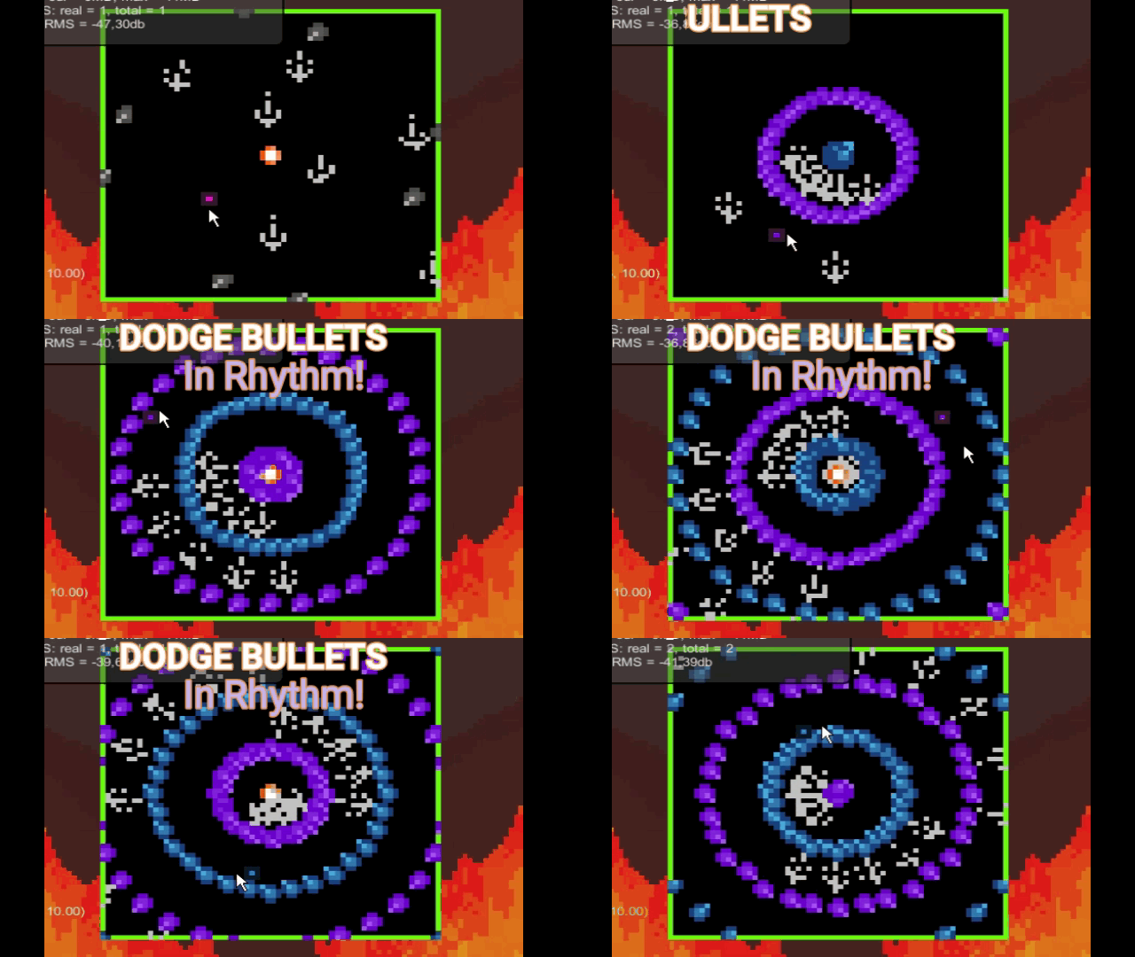
Nice bullet hell, reminded me of Bullet Audyssey! I found the game to be quite easy to beat since it was always alternating between the two colors, more difficult levels (maybe not "Galaxy Collapse"-difficulty) would have been great. Also it would be nice to add song credits to the description so that players who enjoyed them can check them out. I knew the music for level 2 was familiar but I had to use Shazam to find it again :P
the music is absolutely good, and i like the way it was implemented into the gameplay. had a blast playing this
The color changing mechanic brought a bit of variety to a regular bullet hell. There were some points where you felt trapped by the grey projectiles but not to the point of frustration. I liked the soundtrack probably the best music in the jam so far. Decent work.
Also not entirely sure but is the game screen and the flame background altogether 64x64?
Ty for testing our game! Actually the flame background isn't part of the game, we added it at the end so you don't have a black screen around the real game screen in 64x64, it's just for a better render on every screen size and have nothing to do with the game ^^
Cool concept! Thought the music was really impressive and like how it synced up with the gameplay nicely.
Fun bullet hell! I love the sprites and animations, definitely made every pixel count. The music was a tad quiet and I think adding some more contrast between the two colors would help a bit, but other than that a very solid game.
Good job to all!
Thank you for taking your time to try our game!
Right now there are only 3 colors because we wanted to make it simple : having too many colors can confuse player and it would be also difficult to make sense with so many colors in a 64x64 pixels area^^ However I like the idea, maybe for a rework of this game where we delete the area size limitation, it can be cool!
Oh for sure, definitely keep it to 3 colors! I just feel like the two colors the player can switch between and the corresponding bullets were a bit too close to be able to quickly decide which color you should be switched to. I feel making them more distinct colors from one another would make quick decisions in a game like this much easier.
Nice approach to a rhtyhm bullet-hell. Maybe you could get a bit more of velocity but given the small resolution maybe that could end up beeing too much. Enjoyable and challenging. Nice job!
Thanks! And yep velocity will be a way to increase the difficulty (pss at the beginning I wanted to have the music "Galaxy Collapse" in the game, if you know, you know x)) For a gamejam, the game have to be playable and enjoyable for everyone but I would definitely if we keep to development of the game add more difficulties with a painfull velocity ;)
This game is an underrated masterpiece! The music had me jamming and the gameplay was very engaging
Though I wish there were more levels and maybe just a bit more polish in between levels, but otherwise a 10/10 game
Thank you for the support <3
We had the idea of keeping the game updated and work more on it since for us 14 days was not enough to have a fully polished game and more levels with *maybe* some new mechanics incoming!
Very interesting concept! 💯
I think the music had quite low volume, I hardly heard it.
One nitpick: player’s purple color is different than the one emitted by an orb, therefore I hesitated whether they match to make me invulnerable.
Thank you for the comment!
There is an option menu to change the volume of the music (you can access it on the main menu or by pressing ECHAP in game).
And for the color choice we decided to change it a bit so you don't lose the player's sprite between all the others bullets^^
Fantastic game - I love the soundtrack, it adds so much to the intensity of the experience!
Gameplay is challenging, but in a way that never felt unfair. Always got a soft spot for bullet hell games :) Once I followed your suggestion and started playing it like a rhythm game I found I took way less damage.
I love your solution to traditional HUD elements taking up space - the single pixel border as health indicator works really well, and makes for a brilliant way to get the most out of the 64x64 maximum.
Wow! I don't know what to say ^^' Thank you so much for this kind comment and for taking time trying out our game! We really appreciate it :)
To try and play the game you just have to redirect yourself to the itch page of the game! The button is just on top of that ^^