Play game
CLOSER (2023)'s itch.io pageResults
| Criteria | Rank | Score* | Raw Score |
| Creativity (how unique or innovative was this experience?) | #38 | 2.879 | 2.879 |
| Implementation (rate the game's overall stability and functionality) | #41 | 3.103 | 3.103 |
| Presentation (rate its art, animations, sfx, music, and aesthetic appeal) | #54 | 3.121 | 3.121 |
| Overall | #55 | 2.800 | 2.800 |
| Gameplay (how good was the user experience, game design, narrative, etc?) | #76 | 2.534 | 2.534 |
| Theme (how well does the game fit the challenge theme?) | #131 | 2.362 | 2.362 |
Ranked from 58 ratings. Score is adjusted from raw score by the median number of ratings per game in the jam.
List the Itch usernames of all official team members.
felixleonggames
Team Name
AbstractActionArcade
How does your game fit the theme?
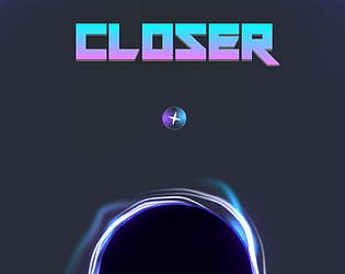
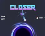
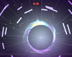
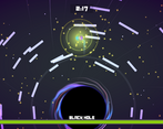
The black hole is a boss character who inhale and exhale with a heavy breathing interval, drawing the player closer and pushing the player away constantly while the player is calming (closing) it down.
Leave a comment
Log in with itch.io to leave a comment.


Comments
I adore this idea! I agree that the title screen needed more guidance--I did figure it out, but it took a while. I'd also appreciate a longer timer because I'm not very good at this! It was really fun anyway, though, and the rhythm made it exciting.
Show post...
Awesome visuals and the music really adds to the action. The idea is also pretty cool but it was pretty confusing at first, as others have already said here. Great job man
Great design all around! I loved the mechanics and spherical map. Sounds made the player feel like a real marble ball and music fit really well to the action. Particle and light effects <3 Fantastic job!
Thanks for playing! <3
Love the graphics and gameplay mechanics, although it took me a little while to get the hang of it
Thanks for the feedback, I'm glad you enjoyed the game!
I think I had like 20 left on the timer before I realized I should collect the stars before attacking... xD
I felt the fight was very extended, but that's likely because I missed out on that crucial information. Super satisfying starting tutorial screen, I really [redacted] love it! If it would teach me about the stars as well it would be perfect. I will take inspiration from this.
A lot of people get confused with the starting screen, so your comment really really means a lot to me! I'm glad someone like it :D
Yea I agree on the stars mechanic not being 'tutorialized'. I really wish to improve the onboarding design of this game. Anyway, thanks again <3
awesome visuals and sound
Thanks!
Hey there! Great work with the art and overall feel.. Animations are very satisfying, effects are really cool! I'm not much of a gamer myself, so it took me over 3 minutes to jump in the black hole at the start of the gaming experience. Here's my thought process:
"I'm not sure how I influence the enemy. I mean, I know I can click and do the dash thing if I hold the mouse button down, but is it the same as the attack? I mean, do I have to hit the black hole or just click when I'm near but not too near it? I feel I didn't understand right what to do."
Anyway, it was very satisfying to interact with the elements, congratulations! Thank you for sharing!
Hello! I totally agree with you. I have a few friends who mentioned the same exact feedback as you. I was relying too much on the start menu as the 'natural' tutorial so if you can start the game (by attacking the black hole), you will know how to play the game generally. But it's definitely not clear enough, apparently. But hey, thanks for the feedback, it's a great lesson for me! I hope you still enjoy playing the game :D
This is my comment as a player.
1. The starting area is quite confusing because it took me quite some time to start the game. I dont know that I need to hold the attack button to start.
2. I like the animation and the SFX. The animation is smooth and SFX is really great at conveying the game.
3. Im not sure how the game represent the theme.
4. I know this is just a minigame/a demo, but I wish It has more clear goals and objectives.
5. I think it has good potential if can develop more levels and puzzles.
Hey, thanks for the comment!
Yes, the starting area is indeed one of the humbling mistakes. I assumed color theory and some UI animation could help the player understand and figure out how to attack, but I was wrong. I received feedback that it took some players some time to start the game, or some even quit without getting into the game. So yes, I definitely need to work on my onboarding design.
Love the idea of pushing my luck and getting more stars , the attack animation is also really satisfying. Instead of the countdown, I would love to race on a leaderboard to see who can defeat the boss the fastest! Great game overall ✨
Glad you're enjoying the game Lio! You know what's the funny part? The leaderboard is one of the initial elements! But it got scrapped due to time :P
Really cool game, so addictive I just had to try again until I beat it! Very interesting interpretation of the theme too. The music and sounds are extremely satisfying and fit really well together.
Great job!
Thanks so much for the comment Raul!
Hey voters 👋🏻 I hope you guys have fun closing the breathing black hole!
Just a gentle reminder, if you think you're stuck at the main menu and not sure how to start the game, why not try attacking the black hole (hold the mouse button until fully charge and release it)? 🤭 And of course, if you think that is not intuitive, please give your honest rating, I don't mind at all 😊
I will appreciate any comments, reviews, and ratings. Thanks for playing! 🙌🏻
Nice start menu! The game felt like a cool boss fight.
Thanks Joebinns!